 It’s the end of the week, but that doesn’t mean an end to learning more about your favorite Apple devices. Each week, the Friday Five takes a quick look at a Mac OS X or iOS app to point out five things you may have overlooked before.
Preview: it’s the app that many of us get used to seeing when we double-click an image file but really wanted it to open in another app. Sadly, that’s the opinion a lot of people have of this app that’s part of OS X, but there are some pretty amazing ways to use the app. Today’s Friday Five takes a look at the OS X Preview app and five ways you can use it to do things you may have never thought it could do.
1) Photo Editing
Sure, you have Photos, and you may also have a pile of other photo editing apps on your Mac. But Preview is a surprisingly powerful app for doing photo editing, and I have to admit that it’s become one of my go-to apps when I need to quickly edit, adjust, and otherwise make images snazzy for web posting. What are some of the things you can do to your photos in Preview?
Adjust Color:
Sometimes your photos may need a little bit of color adjustment. Perhaps a shadow is obscuring a detail you want people to see, maybe the photo is slightly over or underexposed. White balance might be off, giving the image a bluish or yellowish cast. Fortunately, the Preview app has tools to fix this.
Related: Learn even more about your Mac or iOS device in our Tech Tips section
When you first launch Preview, you may see just a minimal toolbar. Click the “toolbox” icon (see image below) and another toolbar appears with many of the powerful tools that are available in Preview:

To adjust the color of an image, click the “prism” button or select Tools > Adjust Color. What appears is a tool full of sliders for adjusting individual attributes of the color of an image, and a histogram showing the RGB (red/green/blue) levels in the photo (see image below). Probably the most important button is the one at the bottom, which allows you to tweak and play with a photo, then reset all of your changes back to the original settings.
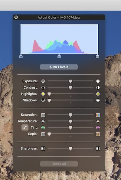
Clicking “Auto Levels,” Preview will do its best to adjust the photo to what it believes are the optimum settings. I was surprised to find that the image I used in this post was slightly underexposed — a shocker considering it was taken under bright lighting conditions. Adjusting exposure by hand can be done with the Exposure slider, going from dark (underexposed) on the far left to washed-out (overexposed) on the far right.
The Contrast slider, of course, adjusts image contrast. That’s the difference in luminance or color that makes an object in an image distinguishable. When the slider is all the way to the left, the image appears washed out; when it’s all the way to the right, colors may appear over saturated and darker/lighter areas of the image are exaggerated.
The Highlights slider tones down bright parts of an image as it is moved to the right, perfect for fixing bright reflections or glare in part of the photo. The Shadows slider does just the opposite, brightening dark parts of an image. That helps if something that you’d like viewers to see is obscured in shadow.
Saturation is the intensity of a color, and the Saturation slider changes the intensity of all of the colors in an image. It’s useful in making a blue sky seem even more intense, or bringing the colors in a photo from dull to exciting. It can be overused, however, making images look just plain odd. Moving the Saturation slide to the left removes saturation from an image, with the full left setting turning the photo into a monochrome (grayscale) image.
Temperature denotes the color temperature of an image, either cooler (bluish) or warmer (orange). The Temperature slider is perfect for adjusting the color of images taken under fluorescent light (which appear cooler) or incandescent lights (which appear warmer) to a more natural color.
Tint is a bit different from Temperature. Let’s say you take a great photo of a friend’s face, but her face appears greenish because of a reflection from trees. Sliding the Tint to the magenta (right) end can correct the green skin and turn a photo flop into a winner.
Have you ever wanted to turn a photo into an old-time sepia-toned print? It’s actually quite simple. First, use the Saturation slider to remove all of the color from a photo. Then add the desired amount of sepia tint to the grayscale image with the Sepia slider (see images below).
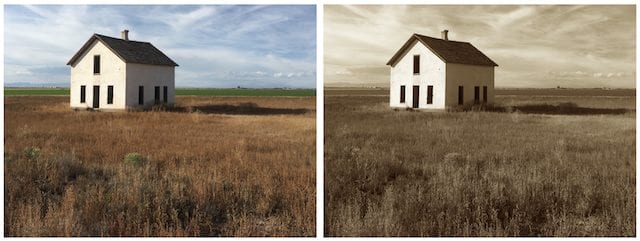
Finally, we come to the Sharpness slider. While it won’t fix badly focused photos, it can provide more or less detail in items that are in focus. Take, for example, the weeds in front of that sepia-tinted image. Sliding the Sharpness slider all the way to the left makes the weeds look slightly unfocused, while going all the way to the right gives them an unrealistic clarity.
As mentioned before, a click on the Reset All button brings your photo back to its original, un-tweaked look.
Crop, Resize and Resample Images:
We bloggers often need to crop or resize images and bring them from higher resolutions — say 300 pixels per inch — to the web standard 72 pixels per inch. This allows us to create images that load faster on websites. The Preview app has tools that make this quick to accomplish.
To crop something’ll you need to do is drag out a rectangle onto the image and then pull the “handles” to the correct image size you want, then click the Crop button in the toolbar, press Command-K, or select Tools > Crop from the menu bar. All three of these actions produce the same result.
Once your image is cropped to create the composition you want, you can resize it. The resizing tool is available on the menu bar as Tools > Adjust Size or by clicking the toolbar button to the right of the “prism” button used to access Adjust Color (see image below).
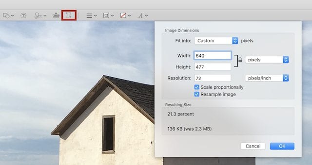
Unless you wish to distort your image, you’ll want to keep “scale proportionally” checked. Enter in the max width/height you wish to get to (The Rocket Yard uses a maximum of 640 pixels, for instance) and let Preview calculate the other dimension. If an image is in Retina resolution (say 144 pixels/inch) or something larger like 300 pixels/inch, you may wish to type 72 into the Resolution edit field to bring the image down to a web-standard resolution.
As you play with the dimensions, Preview calculates the size of the file in real time. Press OK to commit the changes.
Remove Backgrounds with Instant Alpha:
Instant Alpha is another function built into Preview. What it does is give you an opportunity to remove unwanted backgrounds by turning them into a transparent alpha channel. This works best when you have a single foreground item in front of a background that is uncluttered and a constant color.
As an example, I’ll take an image of Death Valley and get rid of the blue sky, then do something fun with it. The Instant Alpha tool looks like a magic wand and is found in the toolbar; click it to select it, then click, drag and hold on the sky in the image. The blue will turn pink, indicating that the color is selected for removal. Continue dragging until all of the sky has been selected. Sometimes, you may need to remove the background a section at a time.
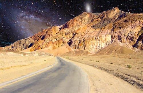
Once an area is highlighted, you remove it by pressing the delete key on your keyboard. By selecting the entire image with the sky removed, copying it, and pasting it onto an image of the Andromeda Galaxy, I was able to make the rather cheesy sci-fi image seen below. Note that professionals have much better tools to work with…but this is fun.
2) Fill Out PDF Forms
I can’t tell you how many times I’ve talked to people who get PDF forms sent to them, and then they print out the forms to fill them out by hand before scanning them and sending them back. Most of the time, the forms are designed to be filled out electronically, and Preview is a perfect app to use for doing that. As you can see in the image below, typed text should be much more readable — the form recipient will thank you.
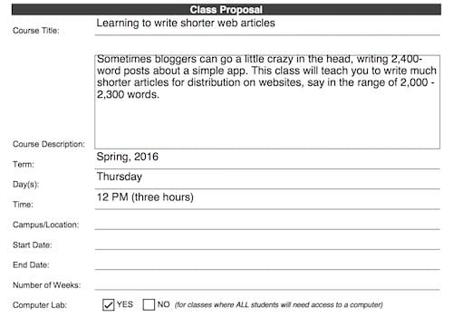
Most PDF forms will open in Preview by default; if not, you can right-click the PDF file and select “Open in…”, and choose Preview from the list of PDF-compatible apps. Once the form is open, click on any of the open fields and you’re likely to find that they’re ready for you to type into. As soon as one field is filled, press Tab to move to the next available field. Checkboxes can be selected with a click as well.
Note that if you make any errors while filling out the form, you can always go use the Undo command (Command-Z) to move backwards through your work erasing what you’ve done. Preview auto-saves the document with all of your changes when you close it.
3) Sign Electronic Documents With Your Handwritten Signature
The past few versions of OS X have had a very cool feature built into Preview – the ability to capture and store handwritten signatures. You can use those signatures on those PDF forms that you’re filling out or in any other situation where you need a handwritten signature.
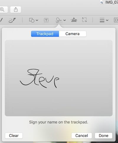
To create a new signature in Preview, select Tools > Annotate > Signature > Manage Signatures > Create Signature, or just click on the button in the Preview toolbar that looks like a signature (see below). You have two choices for creating signatures; first, if you have a trackpad you can write on it with a stylus or your finger. When you’re done writing the signature, you press any key on your keyboard to capture it for posterity.
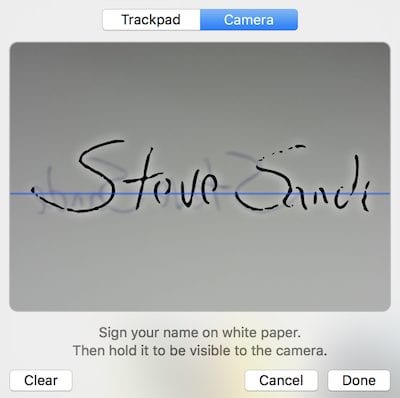
The second method uses your Mac’s camera. Write your signature on a piece of white paper with a pen or pencil, then hold it in front of the camera. There’s a blue line that appears in the capture window in Preview so that you can align your signature properly. Click done when you’re ready to roll.
Using the signatures is easy. You’ll see them appear in a drop-down when you click on the signature button in the Preview toolbar, and selecting any one of them pastes it into your current document. Handles appear on the corners of the signature for resizing it, and you can also click and drag the signature anywhere on the document for proper placement.
4) Create Internet Memes
OK, this is stretching the usefulness of Preview a bit, but it sure is fun! You can create your own Internet meme by simply marking up a photo with text. Open your photo in Preview, then Click on the Text button (looks like a “T”) or select Tools > Annotate > Text. A text box appears on the image, oddly enough bearing the word “text”. Double-click the word to change it to whatever you need it to be, and when you’re done typing you can start changing the size, color, typeface and style of the text. That’s done with the text style button, which looks like a letter “A”.
I’ve found that the Impact typeface at 72 point size or above works well, as it’s very easy to read. Change the text to a color that grabs attention, and you’re ready to become Twitter or Facebook famous. Well, maybe your cat will become famous…
5) Make a Contact Sheet or Slideshow in Seconds
Finally, here are two more Preview tricks that are quite useful. Back in the days of film photography, photographers liked to make contact sheets to figure out what was on all of those 35mm negative strips. That was done in those days by putting all of the negative strips in contact with a sheet of photographic paper, hence the term “contact sheet”, exposing it briefly to light, and then developing the print. Bingo! A bunch of small thumbnail photos on one sheet of photo paper.
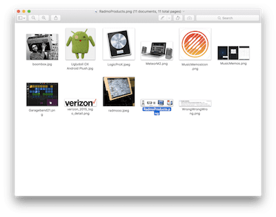
It’s possible to do the same in Preview, without the need for negatives, photo paper and a darkroom. In Preview, select File > Open, and then select any number of images. From the main toolbar of Preview, click on the left-most button and select “Contact Sheet”. Resize the window to fit your images; what you’re actually seeing is each of a number of images all displayed in one Preview window.
Now comes the fun part. Select File > Take Screenshot > From Window, and hover your mouse pointer over the Preview window so that it is highlighted, then click your mouse or trackpad. Save the screenshot with a name, and you have a quick and easy reference sheet of all of the images that you originally chose. Yes, it does have the Preview window and toolbar at the top of the image as well as a drop shadow; those can be cropped out easily.
Finally, if you have a group of photos that you’ve just taken and you want to see them as a slideshow, there’s an easy way to do that. Once again, select File > Open in Preview and select any number of images. Select View > Slideshow, and the magic happens. Your images are expanded to their largest size on your display, and automatically forwards through the photos one at a time. If you need to pause the slideshow, just hover your mouse pointer over the screen and you’ll see play controls for pausing, moving back to the previous slide, or moving forward to the next slide.
A word of warning with the slideshows: I find that they work best with very high-resolution images as lower-resolution pictures may appear pixelated when blown up to full-screen size. If you have a 27-inch Retina display iMac and you’re viewing raw images, it’s magic…
These are just a few of the more useful things you can use Preview for. We’d love to hear what you use Apple’s most versatile OS X app for, so leave your comments below.






your content is very amazing. i love it. i really enjoyed it.
Forgot to check the eMail box on the question I just submitted
Any way one can create a signature when using a Wacom tablet? I have neither a trackpad or a camera on my setup. (Mac OS 10.11 with an AOC monitor with a 27″ screen
I had no idea that Preview had so much power.
And he’s right….we usually just treat Preview to get an overview of a gif or jpeg that looks promising.
Like that article suggests, most of us just go to PhotoShop (I have Elements, which I have found more that meets my needs).
Needless to say I have archived this article with its own tab!!
Glad it was helpful :)
This is a great way to use the preview in OS X. I didn’t know preview could do all this.