 Although the demonstrations of iOS 10 that were the highlight of the Apple Worldwide Developer Conference were intriguing, it’s always much more instructive to actually use a new OS version for the first time. During the past few days, I’ve been acquainting myself with the first developer beta of iOS 10. While it’s still quite rough around the edges — most first releases are — there are some features that are already demonstrating just how Apple is adding ease of use and new features to its mobile operating system.
Lock Screen
The first thing you notice after loading iOS 10 is that the familiar “swipe to unlock” message on the lock screen is gone. That’s because the lock screen now has more functionality than just being pretty for the few milliseconds that you look at it. Powering on an iOS 10 device displays the lock screen and a new, clean set of notifications, as well as a “Press home to unlock” message.
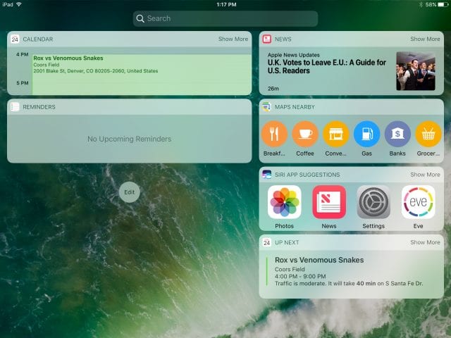
Ignore that message and swipe to the left, and you’re in the camera app, ready to shoot photos and video. Swipe to the right, and the newly-redesigned Spotlight search screen appears. Rather than the rather plain search screen, items are neatly grouped in light panels that make them easier to read and pick from.
Calendar/Contacts/Reminders
Hey, guess what? Some things just don’t work in the first developer beta, and these apps — although they launch and can be viewed — weren’t pulling data from iCloud. At first glance they don’t appear to have any changes at all, which is fine because they were updated in iOS 9. The Notes app was pulling data from iCloud, but still doesn’t appear to have any major changes.
Control Center
Do you use Control Center a lot? If so, you’re going to love iOS 10 because you have three times as much to love.

Swiping up from the bottom of a screen brings up the familiar controls — Airplane Mode, Wi-Fi, Bluetooth, Do Not Disturb and Orientation Lock. There’s a brightness slider, an AirPlay Screen button, a large button for turning iOS 9’s Night Shift feature on and off, AirDrop controls, and buttons for the timer (Clock app) and camera.
But wait, there’s more! Swipe to the left, and a second control panel appears, this one showing controls for music and video playback, including the device that you’re streaming to. One more swipe to the left brings up an all new Home control panel, providing instant access to and control of HomeKit-compatible accessories.
Home App
The main idea behind the Home app is that it will replace all of the individual apps that you currently need to control or monitor HomeKit-compatible devices. The first iteration looks nice and has a very logical design featuring “Homes”, “Rooms” within those homes, and then a special screen for setting up automation.
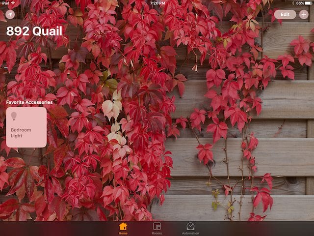
I don’t know if it’s just the HomeKit devices I currently have or what, but the Home app was totally unable to add most of them. The winner? An iHome light switch that showed up immediately and worked like a champ. Other devices still refuse to appear even after going through the “add a new device” process several times. Time to file a radar…
Camera App
Not too much has changed with the Camera app, but I do like that all of the controls (at least on the iPad mini I use for testing) are on the right side of the screen regardless of how the device is oriented. On the left side of the screen in the Video, Photo, and Square cameras you’ll find a zoom slider that’s always there, even when you don’t want to zoom. I like it. What I wouldn’t give to find out if there’s code in that app for some high-end twin-lens über-camera in the iPhone 7 Plus Pro…
Photos App
There are some very big changes in store for the Photos app, and some of them are already working quite well. First, when photos are being viewed, the Edit button has been replaced with an icon and there’s now a Details button.
The latter shows the place where the photo was taken on a map, and also shows related photos or “Memories”. And speaking of Memories, they are the auto-generated movies that can show a quick overview in a few minutes. An example video is included below:
Seriously, this is very cool. I did NOTHING to make this except click on a type of video (sentimental) that I wanted. A lot of people are going to love using this feature.
News App
The News App is growing on me, both as a publisher for another site and as an all-in-one platform for consuming news. As a publisher, I like that the News API is being adopted by more and more content management systems, which means that the stultifying RSS feeds that most sites have been feeding to News are now being replaced by nicely-formatted articles featuring graphics and even such non-text media as video and podcasts. News provider logos now appear in color, making them more recognizable at a glance than they were in monochrome in the “old” News app.
As a reader, though, the latest version of News is just more appealing. The app now looks more like a magazine than a simple list of posts, with sections highlighted with large, bold headlines and post graphics that “slide” as you scroll down a page.

On the other hand, as a reader I’m already noticing more ads than before. This is important for publishers, who need a way to make money off of the content that they’re providing. Apple recently changed its advertising rules and now allows publishers to keep the majority of ad revenues, which will increase the number of publishers who want to produce content for the app.
Clock App
Not that everybody uses it, but the World Clock looks great in the new app. Rather than showing the city name, time, and weather in a complicated glob atop a city’s location, the app now displays large, readable clocks at the bottom of the screen. Sadly, the weather info seems to be gone, although that can be discovered with a quick Siri query.
One big change is the addition of the Bedtime Reminder and Wake Alarm. Through a simple questionnaire asking what time you’d like to wake up, what days of the week you’d like to have the alarm go off, and how many hours of sleep you need each night, and you’ll get a bedtime reminder at the time you should go to bed or at a preset time before.
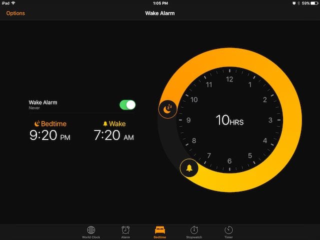
The settings end with a reminder to keep your “Sleep History bars aligned by going to bed and waking up at the same times every day.” Makes me wonder if sleep tracking will be a thing with watchOS 3?
Mail App
One new feature that I’ve found in the Mail App that could come in handy in this election year. When an email appears in an inbox that appears to be from a mass mailer, a small notification appears at the top of the email:

Click that blue “Unsubscribe” link, and a message appears telling you that Mail will send an email request on your behalf to try to get you unsubscribed from the mailing list. There’s no word on how really usable this feature is, but it certainly made me feel good.
Music App
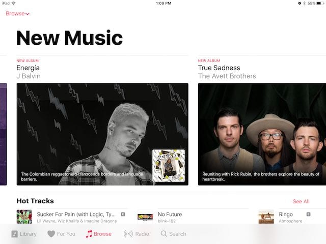
The Music app really looks different and at first glance appears to be much less confusing than in the past. Library shows your purchased or added music, For You provides Apple Music subscribers updates on what they might want to hear, Browse shows new music and gives users a chance to buy new albums or songs, Radio provides access to iTunes Radio music, and there’s a search button. It just seems much more streamlined and clean.
There are other, much more subtle differences in a few apps. All in all, I’m finding this initial Developer Beta to be surprisingly stable, although it’s obvious that there’s still a lot of work to be done before this ships in September or October.





In Photos, can we export to Photoshop yet?