
Whether you’re a Mac newbie or have used a Mac since 1984, there are probably things you didn’t know about one of the most visible aspects of the macOS user interface — the Dock.
Today in the first of a two part series, we’ll look at how to customize the Dock to your liking through System Preferences, then add a few more tricks to make your Dock even more useful.
The Dock in System Preferences
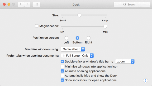
For Mac newbies who might approach System Preferences with a bit of trepidation, the Dock is a great way to explore this powerful tool and learn how to customize your Mac experience. To begin, click on the System Preferences icon in the Dock (the one that looks like a large gear in a silver square — see image at right above), then click on the Dock button in the top row of preferences. The Dock preference pane appears:
Size slider
The top item in the Dock preference pane adjusts the size of the the Dock. Sliding the pointer all the way to the left (“Small”) shrinks the Dock to a very and mostly unusably small size, while sliding it to the right (“Large”) expands the dock to the maximum width of your display. Here’s an idea of what the two extremes look like:

Magnification Slider
Magnification provides a way to expand individual icons in the Dock to a larger size when the cursor hovers above them. This is extremely useful if you have a small screen and have made the Dock small — simply move your cursor over the Dock, and the icons become larger as you move the cursor over them.
To turn on magnification, check the box to the left of the word “Magnification”. Next, slide the magnification slider left or right to control just how big the individual icons become as you hover the cursor over them. This following screenshot shows how the Dock “bulges” when magnification is turned on, making it easier to see Dock icons and select the correct button to click on:

Position on screen
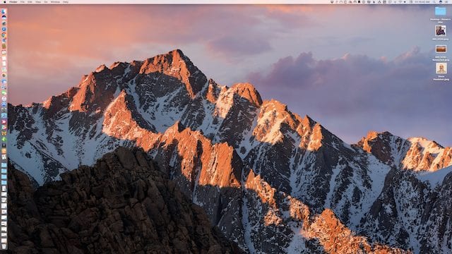
The default location for the macOS Dock is the bottom of the screen, but it’s sometimes more convenient to place it elsewhere — like on the left or right side of the screen. This is particularly useful when using the macOS full-screen mode and you wish to see most of that full window without a Dock interfering at the bottom.
Clicking the Left radio button moves the Dock to a vertical orientation on the left side of the Mac display, while clicking the Right radio button moves it to the right side of the display (see screenshot below):
Minimize windows using
When you click on the yellow button in the upper left corner of any macOS window, that window is minimized and placed into the Dock. That’s a convenient way to hide a window, yet make it available for instant recall with a click of the window’s icon in the Doc. What the “Minimize windows using” control does is provide a way to control the animation that is used by macOS as it moves the minimized window to the Dock.
There are two animations — the Genie effect, which simulates the way a genie supposedly slides into its magic lamp, and the Scale effect, which simply scales down the window until it is placed into the Dock. By the way, if you want to see these effects in slow motion, just hold down the Shift key on your keyboard while clicking the yellow minimize button.
Prefer tabs when opening documents
This control is new to macOS Sierra, which adds tabs to most applications and all Finder windows. In other words, every Finder window and most applications can have multiple tabs in one window similar to the way that one can add tabs to a Safari browser window. The control has three options: In Full Screen Only, Always, and Manually.
In Full Screen Only is the default setting, and it opens new documents in tabs only when Full Screen mode is enabled (clicking the green button in the upper left corner of a window). Always will open documents in tabs all the time, except in macOS apps that have not been updated to take advantage of tabs. Manually turns the feature off, and new tabs are only created if you choose to do so in a particular app.
Double-click a windows title bar to …
This check box controls the behavior of a window when the user double-clicks the window’s title bar. This control defaults to zooming a window (that is, maximizing its vertical dimension to the available space on the Mac display) when the title bar is double-clicked. It can be disabled by unchecking the check box, or the behavior can be set to minimize a window into the Dock when the title bar is double-clicked.
Minimize windows into application icon
This control is usually disabled, but it offers a handy way to keep the Dock from expanding in width if you do a lot of window minimizing. For example, if you minimize the Mail window without this control being enabled, a Dock icon is added at the far right of the Dock. Click that icon, and the Mail window is maximized again.
By enabling this control, minimizing the window doesn’t add another Dock icon — instead, the window “shrinks” into the app icon (in this example, the Mail icon), and clicking that icon brings the Mail window back to full size again.
Animate opening applications
By default, clicking an application icon in the Dock causes the icon to “bounce” in the Dock until the app is fully loaded. Unchecking this checkbox eliminates the animation. On a fast Mac where most apps launch in an instant, the “bounce” rarely occurs anyway so unchecking the checkbox can be a good idea.
Automatically hide and show the Dock
Do you hate having part of your screen obscured by the Dock all the time? Checking the “Automatically hide and show the Dock” checkbox makes the Dock disappear. Where did it go? It’s just “off the screen”, so hovering your cursor near the edge of the screen where your Dock normally resides will bring it back into view. This is a very handy way to maximize the amount of visible screen real estate when using a MacBook with a small display.
Show indicators for open applications
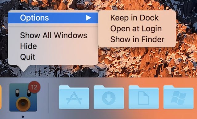
If your Mac is running slowly, you may want to close some of your open applications to give it some breathing room in terms of processor load and available memory. But how can you determine which applications are open? “Show indicators for open applications” places a dot below any application that is currently running.
By default, the dot is black on the background of the Dock (see image below). If you have enabled a dark menu bar and Dock (System Preferences > General > Use dark menu bar and Dock), the dot appears to be light gray.

But wait, there’s more!
Would you believe that there is even more customization that can be done with the Dock? Next week, we’ll have a followup article showing even more hints and tips dealing with the Dock.





I’m having trouble moving the dock to the right side of the screen using Systems Preferences. The dock just disappears when I select the ‘right’ button as the position on screen pane. For years have had it on the right but recently it just disappeared and can not the dock on the right-side. It does come on the left or bottom.
Thanks for all the good information.
I’m having trouble understanding the “Prefer Tabs When Opening Documents.” When i select this option in, say Preview, I only see that window – even if there are other Preview windows open. I can get to the Windows menu to switch documents, but only the one is in full screen mode. I have never seen tabs. If in full screen mode I go to the Finder menu bar, I can open other documents from the File menu, and I can access the Dock to open apps, documents. But when I do this, the other documents are not in full screen mode, and I can only access them by the Windows menu.
Great info especially for a newbie.
Thanks for the great article. I have a question on the dock which I have not been able to figure out. I use multiple screens, I prefer to have my dock remain only on my main screen, however, if I hover to closely to the bottom of my secondary screens, my dock moves to the other screen. I would like to have my dock remain only on my main screen, is this possible?
Hi, Don –
There are two ways to make the Dock remain only on the main screen. First, go to System Preferences > Mission Control and deselect the option “Displays have separate Spaces”. However, if you like using Spaces in macOS, you’ll find that this turns off things like multiple menu bars, single-monitor full-screen mode, etc…
The second way works if you have two monitors — use System Preferences > Dock > Position on screen: Left to get it to “stick” on the leftmost monitor or Right to stick on the right side of the rightmost monitor . Sadly, this puts the Dock in vertical mode, and it won’t work if you have three monitors (i.e, MacBook Pro driving two Thunderbolt 3 monitors).
There used to be a Terminal command that worked, but since OS X Yosemite it’s been out of order…so I won’t list it here.
Steve