 The day that the first developer beta of a new operating system version is available is a bit like Christmas; we get to open up a package and see what’s inside. That was the situation on Monday, June 6 when the first developer betas of iOS 11 (see if your iDevice is compatible here) and macOS High Sierra were released. While I still haven’t tried running macOS High Sierra on my test Mac mini, iOS 11 was quickly installed on a test iPad mini and has been remarkably stable. Here’s a first look at some of the new features.
The Dock
The feature that jumps out at you when firing up iOS 11 for the first time is the very Mac-like Dock. It sits at the bottom of the screen in the familiar location, and holds a variable number of app icons. As more icons are placed in the dock, they shrink is size to fit the available screen width. For example, you’ll notice in future screenshots that I put eight apps in the Dock, and ended up with 11 altogether — iOS 11 selects the three most recently used apps to place on the right side of the Dock (see screenshot below).

The Dock is an app launcher as it is on the Mac, and it disappears when an app is launched. Want to switch to another app? Swipe up from the bottom of the iPad display and the Dock floats above whatever app you’re currently using. Tap on an icon and you switch to that app.
Related: Check out all of our WWDC 2017 coverage here!
On a larger iPad this would also be used to select apps to work in Split Screen mode, but the small screen of the iPad mini made it impossible to test…
App Switcher
Speaking of switching apps, continuing the swiping motion from the bottom of the screen to above the Dock brings up a screen that displays both an App Switcher (see image below) showing large thumbnails of apps that have been launched as well as the new Control Center that I’ll talk about shortly.
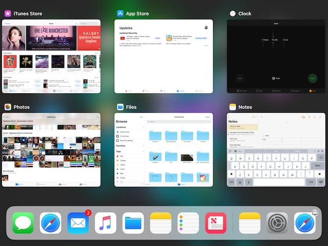
This App Switcher is so much easier to use than the current standard 3-dimensional “flick and choose”. The thumbnails are easy to see in detail, they’re and there’s even a tiny app icon and label at the top of each so you know for certain what app you’re looking at. Tap on any of the thumbnails and you’re right into the app. As before, I couldn’t test this in Split Screen. On an iPad Pro, for example, the App Switcher can also be used to bring up Spaces that have groupings of apps that have been used together before.
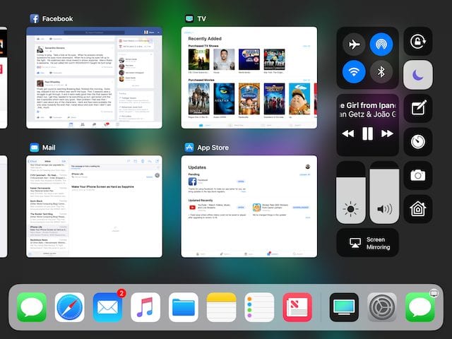
Control Center
The new Control Center (see screenshot above) is also a vast improvement over the three-pane model used in iOS 10. There are clusters of buttons — one controls connectivity items like Airplane Mode, AirDrop, Wi-Fi and Bluetooth, while another is used for controlling media playback. There are two large sliders for screen brightness and volume, and an AirPlay controller. Smaller single buttons control things like orientation lock, Do Not Disturb, launching the Camera app, or setting a timer. These buttons are configurable from Settings, which makes the Control Center very useful as those buttons that are never used can be removed.
Screenshots
Taking screenshots for this post demonstrated another feature. When you take a screenshot by holding down the power and Home buttons simultaneously, a small thumbnail of the screenshot appears on the screen for a moment. Tap on it, and a set of editing and markup tools appear. These tools include pencils and markers of various types, selection tools, a magnifier, a text tool, arrows, boxes, circles, text balloons, and signatures.
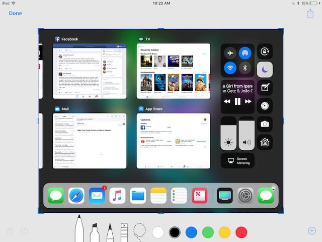
Once editing and markups are complete, tapping “Done” makes it easy to save the screenshots to the Photos app.
New App Store
The new iOS App Store is definitely inspired by Apple Music and the News app, as it has the same look and feel. For any particular day you see what’s new in large, artistic buttons that are easy to tap, and with a tap you see beautifully designed app description pages. Now, not every app will get the beauty treatment from the App Store staff, but for those that do (or for those developers who spend a lot of time working on their descriptions) it’s an eye-catching way to “sell” an app.
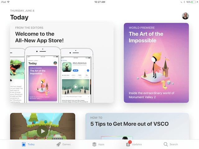
There’s also no more scrolling to the bottom of the App Store to find that little link for redeeming promo codes; now a small button on the upper right of the App Store screen (in this case it has my photo on it, see screenshot above) brings you to an Account screen. Change your account and payment information, manager alerts, iTunes newsletters and special offers, remove a device from iTunes in the Cloud, or manage subscriptions, all from one screen.
Your list of purchased apps is also a tap away, as well as those all-important Redeem and Send Gift buttons. Predefined pages for Games, Apps and Updates make it easy to look for new apps and updates with a tap. Personally, I think the new App Store is a winner.
Siri
Siri’s new voice is a bit more expressive than it used to be. When Siri is in “waiting” mode, there’s a constantly changing orb that appears at the bottom of the screen – that’s the new button for asking Siri a question.
Smoother Scrolling in Safari
One feature that wasn’t mentioned during the Keynote that Apple has said it will improve is scrolling in Safari. Right now, it doesn’t scroll as smoothly as other apps, but the iOS 11 beta shows that the app now has much better “inertia” and smoothly scrolls up and down. It’s hard to describe, but you’ll like it when you see it.
Files App
The Files app isn’t fully functional right now in Beta 1 — I wasn’t able to find any way to add my other cloud drives like Dropbox or Google Drive to the app. But it is very Finder-like and useful already, especially for those who use iCloud Drive.
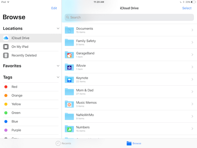
Files or folders can be sorted by name, date, size or tag, and either in icon or list mode. Adding a tag to an item is as simple as dragging it over to the list of tags, and dropping it. Items that are stored in the cloud that are not locally on the device can be downloaded with a tap on a download icon. I was able to take a zip file archive of three podcast files, download it to the iPad, then unzip and listen to the individual files. Pretty cool, and all done much faster than the process of trying to find those files and work with them in the current iCloud Drive app.
Notes App
The Notes app keeps gaining functionality, and that’s a good thing.
The new version in iOS 11 has some amazing features. Handwritten notes are now analyzed with handwriting recognition in the background, so they can be searched with Spotlight or Siri. The handwriting recognition is flawless — even text written with a finger is correctly translated. Note that the title of the note below was handwritten and shows up in text on the sidebar.
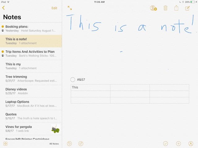
Notes also gains tables, which are perfect for creating nicely formatted text in the app. There’s a built-in document scanner that works quite well even in this early beta version – the scanned documents are automatically recognized on a desktop or tabletop, corrected for distortion so that they’re properly rectangular, and then saved to the note where they can be marked up if necessary, then shared.
New On-Screen Keyboard
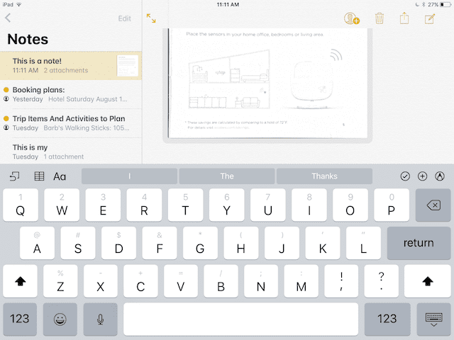
The new on-screen keyboard is great, especially when typing in passwords that may have both symbols and numbers. Finally, those symbols and numbers are available from the main keyboard without having to jump over to another keyboard. How? In the screenshot here, you can see that each letter key has a number or symbol over it. Tap on a key and then swipe down slightly, and that number or symbol “takes over” the key and is typed when you let go of the key. It’s much faster than switching keyboards and I think most users will like this feature.
Use caution when downloading
Should you install Beta 1 of iOS 11 on your favorite iOS device? Although I’ve found this beta to be remarkably stable, don’t install the beta on any production device that you use for day to day work. If you have an iPad or iPhone that can handle iOS 11 and you’re willing to “sacrifice it” to beta testing, then feel free. The beta is only available for developers at the moment, but a public beta will most likely appear in the next few weeks.
I’ve just covered a few of the many UI changes, while there’s a lot more that has been improved in iOS 11. As future versions of iOS 11 beta appear, I’ll be sure to highlight any new features that catch my eye in additional posts here on the Rocket Yard.






Terrifically helpful review! I’m looking forward to the release. Your screenshots and comments are very clear and easy to understand. Thank you
iOS 11 sounds encouraging… even excitingly productive compared to previous trend at Apple. It appears there are still some adults who understand productivity left in the product development group. Maybe they should work in the hardware group for their next project. Here’s hoping!
>> I read in The NY Times <<
Therefore the information is probably wrong or highly inaccurate.
The driving mode has been around on android for a while. It is completely disablable. Otherwise people would stop buying iPhones.
I read in The NY Times that iOS 11 for iPhone will let your phone decide when you are traveling in a car so it will intercept your messages and calls unless you program on names of family, etc. IMHO a stupid idea. Many cars now are equipped with hands free phone capabilities. Also – what if you are a passenger? Is my phone going to be in control then?
Hi, Janet. I believe that mode will be able to be toggled on and off. So it won’t be active if you’re the passenger.