Have you updated your favorite iOS devices to iOS 12 yet? If not, you’re missing out on some useful, fun and productive new features that have been added to Apple’s mobile operating system. In today’s post, we’ll explore a dozen of the best new iOS 12 features of which you may not be aware.
Stacked Notifications
Notifications have been improved a lot in iOS 12! No more will you see a long list of notifications from an app; instead, notifications that are related are “stacked” upon each other. For example, in the screenshot below all notifications from a Nest camera are stacked, as well as all Twitter notifications.
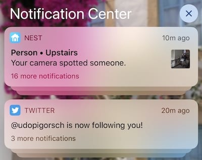
To see all of the individual notifications in a stack, just tap the top notification and all of the notifications are listed one by one. A tap-and-hold opens any one of the individual notifications — that’s useful with the Nest camera, as it shows a short video loop.
Notifications – Instant Tuning
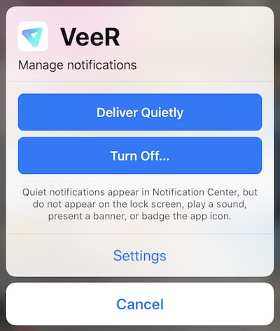
If you find that notifications are still a bother, iOS 12 now provides Instant Tuning of notification settings. Tap and hold on any specific notification to view it, and the notification shows a “more” icon (i.e., three dots … see image below).

Tap that icon, and an Instant Tuning dialog appears. Immediately, it’s possible to set a notification to “Deliver Quietly;” that is, it won’t appear on the lock screen nor will it play a sound or present a banner or badge on the app icon (see image below). In addition, users can also turn off all notifications from a specific app with a tap of the “Turn Off…” button, or be taken to notification settings for the app by tapping “Settings.”
Improved Stocks App
Are you the type of person who obsesses over how your investments are doing? You may like the new and improved Stocks app, which adds two features that are quite useful. First, each line listing for a stock now includes a “sparkline,” or a line that shows (in graphical format) how a stock has performed during the day. For example, the listing for AAPL (Apple) below shows that the share price was below the opening price (the dotted line) for most of the day, but the green line shows that AAPL shares are now slightly up for the day.

In addition to the sparkline, the app now includes stories from Apple News that pertain to the companies that you watch. With a tap, you can read each story in Apple News.
Screen Time
Screen Time is a feature that Apple has proactively added to iOS in order to answer the increasing concern about people spending too much time on electronic devices and not enough time in the real world. In other words, they want to help us reduce our time on FaceTime and increase our in-person “face time.”
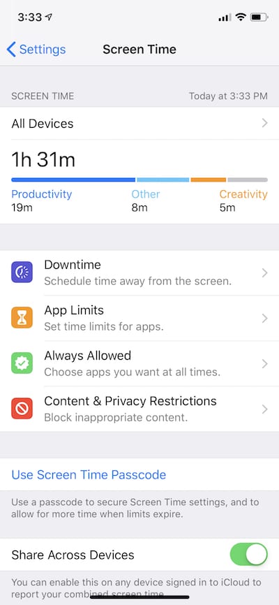
Screen Time automatically monitors usage of your iOS devices and then provides visual feedback on how much time is spent in various apps and categories like Productivity, Creativity, Social Networking, Entertainment and Reading and Reference. For each app or website you visit, Screen Time provides information on exactly how much time you spent, and at what time during the day you were gazing at your iOS device.
One nifty feature is that if you have multiple iOS devices, Screen Time can accumulate all of your usage for all devices via iCloud to give you a much better picture of your “device addiction.” Should you decide that you are spending too much time on your gizmos, it’s possible to set a limit per day. Once your total usage on all devices gets close to the limit, a notification is sent to you telling you that you have only 5 minutes remaining in that category or app. It’s also possible to set up a “downtime schedule” in Screen Time to force you to stop using your devices. Only apps and phone calls that you choose to allow are accessible on the iPhone during downtime.
I found Screen Time to be quite helpful in one other respect; I can now see which apps are the most “annoying” in terms of sending notifications. According to Screen Time, I am getting about 41 notifications a day — most of them coming from the MLB At Bat app and my Nest security camera. Armed with that information, I can now use the Instant Tuning feature described earlier to reduce the frequency of notifications.

Memoji
Call it a toy, but Memoji are probably going to be very popular. Memoji (pronounced “me – moji”) are like Apple’s animated Animoji, but there’s a difference: instead of being an animated animal, dinosaur or robot, the Memoji is customized to look just like you.
Through an easy-to-use interface, users select a head shape, hair style and color, facial hair and color, eye color, skin tone, and glasses (if desired). The result can end up looking remarkably like a real person (see example at right).
Once configured, Memoji are used to send animated videos in Messages or can replace a user’s real head in real time in a FaceTime chat. There’s something quite disconcerting about seeing a person in a FaceTime chat and their head is replaced by a moving, talking cartoon avatar!
Siri Shortcuts
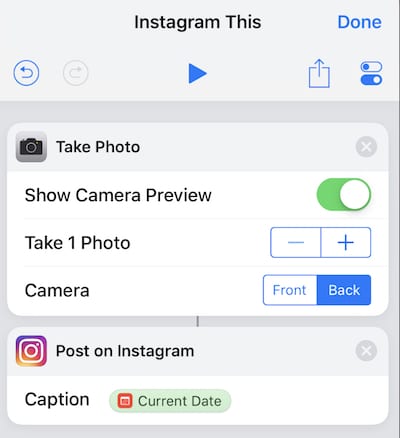
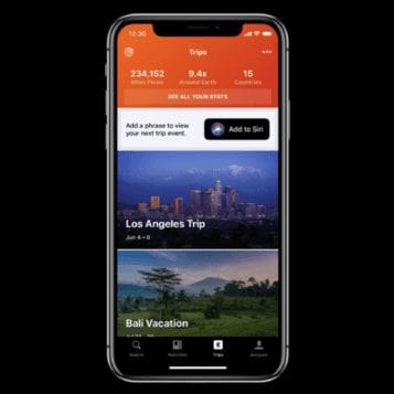
If you liked Apple’s iOS Workflow app for automation, you’re going to love the new Shortcuts app that replaces Workflow (only on iPhone for now). The best way to describe Shortcuts is that it allows users to create their own automations that string together a number of iOS app actions, then link those to Siri so that with a single voice command, their iPhone performs all of those tasks automatically.
This gives you the ability to do some pretty amazing things, such as saying “Instagram this” to Siri and having the camera take a photo, then push it into Instagram for posting (see example screenshot below):
The power of Siri Shortcuts will begin to shine as more people begin to use the feature and share their Shortcuts. The thought of being able to say one thing like “Siri, I’m heading home” and have Siri control a thermostat to begin heating or cooling the house, send a Glympse notification to your spouse telling him or her where you are, turn on lights in the house, and send a Message to a group is awe-inspiring.
Siri Suggestions
Along with the power of Siri Shortcuts comes another Siri feature: Suggestions. As Siri learns your daily routines, it makes suggested shortcuts for what you need at the right time either on the Lock screen or in search results.
Measure App
When iOS 11 first appeared, one of the more popular augmented reality (AR) app genres that popped up was that of “tape measure” apps. Sadly, not many of them worked that well. With iOS 12, Apple has “sherlocked” (i.e., created an application that seems similar to an existing third-party app) the tape measure apps with Measure (see image below). It’s different from many of those third-party apps in that it actually works quite well in some circumstances.

I’ve found that Measure seems to work best when the surface that it’s measuring is both light in color and well-lit, and in those cases it is exactly on in terms of the length measurements it makes. Before using Measure for real work, it’s a good idea to try it out and find the limitations.
Face ID Improvements
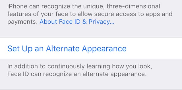
Apple listens to customers, and one of the first complaints about Face ID when it appeared on the iPhone X last year was that it only worked with one person at a time. That’s changed with iOS 12; users can now set up an “alternate appearance” in Settings > Face ID & Passcode (see screenshot below):
Not only does this give users a chance to set up a friend or spouse as acceptable parties to use Face ID, but also if your appearance changes drastically during the day (e.g., from disheveled upon waking to “professional” after grooming) it can improve the accuracy of Face ID for some people.
Improved Do Not Disturb
Do Not Disturb has been in iOS for quite a few years, and up until this time it has allowed you to set a schedule during which neither calls nor notifications can bother you. Many people set their iPhones up with Do Not Disturb during the night, with only emergency phone calls allowed to wake them up. iOS 12 adds much more to Do Not Disturb, making the tool even more useful.
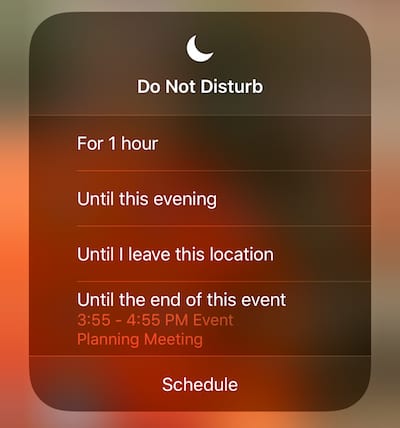
It’s now possible to set up Do Not Disturb for events and locations. For example, say you’re going into a meeting and you really don’t want to be disturbed until the event is over. A new dialog provides the ability to set Do Not Disturb for an hour, until this evening, until I leave this location or until the end of this event.
To view the dialog, enter Control Center then 3D Touch the Do Not Disturb icon (it looks like a crescent moon). With a tap on the correct scheduling option (see screenshot below), it’s easy to stop those pesky notifications and calls while you really want to concentrate on matters at hand.
Security Code Autofill
One common new feature of macOS Mojave and iOS 12 is Security Code Autofill. This is used to automatically fill in two-factor authentication security codes when you’re asked for them.
In most situations, a user is asked to enter a 4- or 6-digit PIN code that is texted to them into a field to verify that they are indeed the person they say they are. When that PIN code shows up in a notification in older versions of iOS, it has to be manually typed into the text field on a web page or in an app to do the authentication. With Security Code Autofill, the number is automatically moved from the incoming text message directly into the text field. It makes two-factor authentication much less of a hassle.
Photos “For You” Tab and Sharing Suggestions
The Photos app keeps getting incremental updates to add functionality and make it easier to share and search for photos. iOS 12 upped the game for Photos fun with the new For You tab. It’s similar to the For You tab in iTunes, but delivering photos and memories you may wish to see rather than getting recommendations on music.
For example, the screenshot below shows today’s For You tab on my iPhone X, which had a collection of photos taken in Málaga, Spain on a recent trip. It not only made a collection by date, but also suggested that I share it with my wife. I’m more apt to share photos with these new suggestions, as the selection of the photos and the person to share it with are already made by Photos — all I have to do is tap on a button.

The features listed here are just a dozen of the many improvements that have been made to iOS 12. What’s your favorite new feature? Share it with us in the comments section below.





Notifications will only start to stack once the screen is full or you explicitly bring up Notification Center, so when looking at your home screen as they come in you will still see a “long list of notifications” until there are too many to show on one screen, THEN they will stack.