
On September 24, 2019, Apple officially releases iPadOS 13 — the first version of its operating system specifically for the iPad line. While the Rocket Yard staff has been preparing you for macOS 10.15 Catalina, we’ve been quiet on the iPadOS front…until now. Today we’ll go over some of the key features of iPadOS.
Which iPads does iPadOS work on?
- 12.9-inch iPad Pro
- 11-inch iPad Pro
- 10.5-inch iPad Pro
- 9.7-inch iPad Pro
- iPad (7th generation)
- iPad (6th generation)
- iPad (5th generation)
- iPad mini (5th generation)
- iPad mini 4
- iPad Air (3rd generation)
- iPad Air 2
Why is it called iPadOS 13 if it’s the first version of the operating system?
iPadOS is based on iOS, and Apple apparently wishes to keep the version numbers for iPadOS and iOS in sync. tvOS, the operating system for the Apple TV, is also based on iOS and the newest version is tvOS 13.

Dark Mode: Not Ready for Prime Time?
iPadOS 13 brings dark mode to the iPad for the first time. Dark Mode can be set to automatically kick in at sunset and turn off at sunrise, or you can set your own schedule.
Why am I asking the rhetorical question about whether or not Dark Mode is ready for prime time? Until a majority of apps take advantage of Dark Mode, you’ll barely know it’s there. My favorite text editing app, Bear, announced today that they’re working on an iOS and iPadOS version that supports Dark Mode. I’ll wait…
Better Handling of Text
Have you ever tried to do “real writing” on an iPad Pro? It’s a lot easier now that it used to be, but handling blocks of text, moving the cursor around, and even copying, cutting and pasting can be a chore.
iPadOS attempts to fix this issue with making it easier to control the cursor and introducing new gestures for copy, cut and paste.
How is it easier to control the cursor? First, if you tap and hold on the cursor, it becomes larger and can be dragged anywhere you wish. The second method is more Mac-like — you can use a mouse. For some odd reason, Apple doesn’t seem to want people to use mice with iPads, so the control for doing this is hidden in Accessibility. Apple’s Magic Mouse and Trackpad are not supported, but you can apparently use other USB and Bluetooth mice or trackpads.
The gestures actually work quite well. Using a 3-finger “pinch” gesture (moving the thumb, forefinger and middle finger as if you’re picking up something on the screen) copies text, moving those same three fingers in an outward gesture pastes the text. To cut text, the pinch gesture is repeated twice.
Were you like me in thinking that Apple’s “shake to undo” gesture was one of the most ridiculous gestures ever? It’s gone, finally — to undo something you swipe three fingers to the left, to redo you swipe three fingers to the right. For example, I just did the undo gesture and it undid all of the typing from the word “For” to the end of the sentence; swiping to the right brought it all back.
As verification that these gestures work, iPadOS briefly displays the name of the action at the top of the page — “copy”, “cut”, “paste”, “undo”, “redo”.
Text selection has also changed on apps that have been updated to take advantage of new gestures. In those apps, double-tapping a word selects it (you can also tap and hold the word), triple-tapping selects the current sentence, and quadruple-tapping selects the current paragraph. Perhaps it’s just me, but I found that the tap-and-hold (to select a word) and drag to highlight text seems to work better in iPadOS 13.
Oh, and one more thing…font support. For a long time, you’ve been able to add fonts to individual apps or use a separate keyboard to type in documents using different, non-system fonts. With iPadOS, you’ll be able to get system fonts that work across all apps that allow switching fonts — without having to switch to another keyboard. As of September 17, the App Store doesn’t show any compatible fonts, but expect them to arrive soon.
A More “Desktop-Like” Safari
I use Safari a lot. When I do my writing for The Rocket Yard on my Mac I use it to bring up the WordPress editor to write and lay out my articles, and that often involves needing to drag blocks of text and images around. Likewise, I use Squarespace as the content management system for another website. On the iPad, I would use the native apps for these two website tools because Safari simply didn’t do the job.
In iPadOS 13.1, I find that I can finally write, lay out, and publish my posts using the web-based Squarespace editor. That’s a relief, as I’ve often found the native app to be slower and somewhat lacking in the functions I need. It’s one more step in the direction of using the iPad Pro as a laptop substitute.
What about WordPress? Much of the Internet runs on one form of WordPress or another, and up until now it’s been the norm to use a native iOS app. While that’s fine — the WordPress app is actually quite good — there are still some functions that don’t work. A lot of this article was written on an iPad Pro using the web interface, and with a few exceptions I was able to insert image and other blocks, and move them.
I found in my testing that a few other websites that previously loaded as “mobile” pages with limited functionality actually worked as full desktop sites in iPadOS Safari. Your experience will vary depending on the site you’re visiting, but it’s sure to be an improvement for many sites.
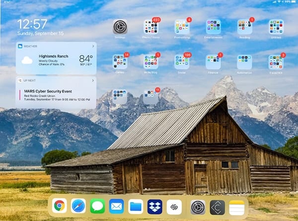
A New Home Screen — If You Want It
The Home screen of your iPad can now be set up to also display the Today screen full time — no more swiping to the right on the Home screen to see your widgets. There is a downside to this; even on the 12.9-inch iPad Pro, you might find the app and folder icons to be smaller than you like.
Improved Multitasking
If you use Slide Over on an iPad now, you’re going to love it in iPadOS. Slide Over currently brings up a small floating pane containing a view of a specific app. In iPadOS, it’s possible to load as many apps as you like into Slide Over, then quickly swipe between them.
This works out well if you’re using one primary app — Safari, for example — and you want to cycle between other secondary apps — like Mail, Calendar, and a text editor — in Split View. It’s much less of a hassle than swiping out of Safari, opening one of the apps you need to look at, then launching Safari again.
In the past, Split View had some limitations. Using an app in Split View meant that it couldn’t be used with another app in another Split View. Now, things are much nicer! You can even use a single app in one “Space” on both sides of a Split View, perfect if you wish to want to work on two documents side by side, for example. Likewise, an app can be used in any number of spaces in a Split View. To find out what spaces it’s being used in, just tap on that app’s icon in the Dock and it displays all of the different spaces. Apple refers to this as “App Exposé“.
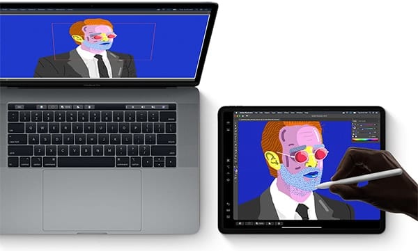
Sidecar
Sidecar is Apple’s name for the ability to use an iPad running iPadOS as a second screen for a Mac running macOS Catalina. It works surprisingly well.
On the Mac, a user simply clicks on the AirPlay icon on the menu bar and selects the iPad running iPadOS. Connected either through Wi-Fi or a USB connection, the Mac screen extends onto the iPad. The second screen can be used to display a second app (like email or Twitter), show a presentation in presentation mode while you’re editing it, and so on.
That Sidecar screen can also mirror the Mac screen if you want to show another person your laptop screen (for example), or even be used to make sketches that are then inserted into into a Mac document using Continuity.
The Files App Is More Like Finder
Any Mac owner who uses the Files app on an iPad is going to love the changes to that app, which becomes much more “Finder-like” in iPadOS.
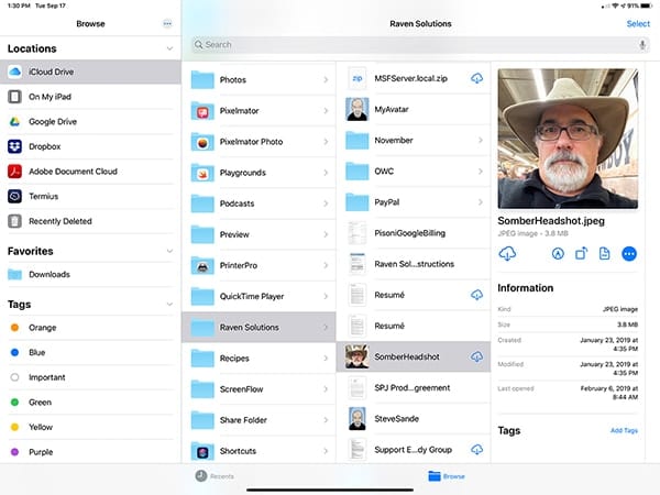
The screenshot shows one of the several ways an iPad user can view files in the Files app. Here, I’ve opened up a folder in iCloud and see the full path to a file. Tapping the file displays a “Get Info” screen, tags (if any), and action buttons. The image can be downloaded from iCloud to the iPad, marked up, rotated and more — all from the Files app.
New iPadOS and Mail Actions
Mac users know that on their desktop or laptop machines, they can right-click a Dock icon to display a menu of actions. Now that same feature appears in iPadOS. Tap and hold a Dock icon on an iPad, and a set of actions appropriate to the app appear (see screenshot below):
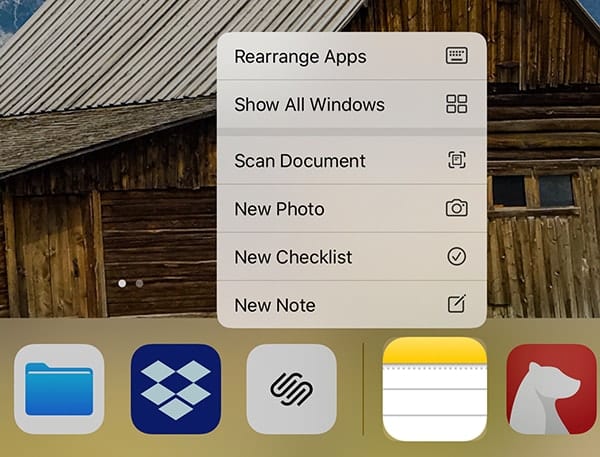
As you can see in the example shown above, this allows users to streamline workflows by opening apps to the most used functions.
This process is repeated in Mail, which gains a powerful action pane. Tap on the reply/forward arrow, and a full set of actions appear. If you’re like me and have muscle memory built up around handling email in iOS, you may find this awkward at first but you’ll soon learn to appreciate the new way of interacting with Mail.

There’s More
Not surprisingly, there’s a lot more to iPadOS than I’ve written about here. The most recent version seems quite stable — I did a 150-minute presentation from an iPad Pro running iPadOS and really put it to the test, and had no crashes or visible faults during the entire session.
If you want more information about iPadOS and the features that will be available on September 30 when downloads for the general public appear, point your web browser to this page on the Apple website.







Does it have the same bugs as iOS 13.0 on the iPhone? That release was a shocker.
Will there be a full guide for the iPadOS from anyone that you know of?