
The Rocket Yard recently featured an article in which I described some of the issues I ran into while installing Developer Beta 1 of macOS 11 Big Sur. When I was unsuccessful in installing the beta onto an external hard drive, I decided to use a MacBook Air I had on hand to run the beta software. In today’s article, I’ll describe some of the new features of Big Sur.
The public beta is now open, so if you have an “extra Mac” that you would like to test Big Sur on, join the Apple Beta Software program and you can start right away. If not, now might be the time to pick one up. OWC has unbeatable deals on new and refurbished Macs – all with free shipping and backed by OWC’s world-class US-based support team!
1. New App Layout
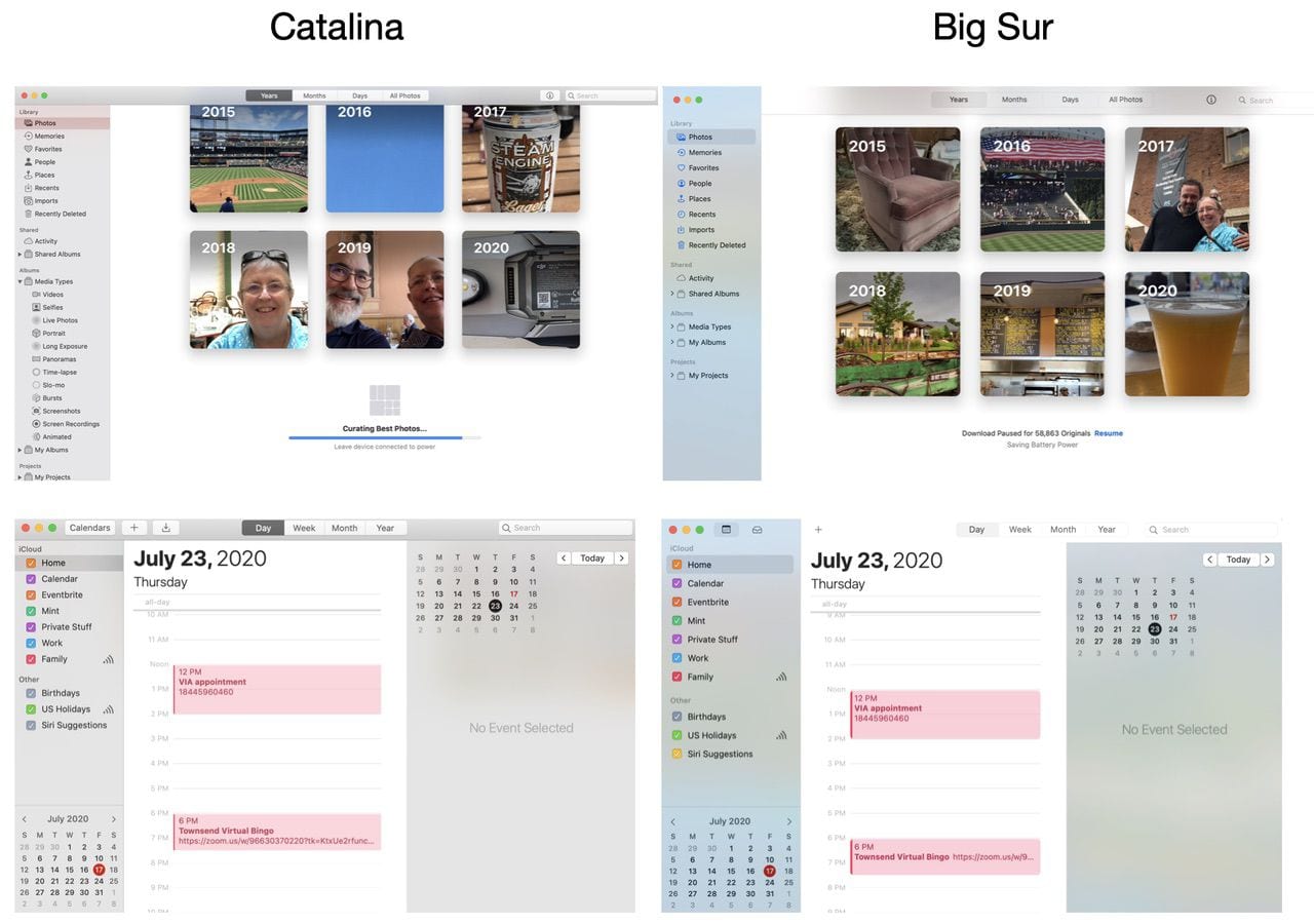
One of the more significant changes to macOS 11 is the look of the default Apple apps. There are sidebars that run the full height of the window (even in full-screen view) and toolbars that are more graphically consistent and “cleaner” than they are in earlier versions of macOS. Below are some side-by-side comparisons of the Photos and Calendars apps from macOS 10.15 Catalina and macOS 11 Big Sur.
2. New Menubar Layout
The Big Sur Mac menubar has more spacing between each item. For example, here’s the Finder’s File menu on both Big Sur and Catalina:
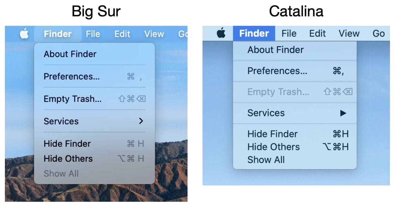
One developer I talked to speculated that this could be in preparation for a touchscreen Mac or Mac/iPad Pro hybrid in the future, as the extra spacing makes touch selection of menu items a lot easier.
3. Dock
The Dock has always been a feature of macOS that made it stand out from other operating systems. It has been redesigned in Big Sur; while retaining the opacity of the Dock that existed in Catalina, all of the Apple app icons are now a consistent shape — a rounded rectangle.

This doesn’t apply to third-party apps; one app I’m using has a circular icon that really seems out of place. In Catalina, some of the Dock icons were circular, some were rectangular, others featured a small facsimile of the app’s feature (i.e., Calendar, Contacts) set at a slight angle from the vertical.
4. Control Center
The new Control Center for Mac has already become one of my favorite features of Big Sur. With a click on Control Center menu button on the menubar of the Mac screen, the Control Center appears:
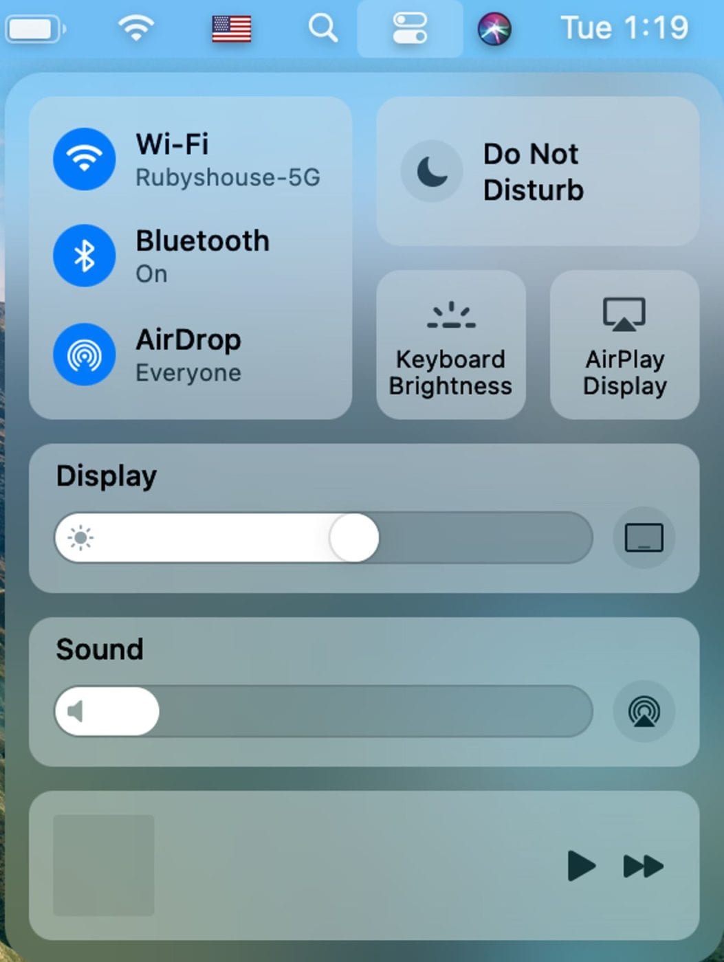
Controls for Wi-Fi, Bluetooth, AirDrop, Do Not Disturb, Keyboard Brightness, AirPlay, Display Settings (including brightness, Dark Mode, Night Shift, and True Tone), Sound Volume and choice of speaker, and controls for music playback are all just a few clicks away.
5. Notification Center
Notification Center is entirely different. Rather than just displaying a laundry list of notifications that have come in like it did in pre-Big Sur days, Notification Center now acts more like the iOS / iPadOS Today View. Similar notifications from a single app are now grouped, the weather app features forecasts from Apple’s Dark Sky, and the widgets can be resized depending on your preference.
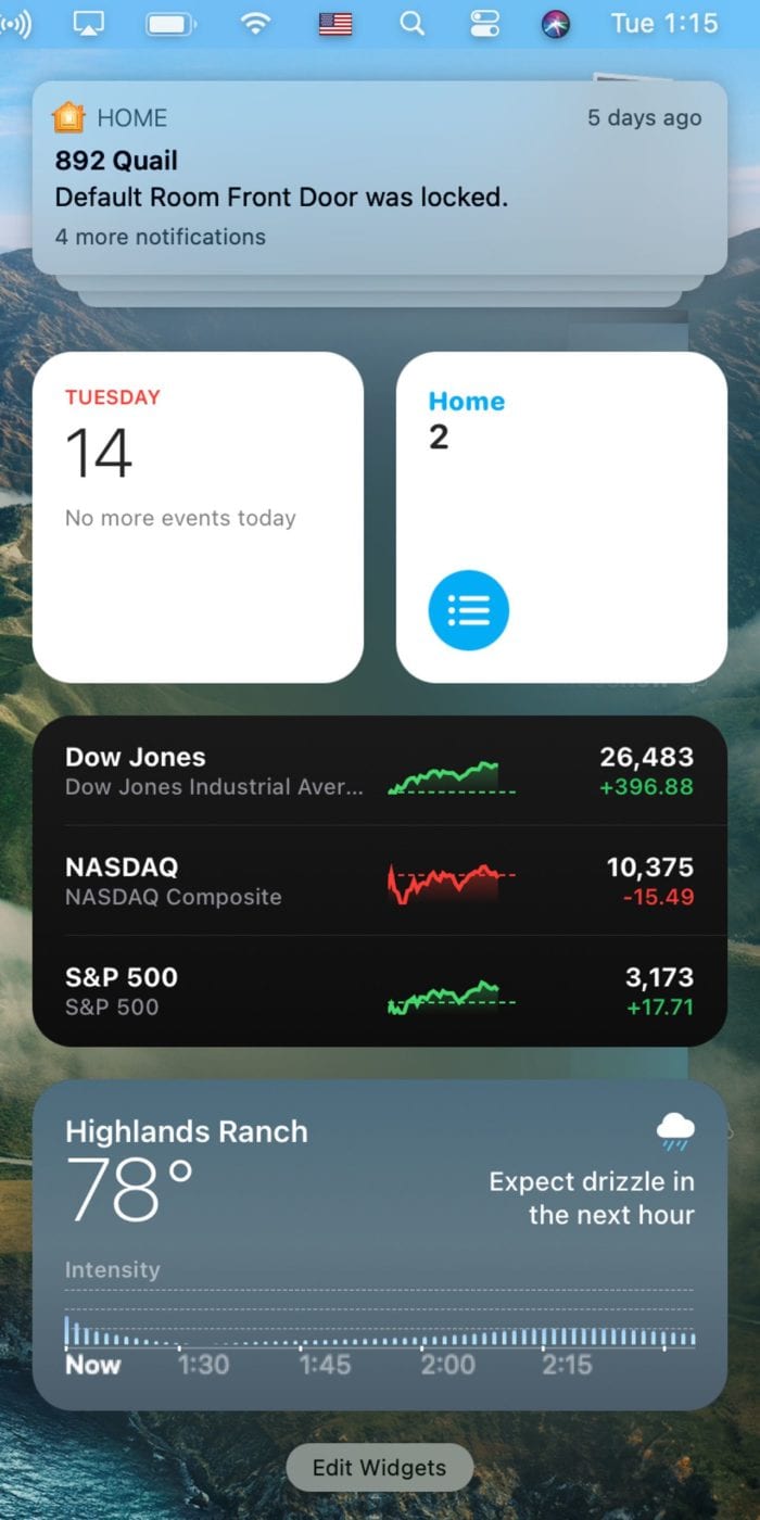
I’m hopeful that many third-party developers decide to add Notification Center widgets to their apps.
6. Safari
Apple’s browser has a new look and features in Big Sur. It starts with the Start Page, which can be customized with a background image and your choice of content. For example, the following screenshot of a Start Page shows a backdrop photo (Colorado National Monument), an updated privacy report showing how many trackers Safari has protected me from, and tabs that are currently open in Safari on my MacBook Pro.
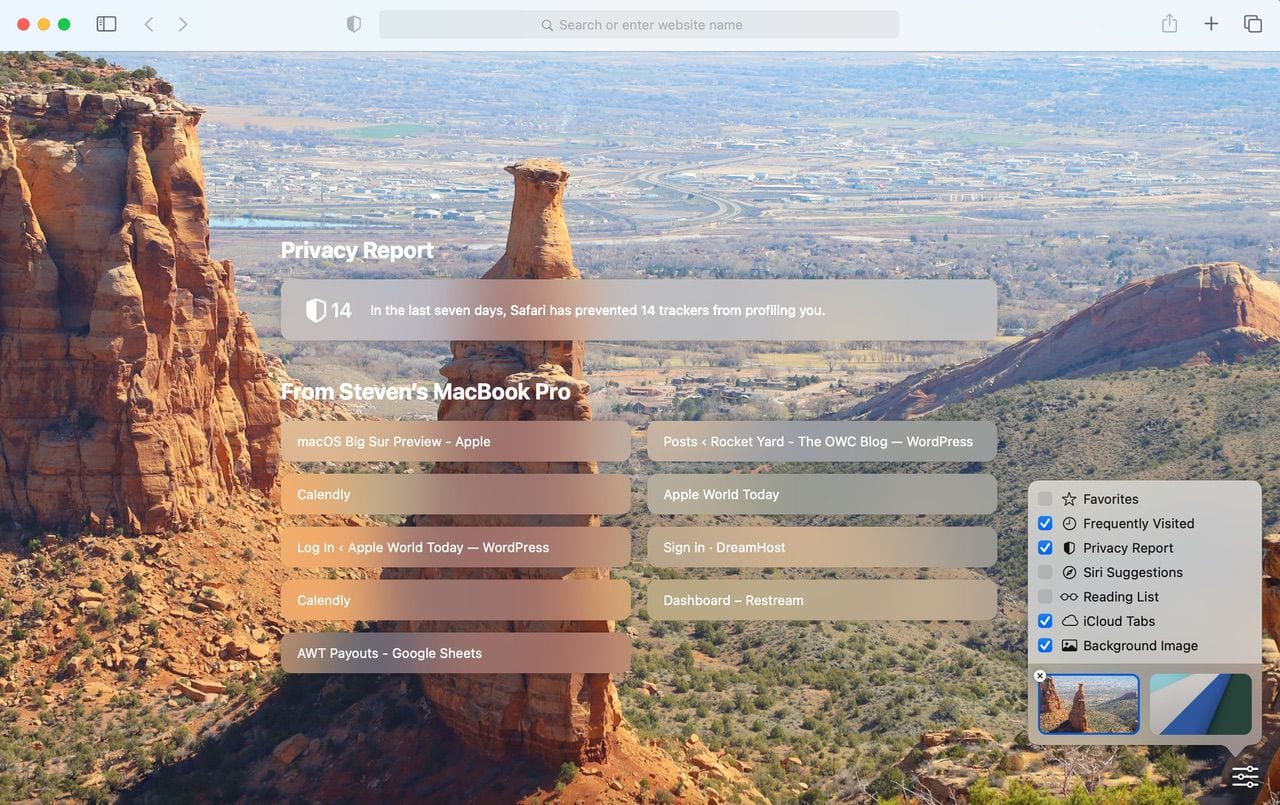
As you can see, the lower right corner of the screenshot, other Start Page items can be selected from a settings button in the corner of the Safari Start Page screen.
One of the other cool features? Hover your cursor over a tab in Safari and you’ll see a preview of what the web page looks like:

The Safari translation feature is rather impressive. When Safari recognizes that a web page is in a different language than the one your Mac defaults to, a translation button appears in the address/search bar. With a click, the page can be translated to English or one of six other languages):
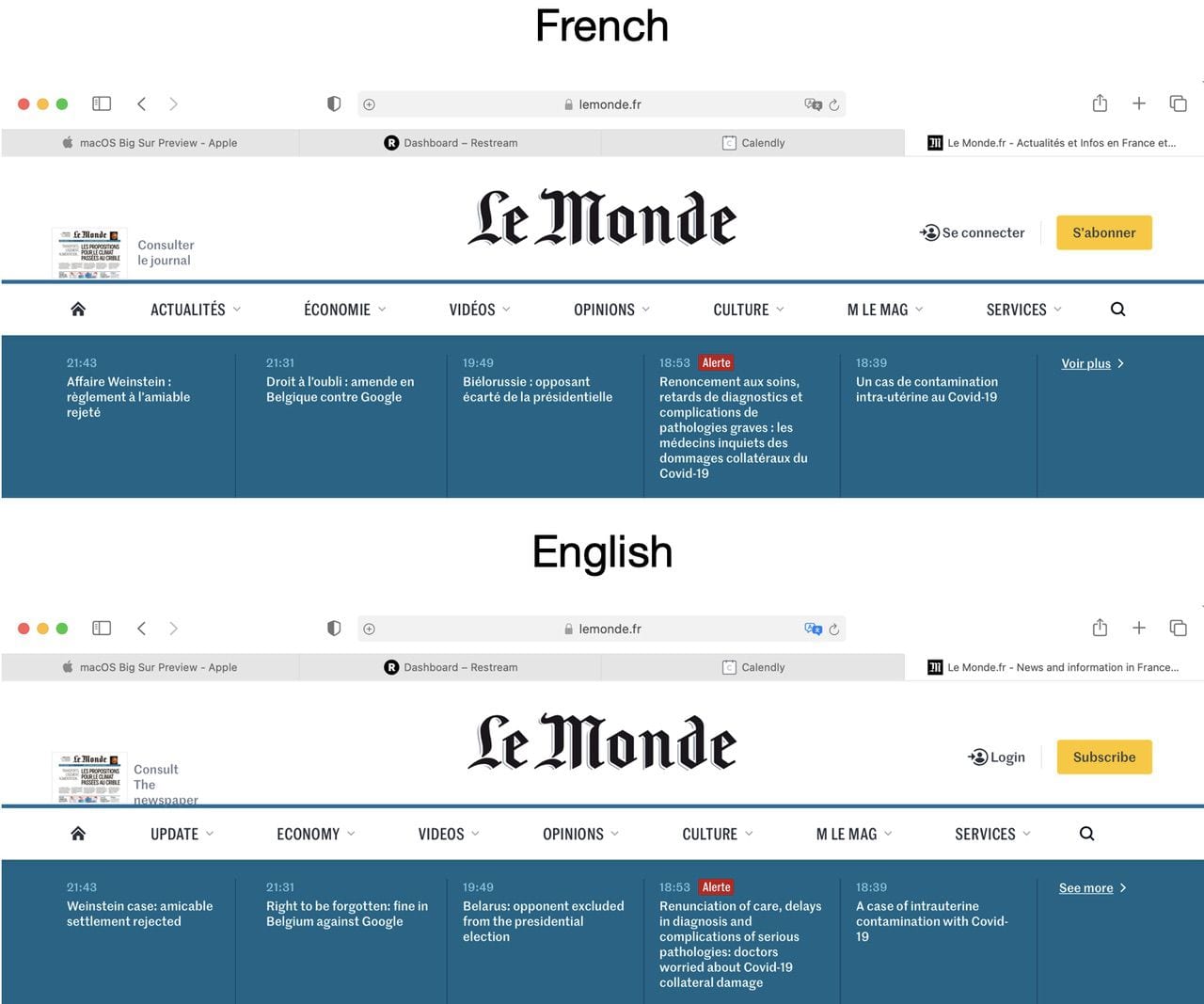
Finally, Safari extensions are getting their own category on the App Store. There don’t appear to be an overwhelming number of extensions at this time, but perhaps developers will find ways to add functionality to Safari and make some money at the same time.
As Big Sur gets closer to release in September or October, we’ll take a look at some of the more subtle nuances of this redesign of macOS as well as any last-minute changes, additions, or deletions made by Apple.






Looking like MacOS IOS merger is inevitable now.
Yeah they said ‘never’, but they have gone back on their word before.
So it looks like spacing is less compact on Big Sur? (#1 & #2)
Not quite to the point of trapped white space, but it seems to be large gaps for a pointer driven OS, which makes mousing about less efficient :/
I understand that familiarity across multiply platforms would be a bonus for any user that has an iOS device who has just recently purchased a Mac or vice versa (visa versa.) Obviously, change can be frustrating, especially when you’re using an app that took months to train on, you’ve been using it for years, and now it’s redesigned and feels like a jumbled mess (iMovie is an example.) Determining whether a “one-size fits all” will be up to the user and continue to send your comments directed at Apple if you want change. Apple has been fairly strong at future planning while understanding the user and how to make it user friendly, all the while, incorporating the beauty of art/design and engineering. I hope they continue that route AND release a solid, stable product with Big Sur.
Steve, thanks for continuing to share your views and passion for Apple products!
It all looks a bit like iPad OS, with the square dock icons. Plus the notification & control centre, reminding me again of iPad OS. It is possible that Apple are working towards the eventual marrying of IPad & Mac. It makes sense from a working point of view as portability and ease of productivity is the feature of modern work on the move & now as many are working from home.
Consolidate the models on offer for that mobile world where a mobile device can link to a larger screen for productive work.
But don’t hold our breath as Apple needs to run out over the next couple of years with existing hardware, but it an obvious NEXT step for Apple. Productivity and mobility being the link in all its devices. AKA the iPhone, watch etc. The pandemic has changed work practices for not only management but in field operatives. The power is in a mobile device.
I’ve been a private Mac user since 1989 but have always worked in Windows environments. I used to come home to the Mac and revel in the simplicity and intuitiveness that had been lacking in my business day exposure. I always felt that there was a yawning gap between the two systems. These days I feel that the gap is somewhat narrowing – and not necessarily because Windows is becoming more Mac-like!
Theses days I also find myself reflecting on how the design team might approach new versions : “New update…what are we gonna change…we gotta change something?!?!” seems to have overtaken the philosophy “What needs improving….what can we do to make the user experience better?”
Consequently, IMHO, too many new system versions (particularly in the Cook era?) have ended up being little more than window dressing.
Catalina was (is) particularly underwhelming, so I hope ‘Big Sur’ is a ‘Big Improvement’
BTW: I also own a mid-2017 MacBook Pro 15″ with the crappy butterfly keys, a 2YO Time Capsule which has just failed and my iPad Air died a few weeks back requiring an expensive changeover, so Mac hardware is something of a worry to me too!
Just when my Adobe apps were finally operating correctly! Is this just some way to annoy Adobe and other ‘outside vendors?’
I look forward to your newsletters and e-mails, taught this old dog some new tricks and make using my Mac’s so much easier.
keep up the great work
I have the Developer Beta on my desktop but when I went to the public Beta page, it said “Coming Soon” Apparently it’s not yet available
Well I appreciate Apple making things prettier in Big Sur, there are still some consistent bugs in Catalina that I hope get addressed by the new operating system, since apparently they’re never going to get fixed in the old one. Things like getting my Mac mini to consistently recognize monitors connected to the HDMI port, and large data transfers of 150 GB or more of multiple MKV video files without corruption out of the thunderbolt ports weather USB-C or Thunderbolt 3.
Catalina has been an interesting upgrade, but it has had persistent issues, and it concerns me that Apple might let these issues persist into a new version of Mac OS. From reading other comments it seems I am not alone in this opinion.
Looks like most things are changing to appear more like iOS. Makes sense for consistent UI across the platforms. Not sure is makes sense for UX but we’ll see what people think.
As long as I can click the network icon and immediately jump to network settings I am okay with these enhancements.
If Big Sur is reliable, I’m in. consider me a less than happy Catalina user here: a new high-spec 16″ MBP crashes most days and no obvious cause. My other two Macs run High Sierra and neither of them has ever crashes (one is a high-spec 2013 15″ MBP).
Reliability, it seems to me, is the most important attribute of an OS for anyone working via their Mac.
Since the early days of owning Macs, I have always done clean installs and generally the installs have gone well, but more importantly the OS has worked fine across my kit from 2012 iMac, 2014 MacBook Air, 2016 MacBook Pro and more recently my IMac 2019, all are running Catalina without issues.
Funny, I’ve never done clean installs. Once you have things a certain way its annoying to have to spend hours to re-install and tweak everything.
In fact, my current user folder dates back to 2008. The system image is almost that old. It’s been through at least 7 Macs. I forked it in 2014 when the trash can showed up.
Never was an issue until Mojave, but that was a Kext problem. Since solved.
On Windows, the registry gets bloated. Macs have the user and system library folders, not nearly as bad.
Kit, that is terrible to hear! You would think the latest, greatest, hardware from Apple would not consistently crash with the an OS versions that is on the cusp of being replaced.
I have a late 2015 iMac, that restarts/crashes from sleep, or when I’m using it. This has occurred for the last two versions of the OS.
I’ve burned to to the ground and did not restore from my Time Machine back-up, and it went two weeks, and then crashed the other day.
I’ve been tempted to replace the Late 2015 iMac to avoid issues. But, it seems brand new hardware with the current OS gives no relief from reliability issues.
Some are interesting and welcomed changed but not sure I would call these Impressive.
I think if the article was titled, “4 Cosmetic Changes And 2 IOS-like Additions Come to Big Sur.”, would have sounded as interesting.