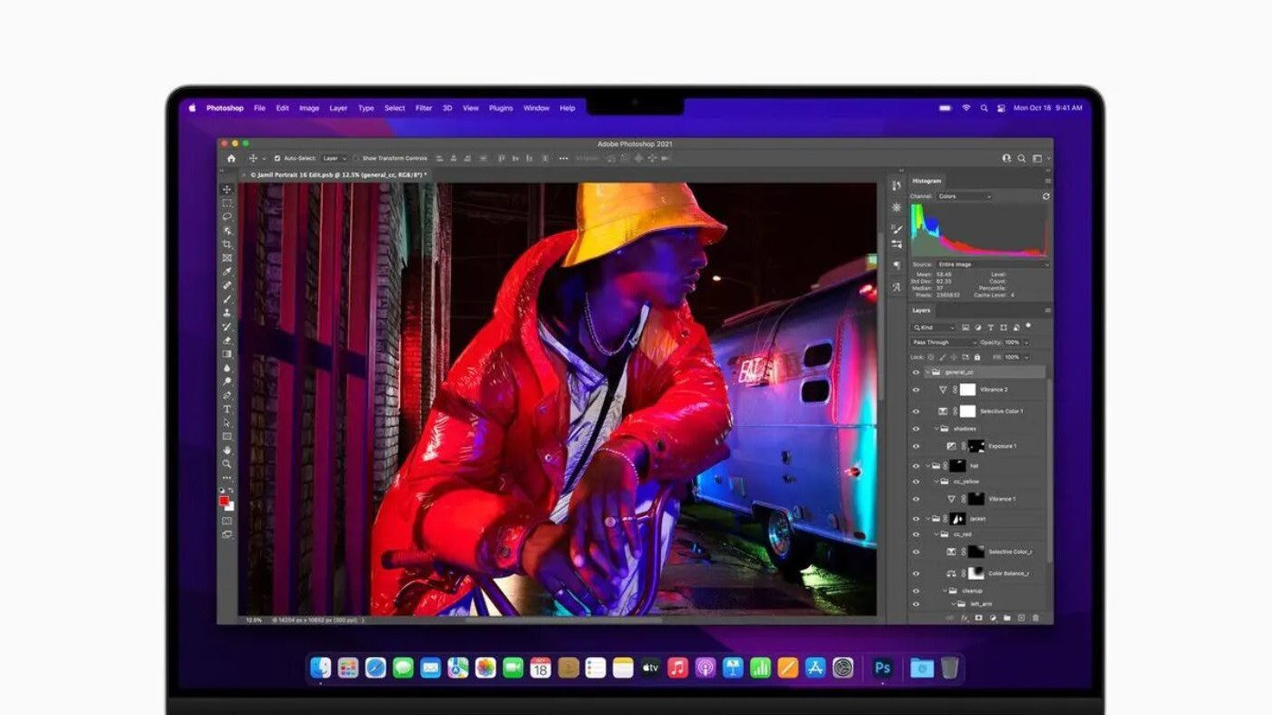
Have problems with the notch on the new MacBook Pros? I’m not. In fact, after using my new laptop for about an hour, I didn’t even notice it. However, if it bothers you, there’s a way to work with it. Or around it.
About the notch
Apple says the MacBook Pro notch offers a “smart way” to give users more room for their content. It also allowed the tech giant to make the bezels thinner and offer more screen real estate.
Consider this: The area under the macOS menu bar, and the notch, is the same 16:10 aspect ratio as before. However, instead of a large bezel at the top of the screen, Apple extended the display upwards. This leaves a small cutout in the middle to house the webcam and True Tone sensor. The result is the notch. The truth is that, overall, you’re getting more screen space, not less.
Dealing with apps that collide with the MacBook Pro notch
Still, it’s possible that you’ll have an app or apps with menus that collide with the MacBook Pro notch. No problem! Here’s the solution:
1. Close the app that you want to adjust.
2. Go to the Finder.
3. Double-click on your Mac’s drive icon.
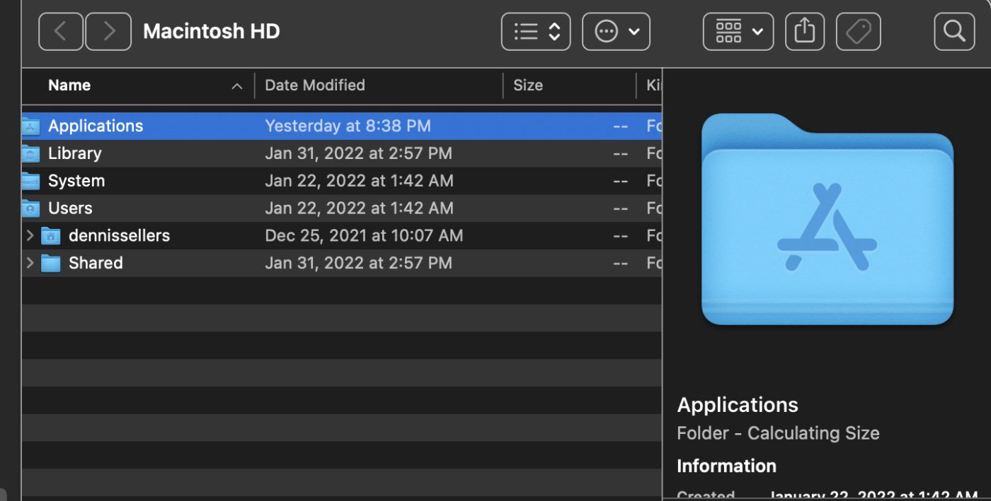
4. Double-click on the Applications folder icon.
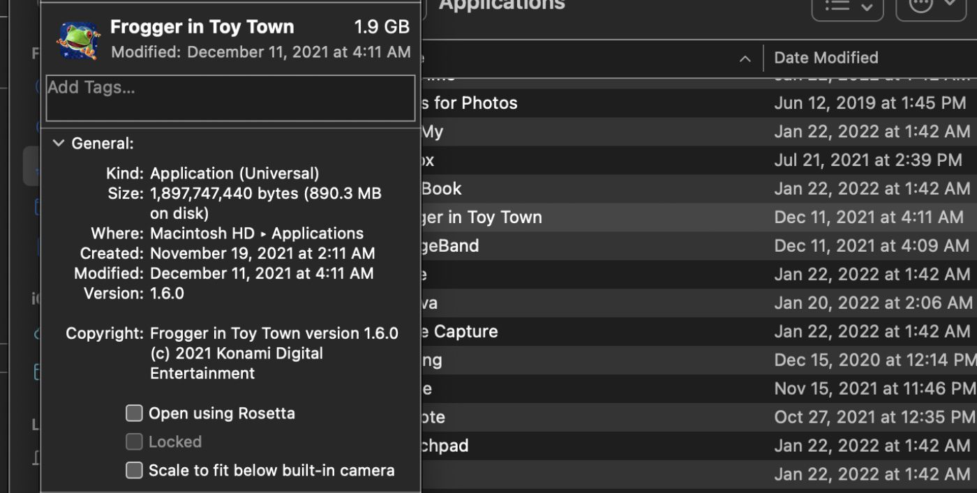
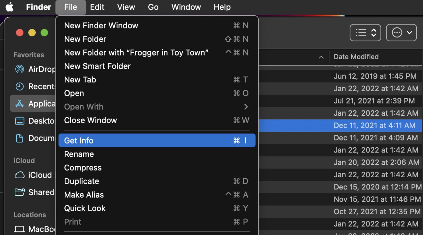
5. Right-click (Ctrl-click) the icon for the app in question and choose Get Info.
6. Click the “Scale to fit below built-in camera” option.
Going full screen to hide the MacBook Pro notch
The easiest way to make the MacBook Pro notch disappear is to use an app in full-screen mode. To go full screen, click the green button in the row of traffic lights at the top-left corner of the app’s window.
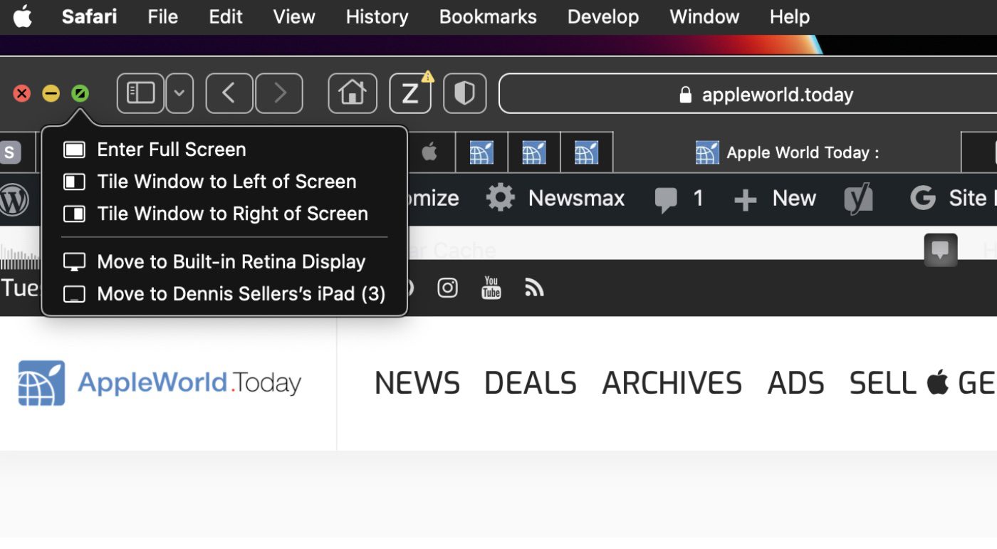
The app will expand to fill the screen. This automatically hides the contents of the menu bar by turning it black.




hi thank you for the help.
I have the problem that everytime I record it records a black bar across the top of the screen, even though there is not a one nor is the notch showing.
this is my first mac and it is going to be my last, the notch spoils my screen recordings that I use to teach young children.
Hi Dennis – you’re wrong about one thing, which is actually quite important to me. The area below the menu bar is close to 16:9, and not 16:10. What is 16:10 (advertised by Apple) is the entire area including the menu bar (and the notch). Since I have strong preferences for 16:10 (for various reasons), this means MacBooks have lost some of their appeal to me…
Best
Jaromir
I’ve replaced my laptop every 3 years, and when I saw the notch I have to consider how long this will have to last me – it’s horrible, doesn’t work well, and it’s apple trying to tell people what they will have, rather than listening to what people want.
I am still being surprised by how little Apple cares about quality and customer delight. Sure, having more video space is great, but requiring users to tweak applications is insane. Apple is truly becoming consumer class. I was half joking that my i9 MBP would be the last Apple notebook I purchased… but I’m not sure it’s a joke anymore.
I have the same problem as Harold. My menu bar icons don’t all fit to the right of the notch. I’m trying to use Bartender as a work-around. For me, I notice the notch ALL the time because there are icons that ought to be in the menu bar, but aren’t, because they are behind the notch. The notch has created extra work for me.
Great tip! I did not know that option existed. Thank you. But, how do you deal with the menu bar icons that get lost in the notch? I have been using Parallels Desktop “Hide Menu Icons.”