With macOS Ventura, Apple has revamped the System Preferences app and given it a new name: System Settings. (However, you should note that settings for apps are still dubbed Preferences and are found in each app’s Preferences menu).
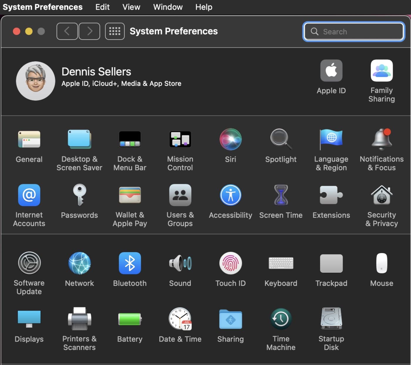
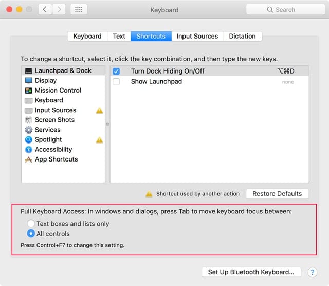
Pictured above is the previous System Preferences.
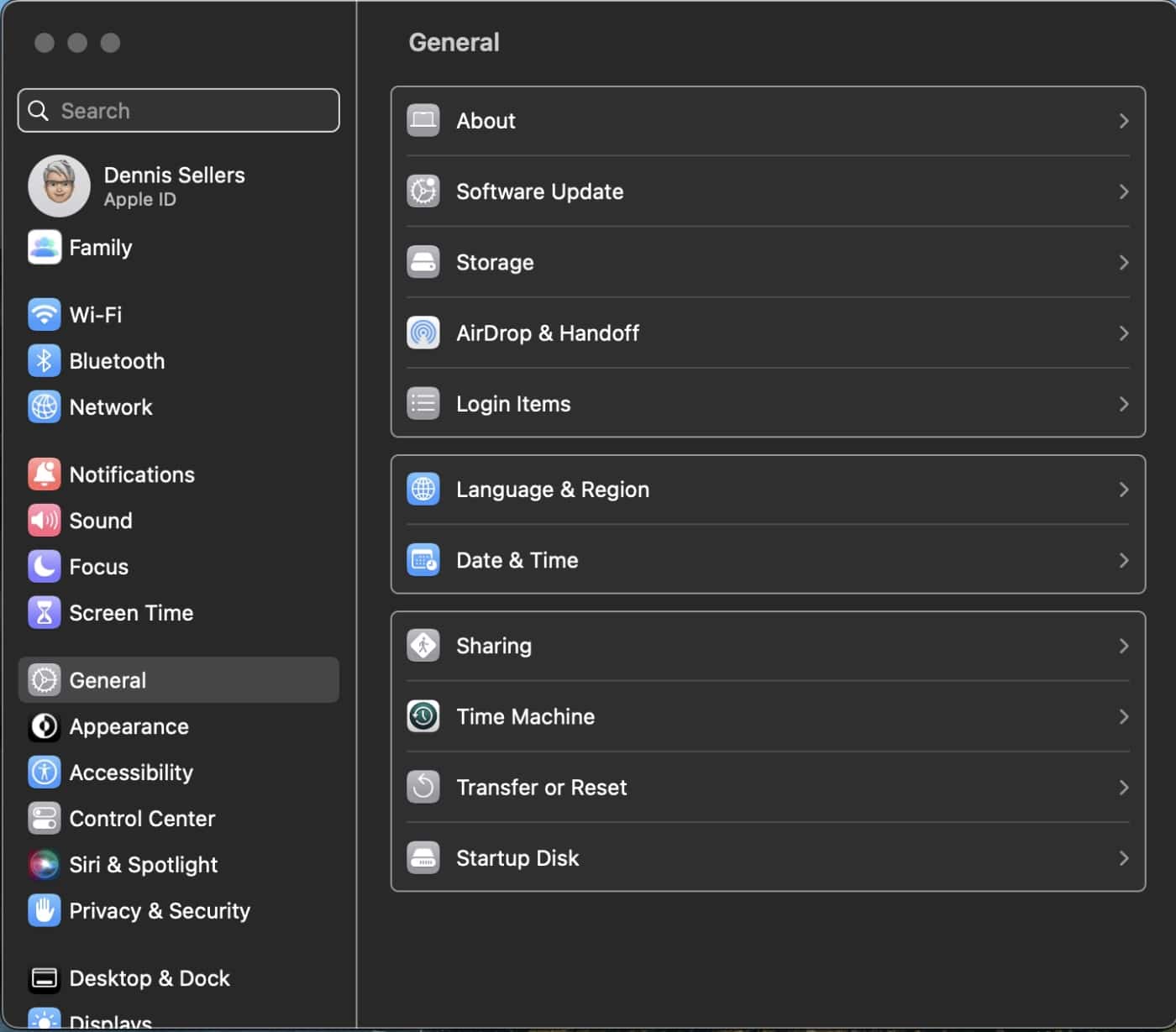
In System Settings in macOS Ventura, the icon view is gone. It’s been replaced by a list in the left column. In the old System Preferences app, clicking an icon would open a setting’s window. In System Settings, the setting that you click on appears in the main part of the window. Plus, some settings have been moved around in System Settings.
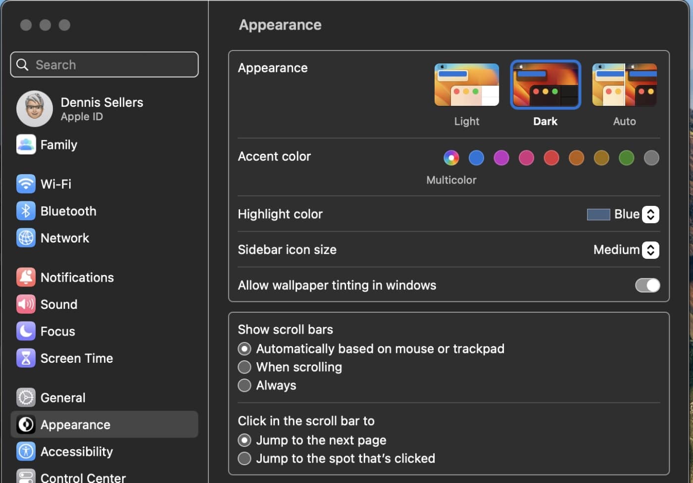
Also, in System Settings, Apple has bid adieu to checkboxes for the various settings replacing them with toggles. This make macOS Ventura look more like iOS 16 and iPadOS 16 (which certainly) isn’t an accident on Apple’s part.
Search for a setting in macOS Monterey or older versions, and the System Preferences app would highlight the matching section with a spotlight. Not so with macOS Ventura.
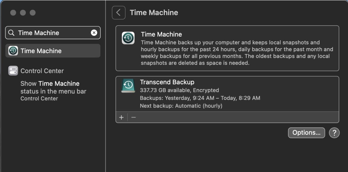
The new System Settings shows search results directly in the Sidebar. Click on one of the results, and the search results stay onscreen. This takes a little adjusting, but it’s pretty convenient. Now if you accidentally click on the wrong section, you don’t have to do another search. Just click the “x” button in the search bar and click on another option.
For example, this is what you see if you search for Time Machine in System Settings:
What’s more, some former System Preferences settings have moved in System Settings. And some settings formerly found in the Dock and/or Menu Bar are now found in the Control Center.
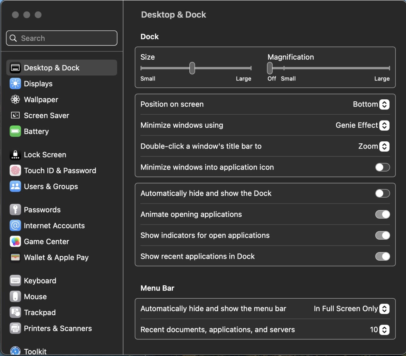
However, to make matters somewhat confusing, Apple has moved items such as the Menu Bar, Dock, and home screen options to the Desktop and Dock tab. And Software Update, Date and Time, Language and Region are listed under the General section. Siri and Spotlight now share a settings page. Also, Login Items used to be under Users & Groups, but it’s now in General.
Moving on, the “About This Mac” panel has ditched the shortcut for Software Update and tabs for Display, Storage, Support have all been removed from the window. Clicking the “More Info” button takes you to the General > About section, which displays info about your Mac.
Finally, System Settings in macOS Ventura has added other new sections:
° Game Controllers
° Game Center
° Lock Screen (this was previously tin Security & Privacy)
° Screen Saver (this was previously in Desktop & Screen Saver)
° Wallpaper (this was previously in Desktop & Screen Saver)







Real tired of these companies forcing their will on users. Give me an option to opt out or i will stop buying your product.
Your new ideas can suck, and my workflow is based on the decades of a standard UI that you have no logical reason to change.
These new agers force their will on people in all aspects of life. Dictators.
This is very poor judgment on Apple side, not to even allow the old display to be used. The new interface is terrible, I have to type to search to be able to find anything now.
Every time the Macbook goes to sleep (which I cant disable as per company policy, I have to go back there to rearrange the displays which do not manage to remember they position. This operation takes much longer now that you have to search for Displays to actually find the menu.
Don’t get me wrong, I am all for improvements and giving users options, but why on earth did Apple not leave a choice to the user to user the ‘old’ preference layout as an option? (or maybe there is one? if so, well I cant find it, you know.. because of the new layout!)
I want the old one back.
Now my Spotlight search won’t find documents — and that’s my whole life. I’m a writer. I need to be able to find different drafts of my documents.
How do I get the old one back?
How to get the old one back
I like the system preference better
Reminds me of Windows 8. I swore off Windows after that. Looks like I spoke too soon. This is looks like doom for Apple. Funny how when windows improves, Apple goes down hill.
how can I get back to the old ‘system settings’ with icons
I hate the new system
The new vertically organized Ventura preference settings are okay for handheld devices (like iPhones) with screens that are generally oriented to be taller than they are wide, but it is not a good UI for desktop screens that are usually MUCH wider than they are tall. I dont want my MacOS desktop to be forced to conform to small screen and handheld device conventions. I don’t like this change.
There is a pretty long thread on reddit regarding this, mostly negative as should be expected. https://www.reddit.com/r/MacOS/comments/yuml74/ventura_settings_interface_sucks_balls/?sort=old
Glad the settings got changed to iOS style. I’ve never got used to the old style anyway. It finally makes sense.
In our video lab, we have a bunch of Macs that are frozen to OS 10.9.5 because we do our editing with iMovie HD 06 and make DVDs with iDVD. What a joy it is to use the older operating systems. 10.6.8 is still my favorite.
Well, while I understand hanging onto older OSes for software compatibility’s sake––upgrading can be expensive––I can’t really say that 10.6.8 is a “joy” by today’s standards. It was a wonderful upgrade to the bloated Leopard, but going backward in time 12 years and 12 OSes doesn’t do it for me. It’s 2022 and I expect my software and hardware to act like it.
There’s really no going back more than 3-4 years if you’re keeping your hardware up to date. You can keep old hardware up and running that way, of course, but missing out on Apple silicon is a shame. It’s really something and I’m thoroughly surprised that Apple pulled it off and executed this transition so amazingly well.
But yeah, Snow Leopard was a great system back in the day. Clean, fast, light, stable, and a major (mostly) under-the-hood improvement to Leopard.
Who are you making DVDs for? I don’t know many who still have them now that streaming and cloud data storage is so ubiquitous.
I’m not thrilled with the new design. Right now it just means having to search for things we’ve known where to find for decades. Anything that wastes navigational time and doesn’t add a much-needed feature, is not going to get a whole lotta love out of the gate.
Apple should have left the option for a “Classic” view, IMHO.
I’m not a big believer in the elegance and “ease” of navigation in iOS either. So, I’d prefer redesigns in the MacOS not be tied to it. We probably can never stem the tide of over-caffeinated app designers, who don’t bother to design a Mac version, but I suppose the few that can run on an M-chip helps.
The bottom line is it feels that since Jobs left the building Apple’s sense of its iconic catchphrases, “intuitive design,” and “user-friendly,” have lost some of their meaning. In the past, I didn’t have to try and think like an OS designer. I could think like a human looking into a drawer I organized last summer and finding what I need.
True intuitive design? Allowing users to place things where they want to.
Why can’t I place apps on my brand new Ultra AppleWatch in list view, in the order I use them?
Why in my mac.com addresses, can I not turn off the me.com and iCloud.com aliases? I’ve never used those but 90% of spammers sure seem to.
I’m running Ventura (from Santa Barbara) on my M2 MBAir, but have kept Monterey on the MacStudio.
Stage Manager is kind of weird. I was trying to get used to it, but it’s annoying that you can’t see (much less access) files on the desktop. I usually run a system with way more than 4 windows and applications open too, so it feels a little gimmicky to me at this stage.
In the plus column, because I did a complete wipe and manual reinstall of everything (due to iCloud Drive insisting on filling the hard drive), I got to see how improved setting up email addresses finally is. The System Settings remembered my old accounts and offered them up in a new and improved way. It’s good to see that process vastly better than in past incarnations.
I feel like I’m sounding like the grumpy old “You kids get off my lawn!” guy, but I haven’t seen much to get excited about Ventura.
Maybe that’s because I’m from Santa Barbara?
I really dislike this new system settings. I don’t understand why Apple thinks it’s OK to make macOS look like IOS. IOS is not better! They need to stop making changes simply because they can and they need to stop removing functionality. What’s really annoying, is they removed to ability to have login items be hidden when they start up. Now that all leave open windows on my desktop when I start my system and I have to manually close them. What the hell were they thinking! I am very sorry I updated from Monterey.
Peter, like you, I’m not in love with them either.
My theory is that Timo (who I think is otherwise doing a pretty good job most of the time managing the world’s largest company) is a big fan of iOS. Some might say he has an iPad fetish. Many of us were worried he’d eventually merge them and I don’t think that possibility is completely off the table. Merging them would be a very bad idea because they were originally designed for two very different types of experiences: Touch -vs- Mouse/Keyboard. Apple still insists they’re going to keep those lines separate, but we never really know till we know, right?
Seems to me that as Apple has gradually released the reigns around the right to repair (the hardware), they might be encouraged to start doing that with the software as well? I’m well aware of how that would affect their ability to support the platform, but they could also build in an “undo” to this process if necessary. That’s a crude way of saying that, but I believe there are some simple interface hacks that might make many of us happier.
My beautiful M2 MBAir is now desperately starved for top menu bar space now that Apple decided to remove an INCH AND A HALF of space from it for the ill-conceived notched camera. Everything must now crowd onto what’s left of the right half of the menu bar. But while iStat Menus will allow you to edit and shrink the size of those icons, Apple will not.
Ironically enough, you can’t ask the TimeMachine icon to appear in the Control Center. It’s either on the top menubar, or not. I wrote to the iStat team and they are already working on closing the space between iStat icons on the menubar for this very purpose, but Apple needs to provide better tools for us to do that.
Change for the sake of change is inefficiency and stress for no constructive reason. I wish Apple would sometimes say, “Hey, MacOS is so powerful and well-loved, that all of our changes in Bakersfield are going to be under the hood––AND––we’re going to give you tools to paint and wax that hood in more ways than ever before.”
You may say I’m a Dreamsicle…
Checkboxes are better than toggles. Especially when Apple does not use color. If you clicked on the toggle switch and you got a green indication that would be good. But Apple likes to use drab light gray, or dark gray. I really miss the colors in iOS 10.6.8.
The wallpapers are not all on display without an extra click for each category. Computer screens are not teeny, so why is the System Settings screen so minimal?
Good point, Irene. And if Apple would give us more control over the sizing of more than just desktop icons, we could customize our own view as needed. My 13″ MBAir screen has all kinds of space restrictions that the 27″ LG UltraFine does not. And in reverse, the MBAir’s screen is massive compared to my iPhone’s. This is why iOS and MacOS should remain separate environments.
That being said, the ability to run a few iPhone/iPad apps on the M1 or M2 chips can help when developers are too lazy to write for the MacOS. I’d like to think that doesn’t encourage them to never write a Mac version, but ignoring the fact that there is at least some workaround would be silly too.