German developers The Soulmen released two products this week — an update to their venerable and powerful Mac OS X text editor Ulysses, and an all-new iPad version of the app. I was involved with beta testing the new apps, and now that they’re available, it’s time to take a look.
Let’s start with the all-new Ulysses for iPad ($19.99). While you might rightly think of it as a companion app to the Mac version, it’s a full-featured iPad text editor that stands on its own.
Ulysses for iPad has a multi-pane design for browsing the document library that’s similar to that of Ulysses for Mac, and with a tap that library information disappears, leaving an uncluttered space for writing. As you can see in the screenshot below, swiping on a document provides access to lot of actions!
All of the tools are available in two toolbars, one at the top of the page, another at the bottom. The bottom bar is only visible when text is highlighted, and provides access to statistics (like word count), Markdown commands, and a search button with find/replace capabilities. The top toolbar disappears when the bottom one is in use, but reappears with a tap on the upper right corner of the page. It provides access to full screen editing, settings, sharing, and creation of a new document.
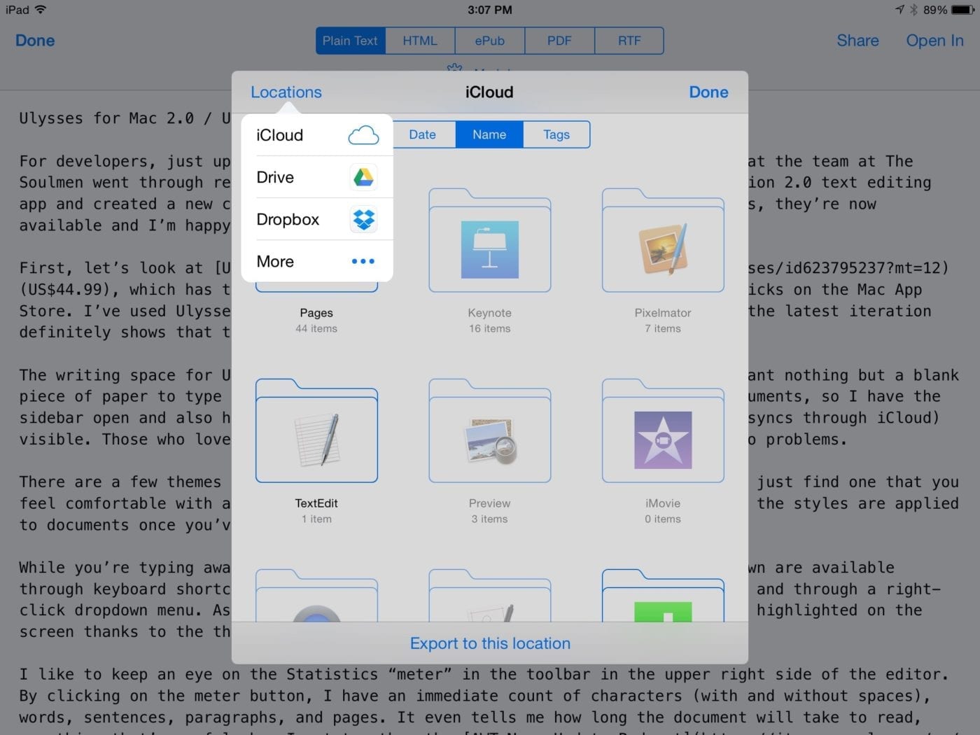
The app syncs with iCloud and can save to a number of other cloud services including Google Drive and Dropbox. If your completed document needs extra finishing, it can be opened in a number of other apps through an export tool.
What I found most compelling about Ulysses for iPad was the ability to write complete blog posts, have them automatically synced to iCloud, then move to my Mac to polish those documents, add images, and publish them.
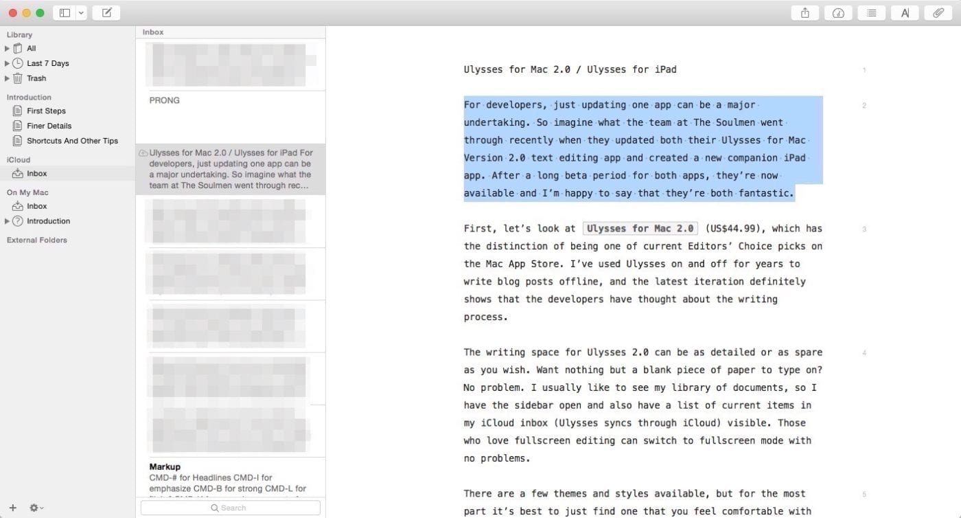
Ulysses for Mac 2.0 ($49.99) is a massive update to the popular writing power tool. While keeping the same distraction-free page format of previous versions, this version adds some user interface changes to make the app even easier to use. The three-pane window you see below can be easily converted to a blank page without the document library information on the far left. If you really want no distractions, just set Ulysses for Mac to full-screen mode…
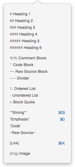 Most writers want to do one thing – write. Ulysses for Mac 2.0 makes all of the standard Markdown tools available in a number of ways; keyboard shortcuts, the Mac menu bar, a dropdown menu on the editor toolbar, and even a drop-down menu that appears if you highlight text and right-click it. Various themes allow you to see where markup tags have been applied on your document.
Bloggers often need to keep an eye on document length, and the statistics button provides a constantly updated count of characters (with or without spaces), words, sentences, paragraphs, and pages. It also tells me how long a document will take to read. Those same statistics are available on the iPad app.
While writing, the app automatically saves my work in progress to either your Mac or to iCloud. Ulysses supports Handoff, making it simple to pick up work on the iPad version when you need to hit the road.
If you’re using Ulysses 2.0 to write a manuscript, it supports attachments such as images, keywords, notes and goals (see below). Those goals are perfect for writers who are participating in National Novel Writing Month (NaNoWriMo), who need to keep an eye on writing 1,667 words each day to stay on schedule.
Once your document is ready to go, it’s possible to export it in a number of formats (text, HTML, ePub, PDF or RTF), or to copy it in a specific format like HTML, Markdown, plaintext or RTF. That flexibility is surprisingly powerful when blogging.
I’m impressed with how The Soulmen were able to provide a pair of apps that work on two different platforms, yet retain a familiar interface that makes it simple to jump between the apps. Both apps are very stable, so hats off to the developers for sticking to a rigorous (and long) beta test.
Overall:
 My overall score for both Ulysses 2.0 for Mac and Ulysses for iPad is a full 5 – the best possible score. I honestly didn’t think that The Soulmen could make the Mac edition of Ulysses any better than it was, yet they tweaked the user interface a bit and added some OS X Yosemite functionality that really took it up a notch. Ulysses for iPad shows a tremendous understanding of the iPad touch interface on the part of the developers, crafting a similarly powerful app on the tablet platform. The way that the two apps work together beautifully is just the icing on the cake.


