This fall we are sharing a series of simple design techniques for Illustrator, Photoshop, and After Effects. Rather than setting up a tutorial where you follow a “recipe” and end up with our design instead of your own, we show core workflow steps that allow you to try different tools or looks. Where pitfalls or caveats were found, we’ve noted them so that you can avoid problems. The idea is to get you experimenting with these powerful apps and enjoying the creative process! While you don’t need to be an expert to follow along, it is a good idea to familiarize yourself with each application and its core features before you begin.
![]() Setup: the application versions used for this article include Adobe Illustrator CC, 2015.3.1 release, and Adobe After Effects, CC 2015.3 release. Both apps were installed on a Late 2013 MacBook Pro with an SSD and 16GB of RAM. The system version is OS X 10.11.6.
Setup: the application versions used for this article include Adobe Illustrator CC, 2015.3.1 release, and Adobe After Effects, CC 2015.3 release. Both apps were installed on a Late 2013 MacBook Pro with an SSD and 16GB of RAM. The system version is OS X 10.11.6.
Introduction: after creating and preparing vector artwork as described in Part 1 of this series, it’s time to import the assets into After Effects so that we can begin animating the letters or symbols that you created.
Step 1) Set up the master composition.
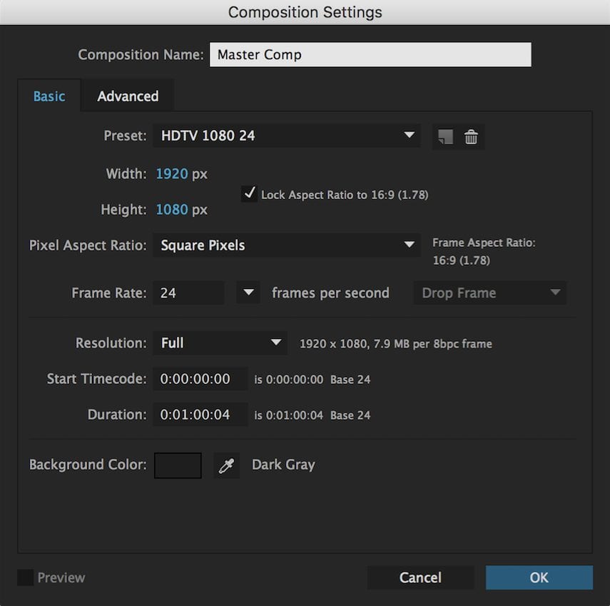
Once you launch After Effects, create the master composition (or “comp”) that will contain your pre-animated letters or symbols. There is no requirement as to how large or small the comp is, but for projects where the target medium is online video, the settings used below should work well for distribution on services like YouTube or Vimeo. Choose Composition > New Composition (Cmd-N on Mac, Ctrl-N on PC).

Step 2) Import Illustrator files as compositions.
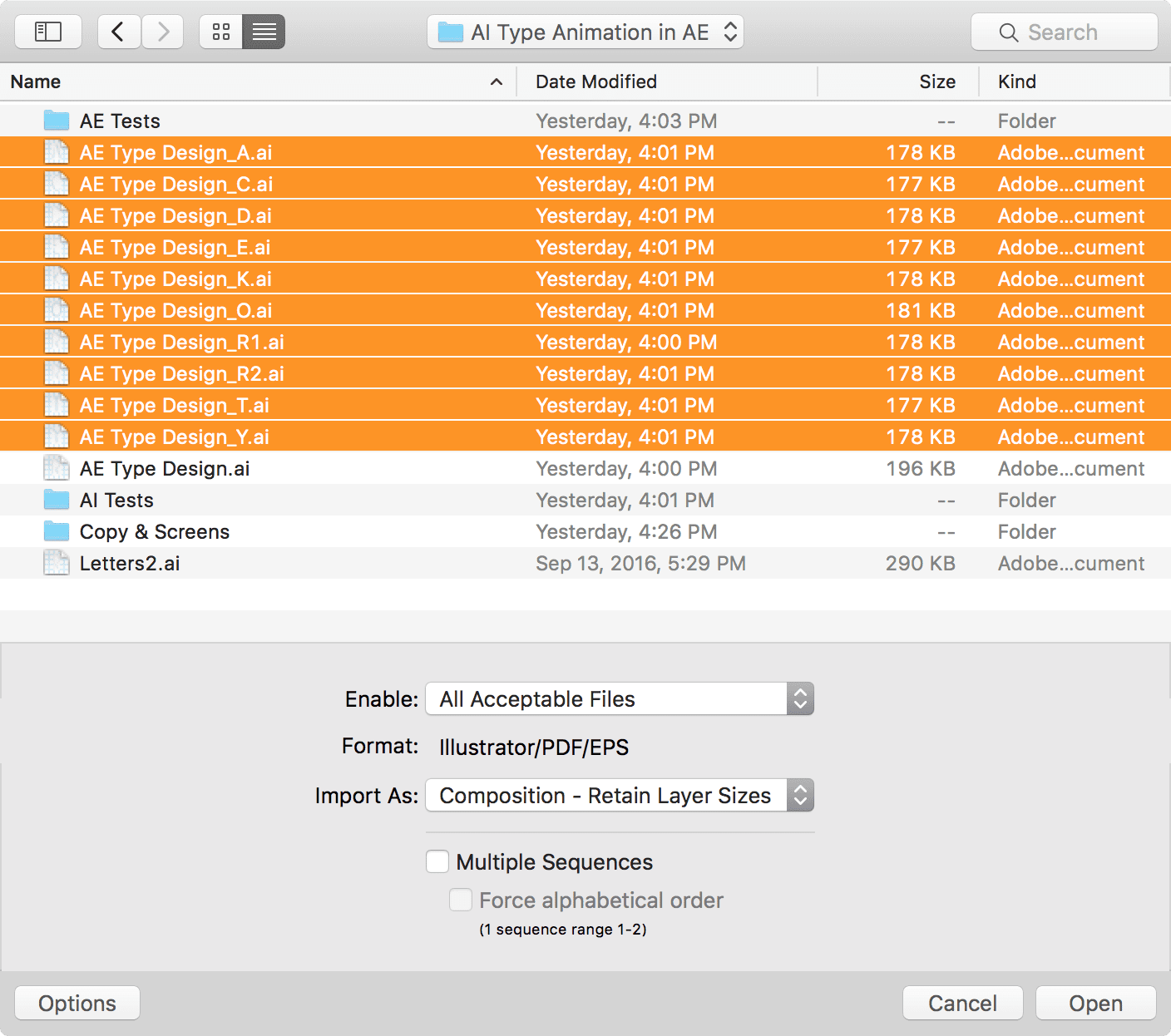
Bring in the Illustrator artboard files that were created in Part 1. Double-click an empty spot in the Project panel. This will open an OS X or Windows file browser window with additional options. Select all of the Illustrator files you created from the artboards, and within the Import As menu, select Composition – Retain Layer Sizes. This brings each file into the After Effects project as its own composition and maintains the size of your original artboards. Click Open when you’re ready.

Step 3) Remove duplicate layer assets.
You should have several compositions in your Project panel — one for each letter or symbol you designed, and the master comp you created in Step 1. Additionally you should also see a folder for each comp that you imported. Notice that each folder contains all of the layers from the Illustrator file, not just the layers specific to that comp. The extra layers need to be removed; highlight and them and press Delete. This cuts down on the project’s file size and helps to keep things organized.
(Above) Removing extraneous vector assets will reduce the size and complexity of your project, and use less RAM.
Step 4) Open the letter / symbol compositions.
You can now select each of the comps for the letters or symbols you created, and double-click them. This will add each comp to the Timeline panel. Re-order them as needed. Click on the tab for the first composition to reveal the Illustrator layers it contains. Had you not removed the extras from the folders in Step 3, each comp would contain all of the layers you originally created, not just the ones specific to this letter or symbol.
(Above) Notice as each comp is clicked, it contains only the layers needed to creation an animation.
Step 5) Create shapes from vector layers, add the Trim Paths effect.
Next we need to convert the vector content into a specific layer type that will make it easier to animate the letters or symbols. Select all of the layers in the first comp, right-click one of the layers and choose ‘Create Shapes from Vector Layer.’ Afterward you can select all of the Illustrator layers (orange icons) and press Delete key to remove them.
Next, select all the new shape layers by clicking on the top-most layer, then press Shift and click the bottom layer. Now click one of the small triangular widgets to the left of the layers to display the layers’ contents. Notice to the right of the ‘Contents’ label there is another label named ‘Add’ with a small pop-up menu. For each layer, open the menu and choose Trim Paths.
(Above) Each layer needs to be set up with the Trim Paths effect.
Repeat this process for each letter or symbol comp you imported.
Step 6) Set keyframes, test, and adjust… .
You probably realize at this point that the visible layer options in the Timeline panel can quickly start to scroll and become tough to manage. To simplify the view, you can select the relevant layers and type “end” in the search bar on the Timeline panel. This will reveal the specific property that we need to animate, while hiding all the other layer properties. This technique can be a big help when working on more complex projects, though it does require familiarity with the parameters used in your chosen effect(s).
Select each ‘End’ property line using Cmd-Click (Mac) or Ctrl-Click (PC), then click one of the End property values that says ‘100%.’ The field should become editable. Set the field to a value of 0 — this will change all of the field values when you press Return. Set a keyframe for each selected End property by clicking one of their stop-watch icons — this becomes your starting point because the timeline indicator defaults to the first frame in the composition. Move the time Current Time Indicator forward 1– 2 seconds, then create a second keyframe and click one of the values that says ‘0.0%’ and change the value to 100%.
(Above) Setting keyframes for the End values of the Trim Paths effect is what creates the animation.
You should now have two keyframes for the End property, one for each piece of your letter or symbol — you can now preview your first attempt at the animation! The video clip above shows this step from start to finish, for a single letter. You’ll need to repeat this process with the other letters or symbols — make sure to vary the total duration of each animation slightly so they don’t all start and finish at exactly the same time.
Note: The Easy Ease commands can be used on individual or all keyframes to refine the look, by ensuring that the speed of each animated letter or symbol ramps up from the beginning and ramps down towards the end, as needed. This provides a more pleasing look than a linear speed throughout. To learn more about After Effects’ expansive set of tools, effects, and animation parameters, please visit the official support site.
Step 7) Add letter or symbol comps to the main composition.
One you have animated each of your letters or symbols, close all of the individual comps and make sure the main comp you created in Step 1 is open, then save the Project. Next select and drag all of the letter / symbol comps into the Timeline so that you can quickly arrange them on a single screen and then test the playback. It is useful to view the Rulers (Cmd-R on Mac, Ctrl-R on PC) and then drag a couple of guides onto the composition preview, so that you can align and space the letters or symbols properly. When you’re done, set the Current Time Indicator to the zero mark, and then press the Space Bar to play back the “rough draft” of your final animation. This will help you to determine where changes are needed.
Step 8) Finish and render
Once your base animation is where you like it — there are many looks and effects you can add beyond those described in this simple demo — you can render a movie file to preview your animation. For OS X you can use the default settings to generate a QuickTime movie. Choose File > Export > Add to Render Queue. This will open a panel that is grouped with your Timeline. The Render Settings and output module will probably default to “Best Settings” and “Lossless” respectively.
This is fine for the type of simple animation we’re creating (i.e. it won’t add much time to the rendering process although it could with more complex compositions that included video or other effects). Next to the “Output To:” field, you should see a file name with a link — click that link to change the file name or output folder. When you’re ready click the blue Render button. You will see the animation play back in your Composition panel for a few seconds and then hear a chime. Your video preview is now saved in the location you specified earlier. Open it and take a look!

Conclusion: While this is a simple project by normal After Effects standards, the idea is to show how line art and other vector shapes from Illustrator can be prepped and animated within After Effects, and then combined and previewed as a single animation. Thanks for joining us and keep the Rocket Yard bookmarked; more Adobe tutorials are on the way this fall.


