We delayed our weekly Free App review by a day this week, in order to give ourselves some time to get to know Monday’s new release: Opera Mini Web browser.
App Description:
Get a fast, cost-efficient Web browsing experience. Use our powerful servers to compress data by up to 90% before sending it to your iPhone, so page-loads are lightning fast. Opera Mini is a breeze to use, and can synchronize data between your phone and computer.
Some great features of Opera Mini:
-Speed Dial gets you to your favorite Web sites with a single tap.
-An address field with auto-completion means you type less.
-Tabs allow for multitasking with several Web pages.
-Bookmarks can be easily managed and accessed.
OWC Mike H’s Review
 To the surprise of many, Apple approved the Opera Browser App for iPhone and iPod Touch. After using for a mere 5 minutes I can see why they did it. The Opera app is one giant piece of terrible. This is definitely a “download, try, and delete” app. Where to start… it’s doesn’t render much accurately, navigating back and forth actually breaks page layouts, it knocks all the content around, can’t scroll without jittering, doesn’t resize fonts, and… well it does a lot of things wrong with “frustrating” being the best word to describe the app.
The only good thing I can report is that Opera was much faster at loading content (likely due to everything routing through Opera’s servers for recompression, no secure banking here). Like the Millenium Falcon, Opera’s a fast “hunk of junk”, but unlike the rebel ship, this browser won’t be winning any wars. Perhaps Mozilla will feel emboldened to make FireFox and we’ll have a real viable option to for those that don’t like Safari for whatever reason.
I cannot imagine many people would prefer this experience over Safari, and I think the Opera people were a little more than disingenuous with the quality of their app when they previewed it in a video a month ago. It’s free, but it leaves a bad aftertaste.
OWC Chris S’s Review
Being the offshoot of a more popular desktop browser, Opera mini may have made the biggest splash in the iPhone browser field, but it’s not the first “alternate” browser released. Most of these, however, seem to use the Safari/Webkit underpinnings available to devs, and just add tabs, “full screen” browsing, and other features. I tried about a half a dozen of them, including Opera, just so I could see how it stacked up to its “competition.”
In order to compare them, I loaded a “test page” (the OWC Blog main page), tried to set it as my “home” page, and then opened a new tab to go to the OWC site. I figured that’d give a range of basic usability to judge things on.
To paraphrase Roger Ebert’s review of North, I hated this browser. Hated, hated, hated, hated, hated this browser.
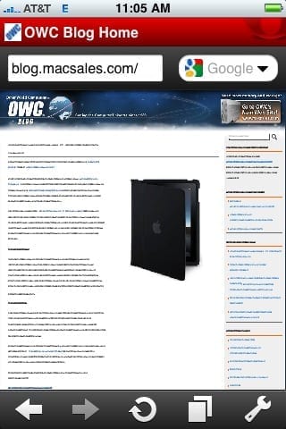
In every other browser I tested, the normal view of the page was resized properly to fit the screen, keeping layout intact while keeping text legible. Opera, on the other hand, turned the text into illegible little squiggles, and simultaneously broke text wrapping around images. Take a look at the screenshot above. See that picture of the iPad case? The text should be flowing around it.
It seems like the folks at Opera took a columnar approach to displaying. Tapping a column of text zoomed in, making it readable, and the resultant layout was “okay,” but unless you’re just reading pages with straight hypertext, the experience is extremely disappointing, especially if there are images that go with the text.
Speed wasn’t as impressive as I was led to believe, either. While this is a “subjective” feel, there were points that it felt slower than the others over WiFi, especially when I stopped using their servers and connected directly to sites.
There was only one feature I liked, and that was the Speed Dial page, which could be useful if there were sites I visited frequently. That isn’t enough to save Opera mini from a quick removal, though.
Final Verdict: Mobile Safari is probably still your best bet for Web browsing in iPhone OS. If you absolutely must have a different browser, save yourself a painful browsing experience and choose anything but Opera mini.
OWC Michael’s Review
Although I didn’t get to spend much time with this, I must say it is fast. Web pages did load faster than Safari on my home wireless system. The navigation of pages is intuitive – if not everything I was looking for. Zoom was a bit tricky to bring up just the portion of the webpage I wanted to see. Using the un-pinch motion to zoom in seemed to instantly bring full zoom in from the full zoom out position. I also found it a bit annoying to use in that to use a link I had to click it twice every time to get to the next page I wanted to see, which reminded me a little of Windows Vista (Are you sure you want to do that? Cancel or allow.) Minor issues that I’ll either get used to or figure out the easiest way to get it to do what I want.
The pages also didn’t quite look the same. While I couldn’t find any content missing on Opera’s pages, I did have to scroll a bit to find everything. On many sites, the layout was changed to show each element one on top of the next leaving much more white space towards the right of the screen. Annoying from a design aspect, but still functional – like using a text only browser.
The start page is great showing 9 sites that you can bookmark similar to the full version of Safari 4’s Top Sites (hint, hint, Apple – please add that to mobile Safari). I use that feature so much in my daily workflow with the full version of Safari that it would be nice to have the few pages I visit on a daily basis previewed. Admittedly, I haven’t set up the start page yet or really delved into the other features and settings of Opera mini for iPhone yet as I really didn’t get much of a chance to use it before writing this review – but so far so good. It certainly won’t be replacing my use of Safari, but I think I’ll be keeping this one around.
[poll id=”9″]


I prefer the iCab browser for iPhone. set it at full screen, landscape mode and I have the web see the iPhone as a desktop mac. This way I avoid the mobile pages that most places insist on sending to the iphone.
ADDENDUM:
Engadget reported that Opera Mini is the number one app downloaded across many of Apple’s International itunes stores as well as the US with the funny/snarky comment “Seems like users actually do want a choice, Steve.”
My bet is that the Opera mini app will share two stats:
– #1 downloaded app
– #1 deleted app