On September 12, 2022, Apple officially rolled out the official release of iOS 16. Debuted in June 2022 during the Worldwide Developers Conference, the latest iPhone operating system brings many changes and several new features and Rocket Yard’s iOS 16 Guide will take you through them all.
This guide will take you through the changes to the Lock Screen, but the full series contains guides to the following:
- Accessibility (Live Now)
- Siri and Dictation (Live Now)
- Live Text and Visual Lookup (Live Now)
- Maps (Live Now)
- Focus Mode (Live Now)
- Communication and Collaboration (Live Now)
Security is a top priority for Apple, and as a result, it is required that your phone be locked at all times when not in use. The lock screen is the security gate to your device with a convenient preview of time, date, and notifications.
But the lock screen is fast becoming the new Home Screen. Maybe the most drastic change—and certainly the one people notice first—in iOS 16 is the completely revamped lock screen, granting access to more information minus the hassle of a passcode or fingerprint.
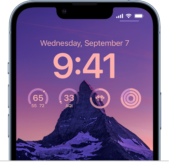
Overall, the lock screen seems to be evolving into a customized dashboard, allowing you take a quick look at stats from various apps without lifting a finger. This means that people may be more likely to put down the phone since they can get essential info at a glance. Great for staying zen!
Notifications Views + Live Activities
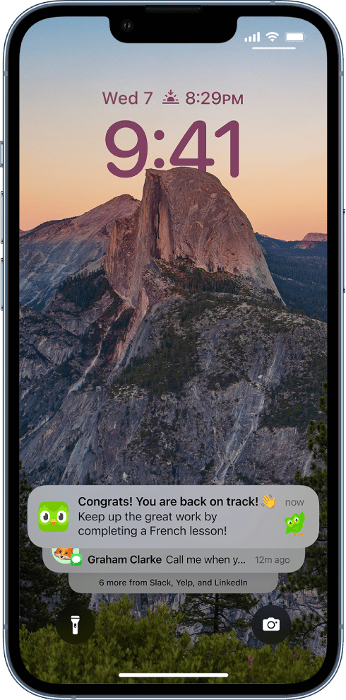
New notification views will give users more options to organize them on the lock screen from setting or on the fly with a pinch gesture. Plus, bolded text and images for visibility. Yet another way iOS is cathing up to Android.
- Stacked View, keeps notifications tucked away like deck of cards.
- Count View, hides them away entirely, letting you know how many are unread.
- Expanded View, takes up the vertical space.
Live Activities
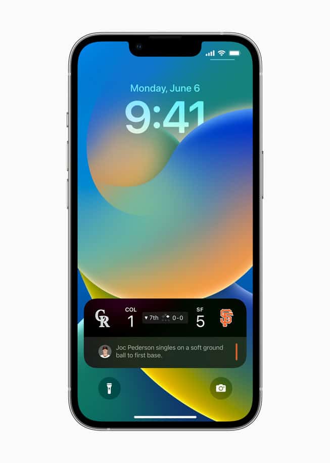
Live Activities is a form of notification that presents an all new API for app developers to reach users. Rather than scrolling through all the notifications on your lock screen, special notifications about events and activities in real time can be pinned to your lock screen, almost like a widget—think an uber ride share, awards ceremony, or sporting event.
Lock Screen Wallpaper Gallery
Besides custom solid colors with gradients, iPhone has also rolled out a host of wallpaper customization features found in a dedicated Lock Screen gallery.
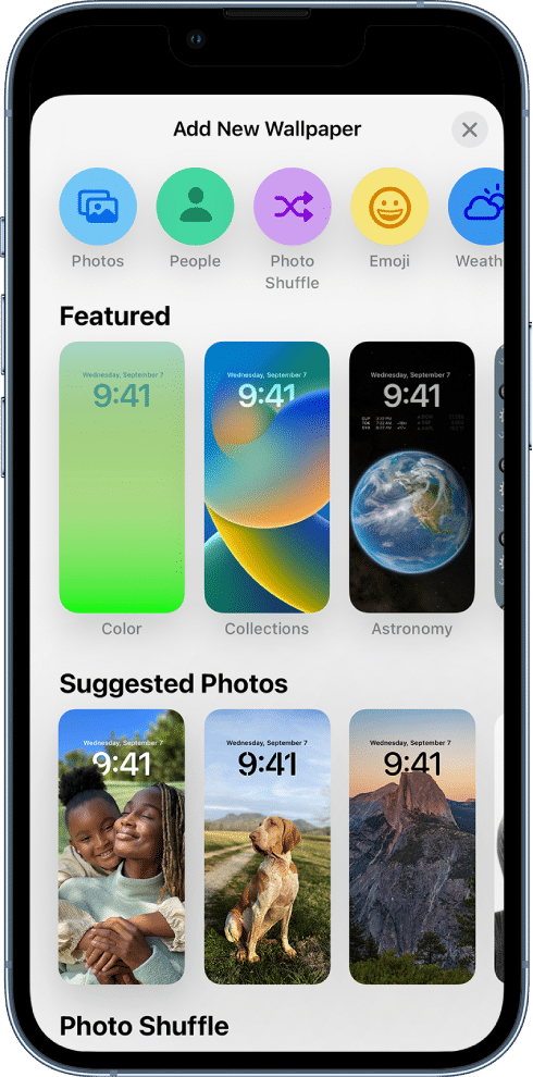
Long press the Lock Screen (you may need to enter your passcode) and you should see a (+) sign. Tap to visit the gallery of suggestions and effects categorized by People, Suggested Photos, Featured, Weather & Astronomy, Emoji, and Collections.
People
Selecting People will bring up photos you’ve taken of humans that are good candidates for the Depth feature, which places the time behind the subject creating a layered effect.
Photos and Photo Shuffle
You can self-select images you’d like in your photo shuffle or Apple’s AI technology will choose photos it thinks might go well with the Depth feature or simply be a good wallpaper image. It makes me a little nervous to have my phone auto-select images from my gallery, but you can select/deselect categories like pets, urban, nature, or people. And if a photo surfaces which you don’t like, simply long press and mark the photo “Do not feature photo again.”
Emoji
People are really excited about the new Emoji wallpaper feature. Up to six emojis may be selected at a time to create a fun wallpaper design with emojis of different sizes plus patterns like small grid, medium, grid, large grid, rings, and spirals.
Plus, with 31 new emojis this year, who can resist?
Weather
Whenever it’s raining outside, it’s also raining on my Android phone’s lockscreen. Well, Apple has finally caught up with a weather wallpaper that emulates the weather app plus live weather animation so real you amy think your phone is wet.
Astronomy
Similar to Watch Face, you can select Earth, Earth Detail, Moon, Moon Detail, or Solar System.
More than simply fun and expressive, the ability to customize a lock screen is a very valuable feature when you have multiple lock screens.
Multiple Lock Screens
Now you can create different lock screens to serve as presets for various situations like work, school, weekend, or travel. This means you don’t need to go through the customization process every time you want to change your lock screen display. Just long press and scroll left or right to choose your preferred lock screen of the moment.
Link Focus Mode
The best part about multiple lock screens is the ability to link each one to specific focus mode, making it easy to shift focus without going into your settings. And to have access to valuable info or limit info on the fly through custom lock screen widgets is a great way to level up your productivity.
Widgets
The lockscreen has three frames—the date, the time, and widgets. The widget frame (below the clock) can fit two rectangular widgets or four square widgets from any proprietary app such as calendar, news, stock, battery life of iPhone or Watch, weather, fitness, or any 3rd party-app if they have designed a widget.
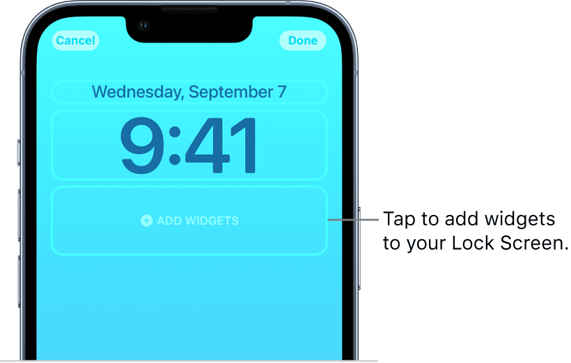
The date frame (above the time) can also be customized with one teeny tiny widget to display a single item of info such as reminders, upcoming appointments, the current temperature, fitness rings, or a stock price.
The clock itself can also be personalized with colors and fonts.
Summary
Lock screen is the new home screen on iPhone iOS 16. We hope this guide has been helpful in outlining all the new changes to lock screen. Let us new which new features you are most excited about in the comments!





Sadly none of the clock widgets show the stopwatch state. Perhaps this is Apple judging me to buy a watch from them too?
That all looks kinda purdy, but I am running iOS 16.1.1 on my SE (3rd generation) and none of that seems to be on my phone – is it only for larger screens? Do I need to set something up in the settings?
It should be available on your device. Lock the screen, then swipe up from the bottom to see notifications (if any) then long press on the screen and this should show the customise interface.
As is sadly typical of many of Apple’s UI choices these days, it is not easily discoverable.
Actually, iOS 16 makes the home screen less user-friendly.
My required home screen is somewhat light. When we changed over to iOS 16 the names of all of the apps went from black (readable), to white (not readable). Shocking but true, Apple does NOT permit you to change the text color.