NOTE: Betas being what they are (i.e. buggy, unstable, incomplete), should never be installed on any Mac that you are usingµ for production work. Install at your own peril.
It’s been 24 hours and my first impressions of macOS Sonoma are in. I’ll summarize by saying: For where it’s currently at, it’s surprisingly good. While all is not peaches and cream (notably, given its current Developer Beta release status), I’ve found several new features which have proven useful in my limited time using macOS Sonoma.
Let’s start with the specifics:
I installed the Developer Beta of macOS Sonoma on my 2018 Mac mini, with the following specs (i7, 32GB RAM, 256GB SSD) connected to an eGPU. This is the machine I use for writing, researching, and consuming content. I use this Mac as a secondary machine, with my main workstation being a 14″ MacBook Pro (2021) model. Having a spare, older Mac affords me the small luxury of testing new software without putting my productivity at risk.
Apple’s new macOS weighs in at approximately 13GB in size. Installation, which was directly over top my macOS Ventura install, took roughly 10 minutes, and went smoothly.
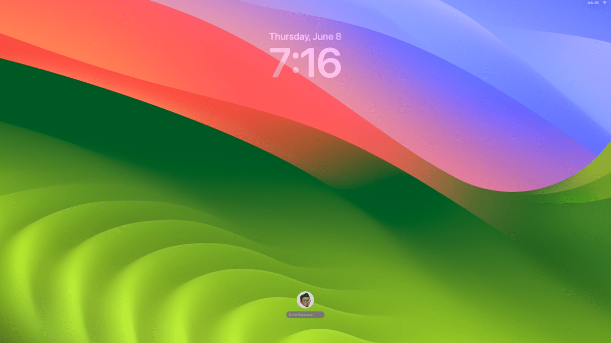
The first thing I noticed after restarting my Mac is macOS Sonoma’s new lock screen; login credentials are now located on the bottom of the screen, similar to the lock screen found on both iPhone and iPad. Some will hate this, and others won’t. Me? I don’t hate it, but it did throw me off for a split second.

Apple’s new desktop background feels like a more abstract take on Microsoft’s famous Windows XP wallpaper. (I don’t like it.)
Thankfully, Apple has many outstanding wallpapers to choose from, including several animated landscapes. When one of these is selected, the landscape animates while your Mac is in locked mode. Unlocking the Mac will have the animation smoothly glide to a stop, as you are taken to your Desktop. On my i7 Mac mini, which drives 3 displays via eGPU, the landscape animation was not without lag. I’ll chalk this up to optimizations which have yet to take place.
Widgets can be useful, but up until macOS Sonoma, the few Mac widgets I had in Notification Center were rarely checked on. (Out of sight, out of mind.) With macOS Sonoma, widgets can now be placed on the Desktop – and I, for one, welcome this long overdue feature. Keeping widgets on my Desktop lets me keep track of certain information in real-time, without taking away my focus. I have Date, Weather, Parcel, and Reminders widgets hanging out on the lower left side of my Desktop, with Fantastical’s calendar widget on the right. Incidentally, long-time Mac users may remember Panic Software’s Stattoo program, which offered similar functionality for older versions of Mac OS X.
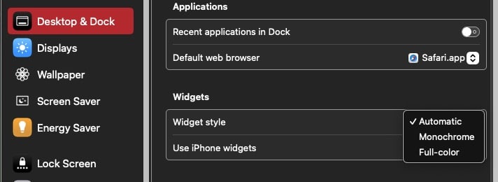
Widgets fade into the background when other windows / applications are active. You can specify the size of your widgets (large, medium or small) and place them on your desktop. Widgets can also be optionally displayed in a monochromatic color scheme, which blend better with your macOS desktop wallpaper.
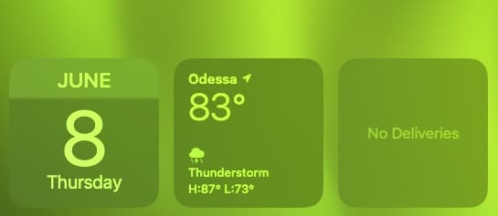
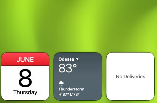
If you place a widget next to another, they will line up, as if they were placed on an imaginary grid. Best of all, widgets can be interacted with. If you have a To-Do list, you can mark an item complete directly within the widget itself.
If you’ve ever wanted to access your Mac’s Desktop, amidst a busy collection of Finder windows and applications, you can now click on your Mac’s wallpaper to show Desktop items. When doing so, your open applications and Finder windows disappear. Click on the Mac’s wallpaper again, and your apps and Finder windows automatically reappear. I found this feature to be useful, but your mileage may vary.
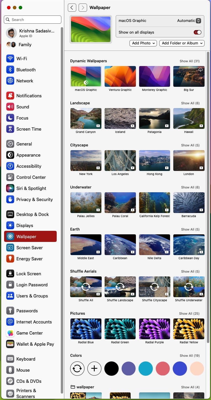
If you’re expecting a better, more logically arranged System Settings with expandable windows in macOS Sonoma, you will be disappointed. Literally nothing changed here.
New and improved in macOS Sonoma: on a multi-display setup, you can change all of your screens to the same wallpaper at once. This isn’t revolutionary; it’s another long overdue feature.
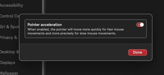
If you’re coming from Windows, you might like macOS Sonoma’s new pointer acceleration option which adjusts the speed of your mouse (faster speed for long movements, and slower speeds for mroe precise movements).
macOS Sonoma sports improved auto completion when typing within various Apple apps (NotePad, Mail, Reminders etc). I found this to be a useful time saver.
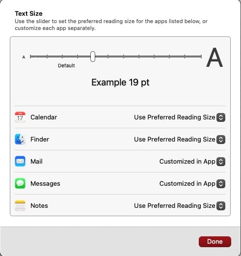
From an accessibility standpoint, macOS Sonoma will allow for more granular control when it comes to text re-sizing. Theoretically, you can set a preferred reading size for the Finder, Calendar, Mail, Messages and Notes. I say “theoretically” because I could not get fonts to re-size in the Developer Beta.
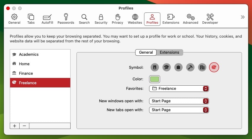
Safari now sports new User Profiles, which allow you to separate your browsing for Work, Personal etc. I really like this feature, which has already been available on Google Chrome. Each Safari profile can be assigned with an icon and color to differentiate between them.
Sadly, AirDrop still looks the same as it did in macOS Ventura. It’s disappointing that I can’t add my own naming / assignments to the machines on my network.
Enhanced autofill for PDFs is a welcome addition in macOS Sonoma. In my brief testing, this feature worked surprisingly well, and should be a big time-saver if filling out PDFs is part of your regular workflow.
Stage Manager still seems quirky, but the underlying animations for window zooms are much faster. I haven’t used Stage Manager much in macOS Sonoma, but it seems to work more consistently compared to macOS Ventura. That being said, I still find Stage Manager to be more trouble than its worth.
There are undoubtedly more features lurking in macOS Sonoma that I haven’t touched yet. My initial impression is that macOS Sonoma seems to behave well and add some genuinely useful features. I was pleasantly surprised that I did not have to re-authenticate Security and Privacy settings for each of my applications when logging into macOS Sonoma’s Desktop for the first time. The ability to edit PDFs inline is immensely useful, as are interactive widgets on the Desktop. The improved auto-complete went from being annoying in previous versions of macOS to being truly robust.
There are other small niceties I’ve run across in macOS Sonoma, which I found helpful for end users. For instance, if you have a PDF from a sender that’s on your Mac’s Desktop, you can right-click on the PDF to reply to the sender. This will open an email already addressed to the recipient.
It’s still early days for macOS Sonoma, but if first impressions are anything, for the first time in a long time, I feel cautiously optimistic.






Will the Energy Saver preference re-establish the schedule for start up/shut down? That was a huge disappointment that you had to command line that in Ventura.
I certainly hope they did a better job than with Ventura – my M1 MacBook Pro has been suffering the weirdest issues – a number of times in the past few weeks the Finder seems to have a barin fart altogether. Force Quit does not work (including attempting to Relaunch Finder). And just yesterday, after getting fed up again with this nonsense, I CTRL-Q quit out of all my open apps (mail, Firefox, Calendar and a few others) and, when the Shut Down and Restart selections from the menu did nothing, force shut down the laptop by holding the power button down.
So imagine my chagrin when, an hour later, I powered up the computer, and ALL the programs that I in fact did the Quit process with popped on screen!
Obviously, something is shoddy in OSX Ventura – and it’s getting on my last nerve. Been using Macs since there were Macs, and this is by far the worst OS they have vomited out to date.
best OS SnowLeopard rock solid + fast
than HighSierra and Mojave
and now Ventura = IOS = like MS Vista
I agree. Sure, it didn’t have all the bells-and-whistles of later versions but it was fast and, as you note, rock stable.
As much as I like Ventura, it does seem to have some hiccups.