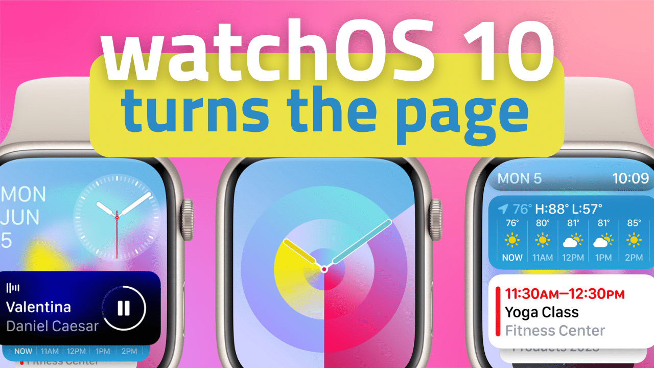
Prior to Apple’s WWDC 2023 keynote, rumors were swirling around a major refresh to watchOS. I don’t know that the changes coming to the Apple Watch would qualify as “major.” The basic flow and design language of Apple Watch are still there.
But… Apple is definitely re-thinking the top layer of the interaction model of its wrist-top computer. Specifically, how you go from raising your wrist to getting the information you need as efficiently as possible.
To be honest, it’s about time.
Heavy is the wrist that wears the Crown
Since the Apple Watch launched in 2015, the experience of using one has basically been the same. Though some of these interactions were introduced after launch, the experience really has been quite consistent from day one.
From your watch face, you can do one of five things: swipe down from the top for quick settings shortcuts in Control Panel; swipe left or right to change watch faces; tap a complication to enter that complication’s app directly; press the digital crown to see all of your apps in either a grid or A-to-Z listing; press the side button to view the dock of favorited or recently used apps, or hold it to see power and emergency options.
The combination of this UI flow with the mess that the watchOS app grid has always been, and the less-than-stellar performance of Watch apps themselves, leaves most users depending heavily on complications on their preferred watch face as their primary way of getting information and opening apps.
Unfortunately, what this means is that watchOS unintentionally pushes users toward choosing information or complication-heavy watch faces. But part of the appeal of watchOS are all those beautiful, minimalist watch faces. If you want to use a photo watch face or if you prefer the look of a watch face with no complications at all, you’re essentially choosing between beauty and functionality, and it severely limits the usability of the watch itself. Complications have become a serious UI crutch on the Watch.
With watchOS 10, Apple is finally admitting this and hopes to solve the issue with the introduction of widgets on the Apple Watch.
Turning over a new stack
Apple’s re-thinking of the watchOS UI places the Digital Crown at the center of the interaction model in a meaningful way for the first time. The Crown isn’t just a glorified home button anymore.
But this isn’t the first time Apple has tried encouraging greater use of the crown. The Time Travel feature was introduced in watchOS 2, allowing you to turn the Digital Crown to essentially “rewind or fast forward time” and watch as the complications or individual elements of a watch face reflected their status at those times in the past or showed what they will be in the future.
Apple quietly removed Time Travel in watchOS 5, but they clearly felt like the Digital Crown’s ability to spin was being wasted as a core navigation element of the OS. So, they’re bringing it back with a new implementation of the Smart Stack widgets on the Watch.
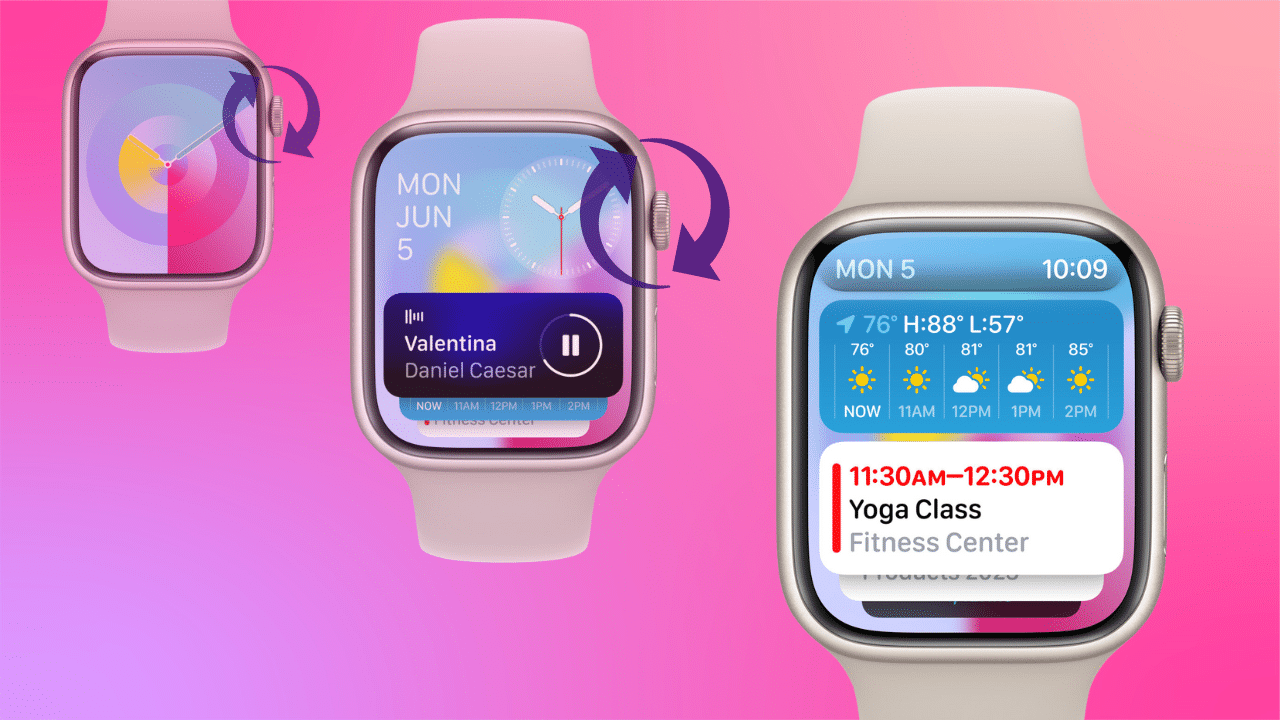
Similar to how Smart Stack works on iPhone and iPad, the Apple Watch with watchOS 10 will generate a stack of widgets using on-device machine learning. Based on the time of day, your location, and other factors, by turning the Digital Crown from any watch face, you’ll be able to flip from the face to the Smart Stack. As you continue turning the crown, you’ll flip through the widgets that are available.
For example, the stack could contain the current weather forecast, boarding passes from Wallet, calendar events, entries from Reminders, and apps running in the background like Podcasts or Music. If you start a timer, a quick scroll up from the watch face will show you the status of that timer.
Apple says that adding widgets just below the watch face in this way allows users to use a minimalist watch face but still have quick access to glanceable information.
And though Smart Stack seeks to surface widgets automatically, Apple has also made it customizable if there are certain widgets you want to keep in the stack. With a long press of the stack, you’ll get the option to add from a selection of widgets to the stack.
During the keynote, Apple showed a widget that essentially acts as a container for complications. The widget can hold three complications and is a thoughtful combination of the usefulness of both this new feature and the complications we know and love.
Flippable design language continues to apps
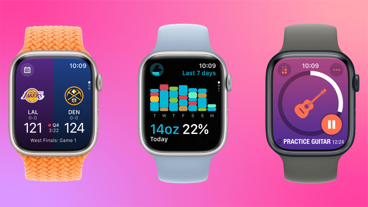
Apple is also making this new page-flipping paradigm available to app developers, allowing apps to use the full watch display for data or animations. So, instead of scrolling down and through information, apps will have the ability to split information into pages that you can flip through using the crown.
Changes to the recent apps dock
As part of these changes to the UI, Apple is also changing the behavior of the side button.
In watchOS 10, rather than opening the dock of recently used apps, a press of the side button will now open Control Center. To reach your recently used apps, you’ll double-press the Digital Crown.
This change brings watchOS more inline with iOS and iPadOS where a double press of the home button, or a swipe and hold of the home bar has always been tied to multitasking and opening recently used apps.
Stock apps use more of the display
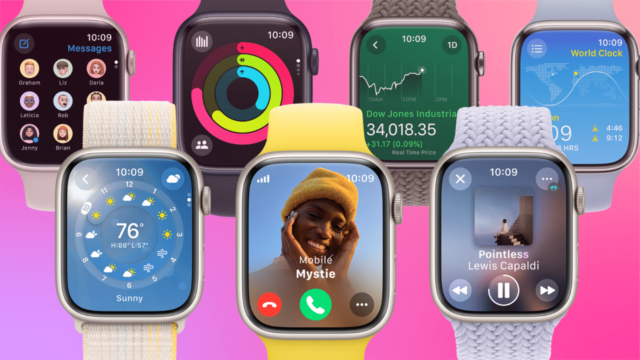
Apple has also updated its stock Watch apps by having them use more of the display to provide more glanceable information. Weather, Stocks, Home, Maps, Messages, World Clock, and others have been updated with the improved look. Plus, the Activity app on Apple Watch and the Fitness app on iPhone now provide more details, improvements to sharing, a redesigned trophy case, and Apple Fitness+ trainer tips.
Two new watch faces
To drive home the usefulness of this new widget-centric UI update, Apple has introduced two new complication-less watch faces.
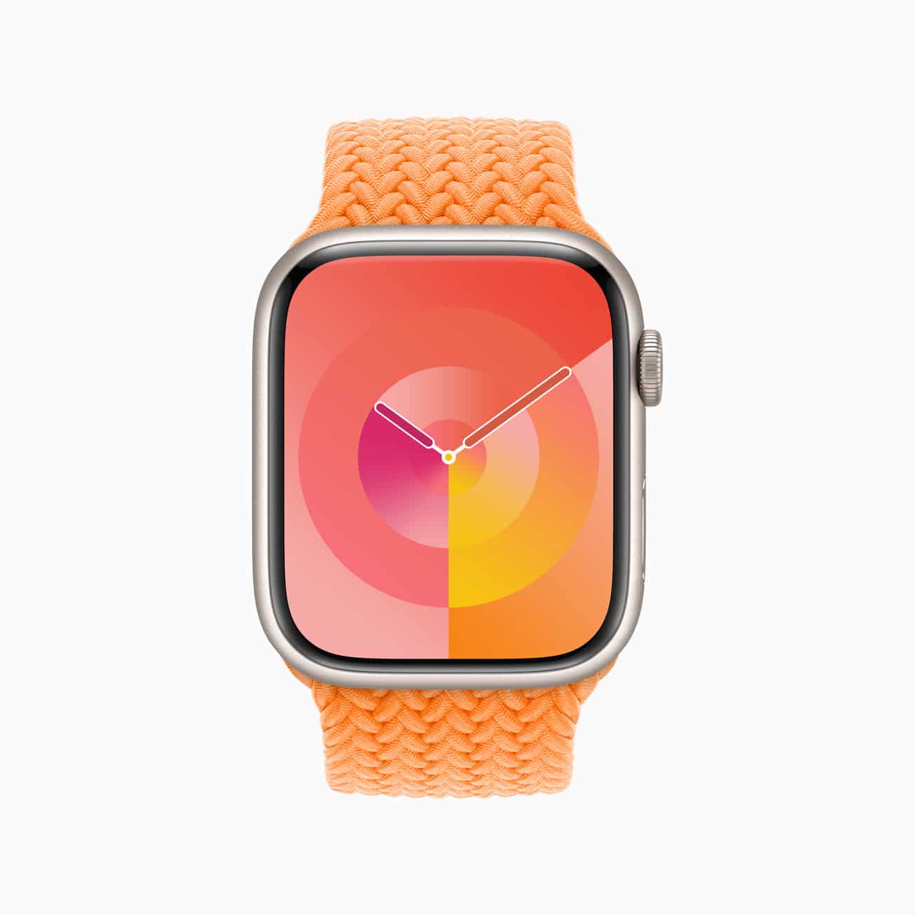
The first is Palette, which Apple says, “depicts time in a wide variety of colors using three distinct overlapping layers, and as the time changes, the colors on the display also shift.”
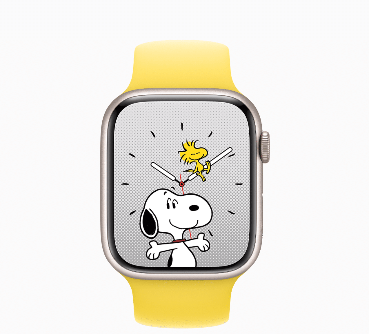
The second new face is the Snoopy watchface. On this watchface, Snoopy and Woodstock from the Peanuts comic strip and cartoons “interact and play with the watch hands, react to weather conditions in the area, or even get active when the user does a workout.”
NameDrop support
Another notable addition to the watchOS experience is the addition of NameDrop.
Announced with iOS 17, NameDrop allows you to bring your iPhone or Apple Watch near another iPhone or Apple Watch to share contact information.
To use NameDrop, Apple Watch users can tap the Share button in My Card inside the Contacts app, or by tapping the My Card watch face complication and then bringing the watch face to face with someone else’s Apple Watch.






Swipe down from the top does not reveal settings or control panel, only notifications. Also swiping left or right from the home screen no longer changes the watch face.