
It has been a long, long, loooong time since I was truly happy with the browser I am using. Compounding that frustration is that we are in the golden age of browsers if you value choice above all else.
But recently, I have experienced the closest thing to browsing zen that I have felt in a long time thanks to the Arc Browser. Made by The aptly-named Browser Company of New York, Arc is not only a complete re-thinking of what a browser should be, but also of how your tasks should flow through it. It’s a truly modern web browser and it’s honestly changed the way I use my Mac.
Arc is a chance to say goodbye to Chrome. If you want to.
Speaking of which, the Arc desktop browser is only available for Mac. (At least for the time being. A Windows release is slated for winter of 2023.) And with the addition of Arc, Mac users now have more choice than anyone thanks to Safari’s exclusivity along with the availability of Firefox, Opera, Vivaldi, DuckDuckGo, Tor, Brave, Edge, and of course, Chrome.
Despite all that awesome choice, it remains a very one-sided affair when it comes to the browser of choice for the majority of users.
Chrome holds a commanding 63% of browser market share across all devices, according to the latest data from StatCounter. Safari is a distant, but respectable, second at 20% thanks to the iPhone, iPad and Mac all using it as the default.
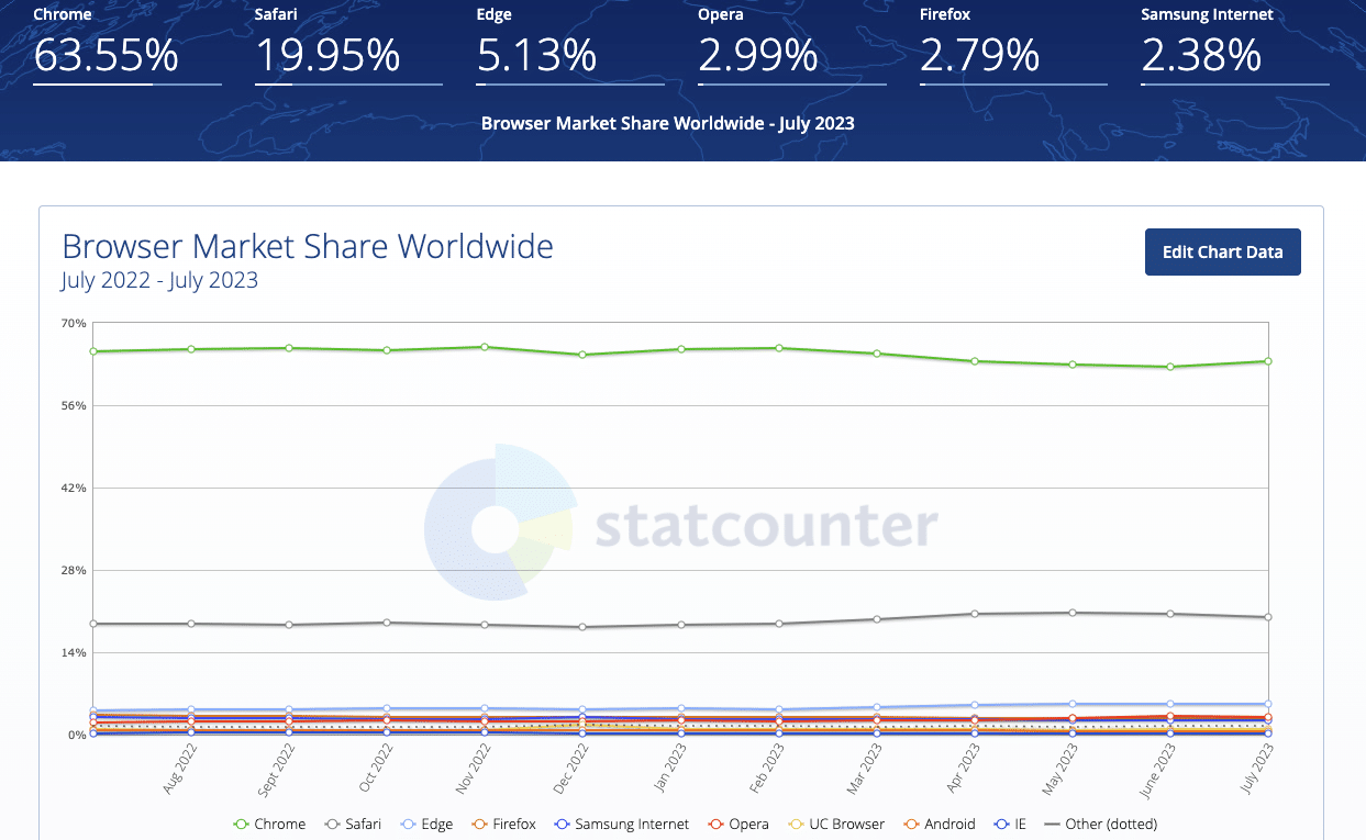
But Chrome’s continued dominance has come into question in recent years—especially if you limit market share to the desktop. Despite establishing the modern browser paradigm as we know it, Chrome has accumulated a reputation as a battery-draining resource hog across all platforms. For years it has been the “best” browser, but also the worst behaved.
Google has made strides in recent years, with support for M-Series Macs and performance optimization that sleeps any tabs you have open that are resource hungry while they’re in the background. But the battery issues remain.
Another interesting wrinkle to the Chrome drama is that most of Google’s browser competition are actually forks of Chrome’s underlying technology: Chromium. Microsoft Edge and Brave are two prominent examples and, depending on the platform, both are better optimized when it comes to performance and battery life.
What Chrome gets right
So, why do so many people stick with Chrome? I can’t speak for everyone, but personally, I always come back to Chrome because it has everything I need and it all usually just works. Yes it drains battery, and yes it hogs memory. But the web is almost exclusively designed these days with Chromium browsers in mind, and as a result, no other browser engine displays pages more consistently than Chrome.
And when you add in Chrome’s excellent profile support—allowing you to keep your work-, school-, and home-related browsing sessions and logins separate—its massive extensions library, and all that baked-in Google goodness like reliable Cast support and device-to-device syncing, it’s a tall order for any competitor to match.
I’ve tried Edge, I’ve tried Brave and they’re…fine. They both do privacy and performance much better than Chrome, but Chrome’s overall familiarity and superior profile support always kept me coming back.
And before I go any further, because I know some of you are glaring at your screen right now—yes, Firefox is great too. It has its own take on profile support via “containers,” it usually loads pages faster than Chrome, it has superior privacy features, and good extension support. Ultimately though, I prefer Chrome’s approach to organizing profiles in separate windows to Firefox’s containers, which are tab-based.
It should be noted that Safari, too, is joining the 21st century with support for profiles in macOS Sonoma.
But the real reason I still can’t stick with Firefox or Safari is page compatibility inconsistency. I use a lot of browser-based apps and tools, and they all load more consistently and perform better in Chrome. At least, in my experience.
“Enter Me,” Arc says, in parentheses
And this is how the Arc Browser found me: begrudgingly using Chrome, a bloated, out-dated browser that actually works, no matter the device, no matter the site.
When Chrome launched in 2008, everything about it was a breath of fresh air. And that’s exactly how I feel about Arc and then some. Outside of Opera’s quirkiness over the years, Arc boasts the most thoughtful browser design since those early days of Chrome.
But here’s the kicker: it’s a Chromium browser. So underneath everything we’re going to dive into in this review, you also get that good ol’ reliable Chromium engine purring away and letting you know everything is under control with excellent site compatibility and full support for all Chrome extensions.
NOTE: The other major thing to know before we move any further is that Arc also runs like a dream on my M2 MacBook Air. Pages load fast, the UI is snappy, and most important of all: it doesn’t single-handedly consume battery.
I have never once glanced at my battery menu in the menu bar and found Arc listed under “using significant energy.” Again, you get all the good of Chrome, none of the bad, and a whole lot more. Let’s talk about the whole lot more.
A beautiful and fun browser
It feels weird to say this, but opening Arc for the first time is…exciting? There’s a well-done intro video that plays upon installation that reminds me of the amazing “Welcome” video Apple used to include in macOS that made a fresh install feel all the better.

Once inside the browser, Arc will hold your hand a bit and take you through all the features that make it unique. It explains its Sidebar interface and shows how deep the customization options within the browser go.
I’ll admit: it’s kind of a lot to learn. But that’s because the team behind Arc is earnestly trying to shift the browsing paradigm.
A sub-OS to macOS
In a lot of ways, Arc is a bit like a sub-OS within macOS. You can say the same thing for Chrome as well—after all Chromebooks are a thing—but Arc expands upon the idea of a browsing OS in ways that make Chrome and Safari feel archaic.
Many people out there operate every day within a Chrome window with countless (hundreds of) open tabs. This is simply no way to live, and I think Arc has the best solution for tab FOMO yet.
At the heart of Arc’s sub-OS is the Sidebar. I initially looked at the Sidebar and said “Those are just vertical tabs. Edge has vertical tabs.” But that is a gross oversimplification.

Yes, Arc places your tabs vertically in the Sidebar. (And no, there is no other display option, so if you’re not open to trying the vertical layout, Arc probably isn’t the browser for you.) But tabs aren’t the only thing in the Sidebar.
What Finder is to macOS, the Sidebar is to Arc. Just as you navigate to different locations on your Mac using the Finder’s sidebar, you use Arc’s Sidebar to navigate to different web pages and what Arc calls Spaces.
Taking this sub-OS idea a bit further, Arc also has built-in split-view in both vertical and horizontal orientations, allowing you to view two tabs at once side-by-side, or one atop the other.
A space for everything and everything in its Space
Just as macOS has Spaces—virtual desktops that you can fill with different apps and window configurations and access via Mission Control—Arc has Spaces as well.
These spaces are contained within the Arc Sidebar and represent the browser’s unique approach to Chrome profiles and Firefox containers. In fact, Spaces is really a blend of the two.
Arc encourages you to use Spaces as a way to keep everything that matters to you within reach, no matter what you’re working on. Each Arc Space has its own favorites grid for bookmarks, its own pinned tabs section, and its own section of open tabs.
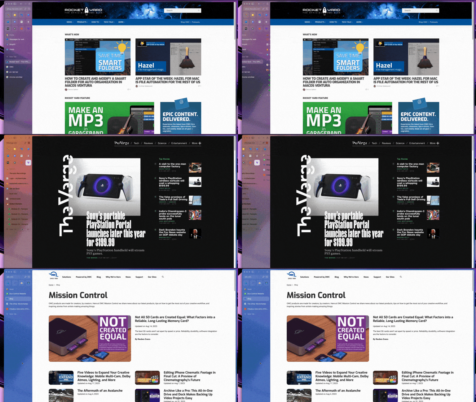
The favorites grid is located just under Arc’s diminutive URL bar. You can drag any open tab into the Favorites grid to save it as a favorite. It’s almost like a mini home screen for your most-used sites or browser-based apps. For instance, Gmail, Canva, Discord, and Google Keep are my Home Space’s favorites grid, along with websites I frequent for news throughout the day.

But Favorites aren’t just tabs turned icons. For certain web apps—Gmail and Outlook for example—Arc has a nifty preview feature that allows you to peek at your inbox by hovering your mouse over the icon.
The other cool aspect of sites in the Favorites grid is that Arc treats them the same way Chrome treats pinned tabs. They stay active in the background as you click between them. After a little while the close in the background and reload when you click back. As of right now, you can only have 12 favorites in your grid.
Thanks to the unique functionality of the Favorites grid, I’ve been liberated from the Teams and Outlook desktop apps because they runs so well as web app Favorites in Arc.
Beneath the Favorites grid are your pinned tabs. These behave pretty much the same as the Favorites grid, but they might not be sites you visit every day. Instead, think of pinned tabs as tabs you don’t want to favorite, but also don’t want to close just yet.

A real power user feature of Arc pinned tabs is the ability to create Folders. This allows you to create a group of pinned tabs with a custom name that expands or minimizes in the Sidebar when you click it. It’s a fantastic combination of ideas that is half-bookmark half-tab.
Finally, below the pinned tabs are your open tabs. These are your throwaway tabs. That stray Google search you performed two hours ago and forgot was open. With Arc, you don’t have to worry about closing these as tabs in this section automatically get whisked away after 12 hours if you leave them there. I can’t overstate how nice it is to not have to worry about closing tabs each and every day, multiple times each day. Arc takes care of it for you.
Each of these features all stay put when you navigate between spaces and even when you close an Arc window or completely quit and reopen the browser. Another very slick feature.
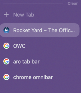
Obviously, the only minor exception to the rule of staying put are your open tabs. They remain if you close the window or quit the browser—but only for 12 hours. After 12 hours, any tabs in this section close automatically to declutter the space. BUT! They’re not lost. They’re just archived. Once a tab is archived, you can swipe right to enter the Library and search through all archived tabs. We’ll come back to the Library in a bit.
Another cool feature of Arc tabs is that you can rename them. If you click a tab and then click the name of the tab, you’ll find that you can edit the text of the tab with a custom name to make it easier to identify.
I have three spaces in Arc: Home, School (for my graduate school program), and Work. Beyond keeping things organized, Arc’s thorough approach to speed-dialing your way around the web saves me massive amounts of time. Because everything stays put between all of my spaces, I rarely ever have to type web addresses or dig through bookmark folders anymore.
Spaces are favorites, pinned tabs, a reading list, and more all in one UI element. I used to swipe like a madman all day between Mission Control spaces on my Mac as I switched between work and personal tasks, which can be fairly disorienting over time. Swiping between Arc spaces feels much more efficient and keeps my focus within one app.
Profiles keep Spaces truly separate
I mentioned earlier how the Spaces feature blends both Chrome’s and Firefox’s approaches to browser profiles.
Firefox containers allow you to have different profiled browsing sessions open across multiple tabs in one window. Meanwhile, Chrome supports profiled browser sessions but only in separate windows. For example, if I have both my home and personal profiles open in Chrome, I have two separate windows open. In Firefox, those sessions could be across two or more tabs.
Both are messy in their own way. Chrome opens a bunch of windows you have to Alt-tab through while Firefox allows you to keep all those differently profiled tabs in one window, which can also make things harder to find when you have a lot of opened tabs.
Arc solves the problem by combining the ideas. Spaces keeps everything in one browser window like Firefox, but organizes your bookmarks and tabs in separate views or sub-windows like Chrome.
But Arc improves upon both ideas as well with its approach to profiles.
Rather than each Space in Arc representing a separate profile, you can assign one profile to one or multiple Spaces. Here’s an example of how that works:
I mentioned before I have three Spaces. Within each Space, Arc gives me the option to assign a profile. When you create a new profile, that profile doesn’t carry over the logins or cookies from other profiles, keeping your personal logins separate from your work and vice versa.
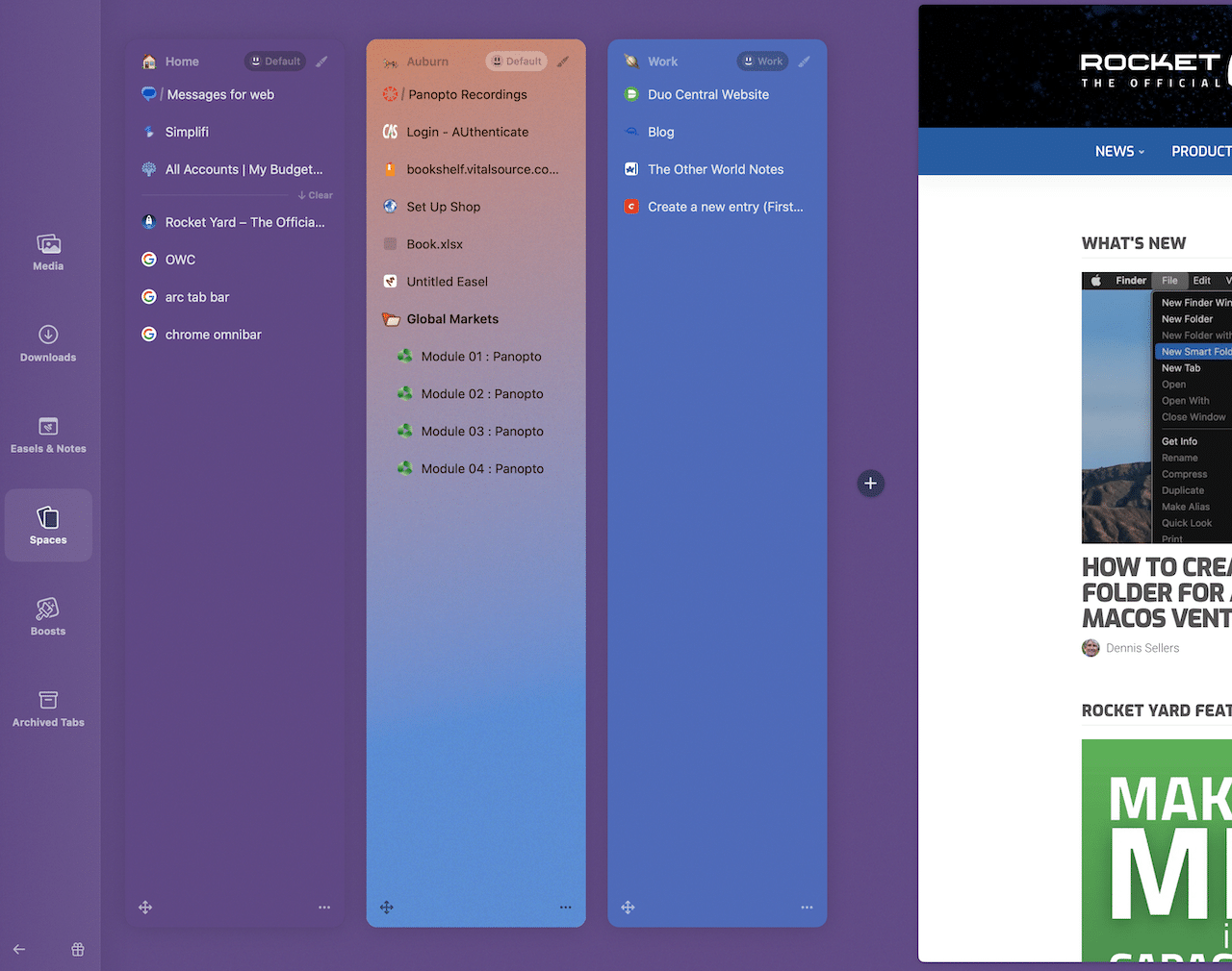
However, Arc allows you to use each profile in more than one space. So, the way that shakes out for me is that I have a Work profile assigned to my Work space and my Personal profile assigned to both my Home and School spaces. I don’t need separate profiles for Home and School because I don’t have any account overlap in those spaces. (My university uses Microsoft accounts, but my personal stuff is all in Gmail and Google Drive.)
A Spotlight on the tab bar
Another novel feature of Arc is the way you enter web addresses or perform searches. Chrome’s Omnibar was one of the browser’s coolest features when it launched in 2008, allowing you to type Google searches and web addresses in one bar, rather than having to visit Google.com every time you needed to search something.
Arc evolves the Omnibar further by combining it with the macOS Spotlight feature to create a unique take on the URL bar.
As I mentioned before, Arc does have a traditional-ish URL bar. But overall, the Arc design demotes the URL bar from the top and center of the browser all the way over to a small space at the top of the Sidebar. You can click it and type addresses and searches into it, but it’s so far out of the way that it’s clear the Browser Company don’t want you to use it that way. (In fact, when you click to copy a web address within the URL bar, Arc nudges you with a keyboard shortcut recommendation: “copy links faster with CMD+Shift+C.”)
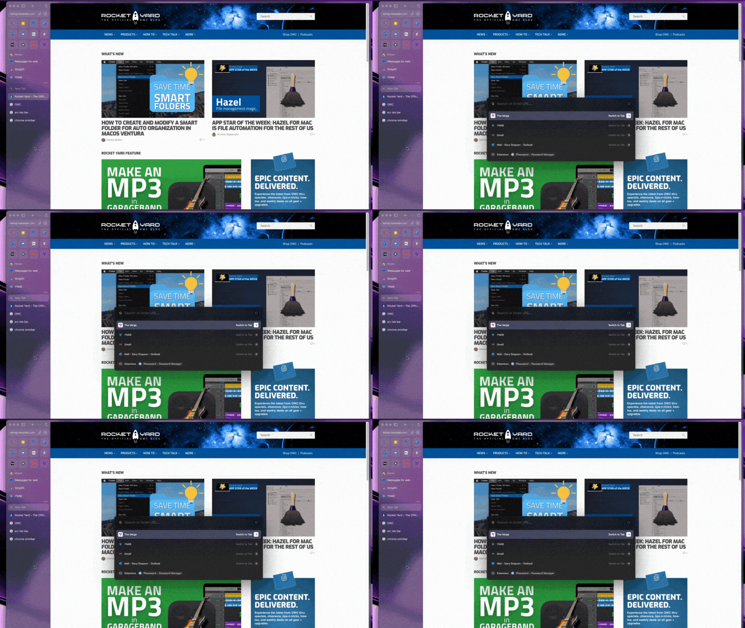
Instead, Arc wants you to use its tab bar. After pressing Command-T on your keyboard, a bar pops up that will look very familiar to heavy users of the macOS Spotlight box or fans of Raycast and Alfred. Just like you can find anything on your Mac with Spotlight and Raycast, you can get to anywhere you need to go by typing in the Arc tab bar. When you hit return, a new tab opens with what you were looking for.
Not only can you type web addresses or searches into the tab bar, you can also find and open to any open or archived tabs. The tab bar also allows you to search and open extensions.
The tab bar is one of Arc’s most compelling features. It saves you a ton of time and allows you to keep your fingers on the keyboard as much as possible.
Library: Easels, Notes, and Boosts
Before we wrap up, I do want to head back to Arc’s Library. This essentially functions like a separate Space within Arc. But instead of Tabs, it’s like the browser’s back-end connection with your browsing history and your Mac.
Within the Library, you can browse your Mac’s media and downloads without having to open the Finder. (This comes in handy several times throughout the day for me.)
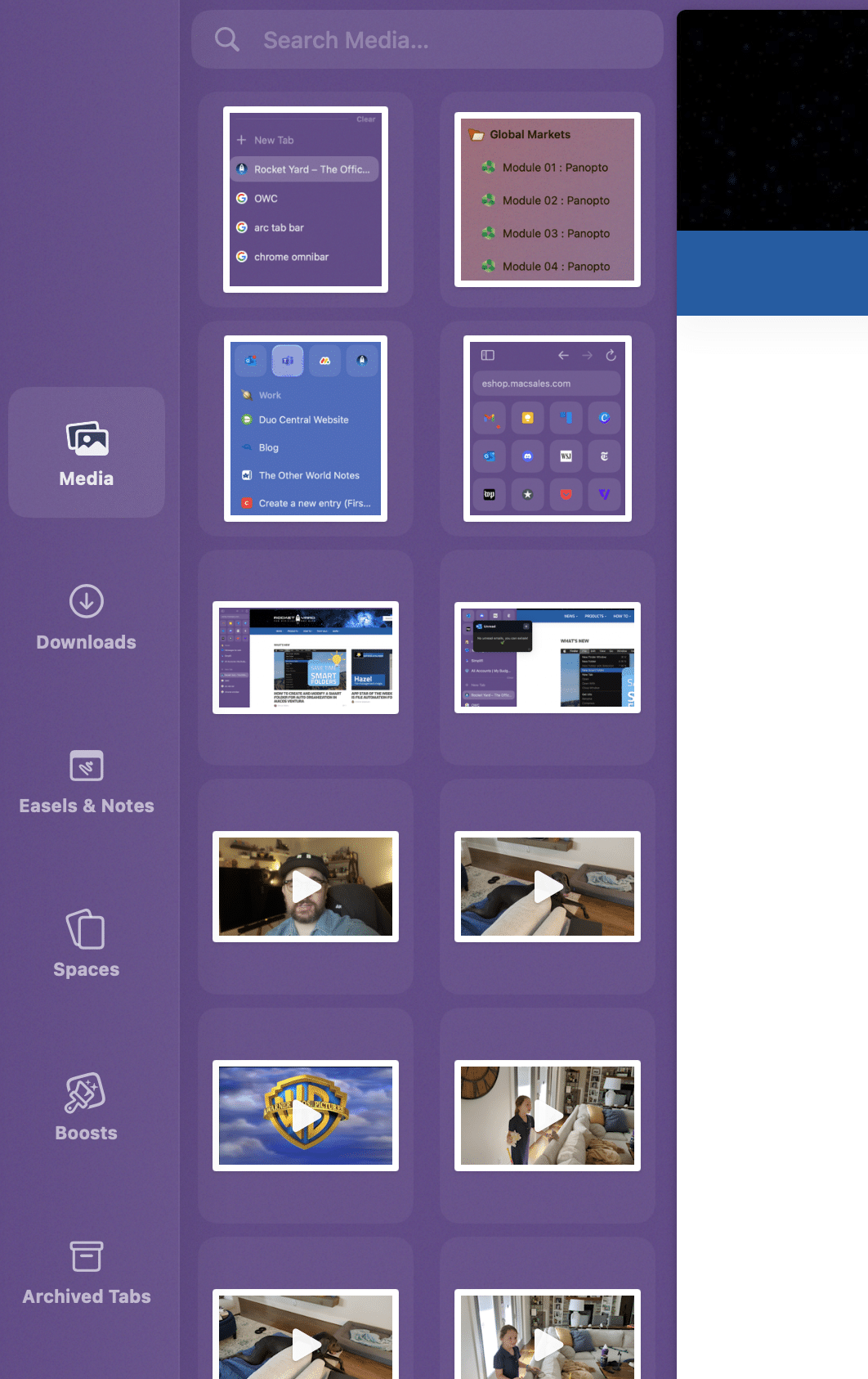
But you’ll also notice a section called “Easels & Notes.” There’s so much to talk about with Arc that we haven’t yet talked about one of the browsers more interesting features: baked-in collaboration and note-taking tools.
From a Space, you can create a new Note or Easel. A note is basically a plain-text note that lives within that Space. An Easel is a digital whiteboard. Both Notes & Easels can be shared for viewing via a link, much like Notion docs. But Easels can be shared, viewed, and edited by those with a link.
Notes and Easels can be pinned like tabs so they hang around. If you close them, you’ll need to head to the Library to reopen them.
Finally, another novel Arc feature stored within the Library are your Boosts. Boosts allow you to customize the colors, fonts, and other elements of any web page you visit. Wish the font was a bit larger on your favorite blog or news site? You can create a boost that does just that in Arc.
Every time you load that page, the Boost will be applied. Or let’s say, a website you frequent doesn’t offer a dark mode option. Arc makes it easy to change the background color of any web page. You can even assign one Boost to multiple websites.
Plus, Arc Boosts even let you “zap” web page elements. Let’s say you’ve got an ad blocker on, but there’s one site that slips through annoying in-house ads. You can zap that element and Arc will even look for related elements to zap as well.
Thoughtful browser design
If you’ve made it this far, I’m sure a non-zero amount of you aren’t totally sold on Arc as your next browser. You might even be saying “Holy crap that sounds complicated.” And I totally get that. It’s kind of a lot.
Plus, one other current minus for a lot of folks out there is Arc’s iPhone app. They do have one, but Arc considers it a “companion” app. In other words, it’s not a full browser. You can perform searches, browse your Mac’s Sidebar Spaces and even pin new tabs to those spaces from your phone, but the app is really designed as a stop-gap for until you get back to your Mac. Some people really like it, others don’t and don’t consider it a “real” browser. I totally get that. To me though, I do consider browsing on my phone as a stop-gap until I get back to my Mac and I appreciate Arc’s attempt to do something different with mobile browsing.
But if all of this seems too complicated, I do urge you to give it a try. If you’re anything like me, you’ll hit your groove soon enough and then start to find features and design choices that are well-considered and thought out. (There are several I didn’t mention here. One of which are “little Arc” windows, pop-up windows that neatly layer over the view of an open tab, allowing you to open a tab within a tab. It’s super userful for web apps like Canva, or opening docs or emails in Teams or Outlook.)
And that’s what I appreciate most about Arc. There’s intention and motivation in every corner of this browser’s design. It’s exciting to have a nice browser again. And that’s made even sweeter by the added fluidity Arc adds to how I work on a Mac.


This guide convinced me to finally try Arc! The Peek feature is brilliant – exactly what my workflow needed. I also started using NoTab and the combo is fantastic. Love how both tools help reduce the mental load of managing dozens of tabs.
Is there a password manager? Extensions? I’ve been using Bitwarden for a long time and couldn’t live without it. (I’m using Window 11 in June 2024 – Arc has been available for Windows for at least a couple months.)
Hey Bill. Arc is built on Chromium so it has very rich extensions support. I’m not sure about Bitwarden, but the 1Password extension works flawlessly for me.
thank you for this excellent explanation of Arc;
I am always looking for better ways to browse; Vivaldi is a great browser that i used over the past few years but after your review and my testing i believe Arc is a real game changer! So few innovations over the last years in browser but now it’s here!
I tried it out and really liked it; however, it doesn’t use the Keychain to store passwords so it makes it a non-starter for me.
I’m one of the 20%, I stay away from google anything that I can, wish this was just based on WebKit instead of chromium. I do not trust google with anything. The only exception is YT, a few years ago I was trying to find an alternative so I could delete my account, but I have a lot of playlists and such there but i still keep my personal info. to a minimum.
I’m with you. Not interested in G knowing everything about me. They are not to be trusted and that is well documented.
Safari works fine for me, I don’t know why people even use tabs.