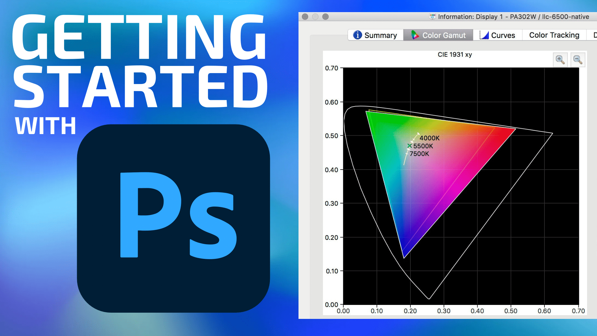
This is the first part of a series of mini tutorials for photographers looking to upgrade their skills and image quality. For photographers, you’ll want to capture RAW images (not JPEG) with your camera for the best possible results.
Adobe Photoshop is an immensely capable image editing application intimidating to newcomers. For that reason, even some skilled photographers end up using Lightroom, an application which makes basic and ajustments to things like exposure, contrast, curves, and colors easy, along with more sophisticated organizational tools. Lightroom is excellent for what it does, but for me personally, it is not nearly as useful for my critical tasks. (Actually, my critical tasks cannot be done in Lightroom, so LR has no value for me.)
Photoshop felt daunting decades ago when I first started usingit. Today it is 20X more complex. Except that the basics are still the basics. I don’t understand how to use 90% of what is in Photoshop, but I also do not need to—I get 99% of the value from with 5% of the feature set.
Over many years based on reader inquiries, I have found that a topic that is not well understood is color management. It is critical to get color management correct, right from the get-go.
Advanced users might enjoy these topics at diglloyd.com: Photoshop, Lightroom, Adobe Camera Raw, Adobe Enhance Details, Adobe AI Denoise as well as general topics like monochrome.
Terminology: Master Image
The term “master image” is used here and in other tutorials. This is the original image from which all other sizes and outputs are made eg a printed image, a downsized image for web display, a desktop background, magazine spread, etc. The master image should be edited in a wide gamut color space and 16-bit color (not 8 bit), so as to preserve the maximum possible quality. Save master images as PSD or PSB files to preserve quality, layers, etc. Formats like JPG should be used only for derivative images made from the master image.
Color Space
On a computer there are no colors—just numbers to be interpreted. Thus the need for color management —mapping numbers to colors based on a color model called a color profile. Numbers by themselves mean little. It would be like saying “I walked 3”… 3 what.. miles, feet, kilometers, football fields? Numbers by themselves need a scope within which they have meaning. This is called the color space or color profile.
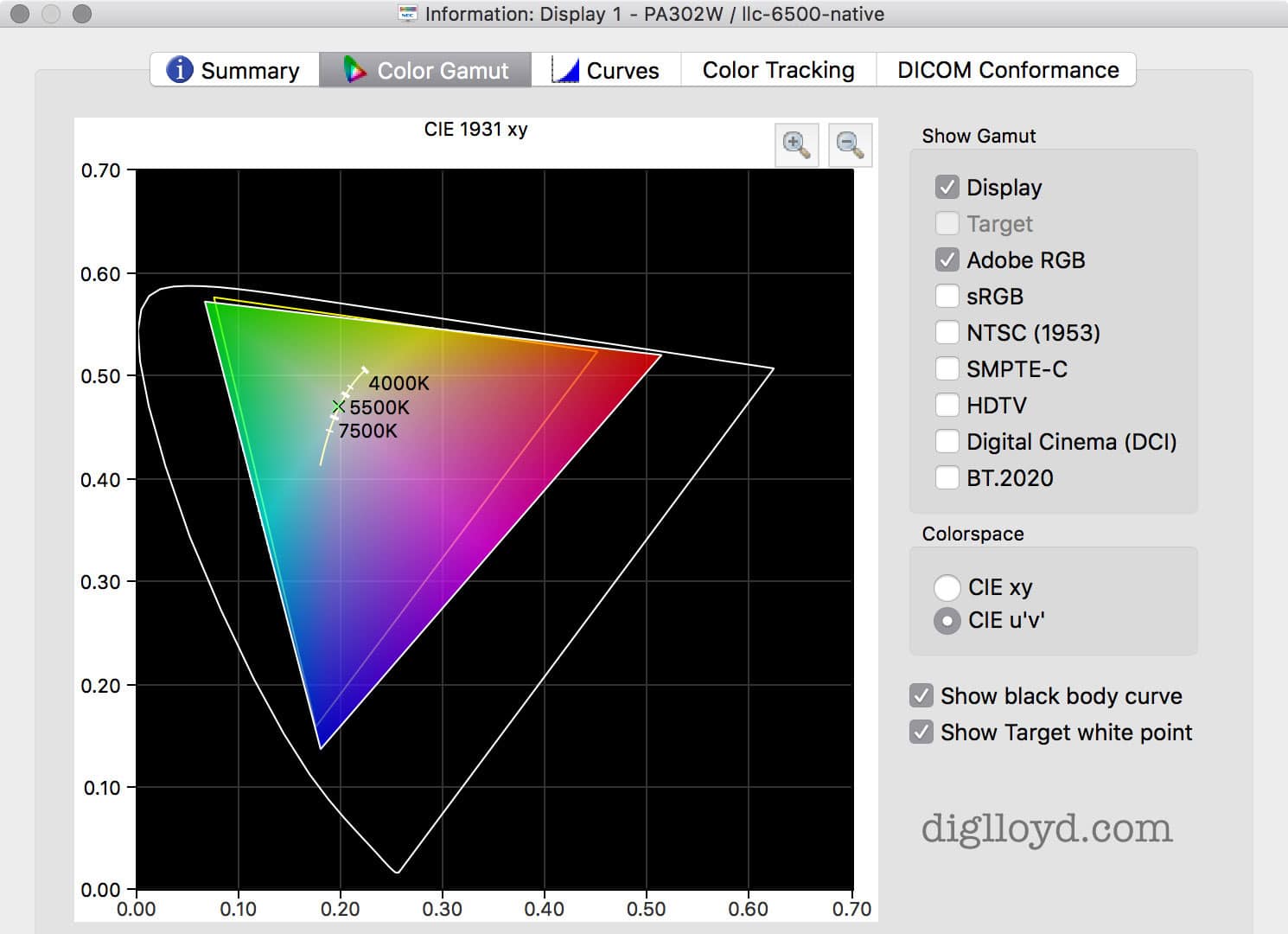
The model that maps numbers to colors is the color space. It defines the range of colors (“color gamut“) that can be represented as well as how to map the numbers within that space to colors. Without the correct color space for the numbers (eg your image), the resulting color can vary hugely in both brightness and the perceived color. Thus the color profile is critical to the correct display of any image. This is why every image should be saved with its color space. The exception is common however: lacking a color profile, software generally assumes sRGB, which works well
Common color spaces include sRGB aka “sad RGB” because the range of colors is severely restricted, so restricted that common real-world colors are crushed. It cannot, for example, ever display a ripe red strawberry, or many types of red fabrics, rich sunsets are rendered drably, etc. This was no big deal when 20 years ago printers and displays had severe limitations, but today’s displays and printers can reproduce an exceptionally wide range of color—more than many displays are capable of showing. Today, sRGB is used only because of inertia, a sad state of worldwide 2nd-rate color rendition.
The next most common color space is AdobeRGB aka AdobeRGB 1998. It broadens the gamut considerably over sRGB, particularly into the reds. While it is a good choice for many purposes, it will clip particularly intense colors. Thus it is an unwise choice for high-grade work.
The most popular wide-gamut color space is ProPhotoRGB. It cannot represent all colors, but it can represent virtually everything available from or to any of today’s devices. For this reason it should be you go-to choice for your “master image” from which is rendered any print or digital output.
The widest color space is Lab (luminance + green/magenta+ blue/yellow). This is what Photoshop uses internally for all calculations no matter the color space. It even includes imaginary colors that no human can perceive (though humans can perceive colors that Lab cannot represent). It is possible to work directly in Lab color mode, but few people do so. Still, I use it in some ways regularly.
Finally, there is human perception, which varies widely among us. Some people have restricted color differentiation (“color blindness”) to varying degrees, even some master photographers do. And some of us have unusually subtle color vision, which makes us much more interested in getting the color right! And a whole range in between.
Photoshop Color Settings
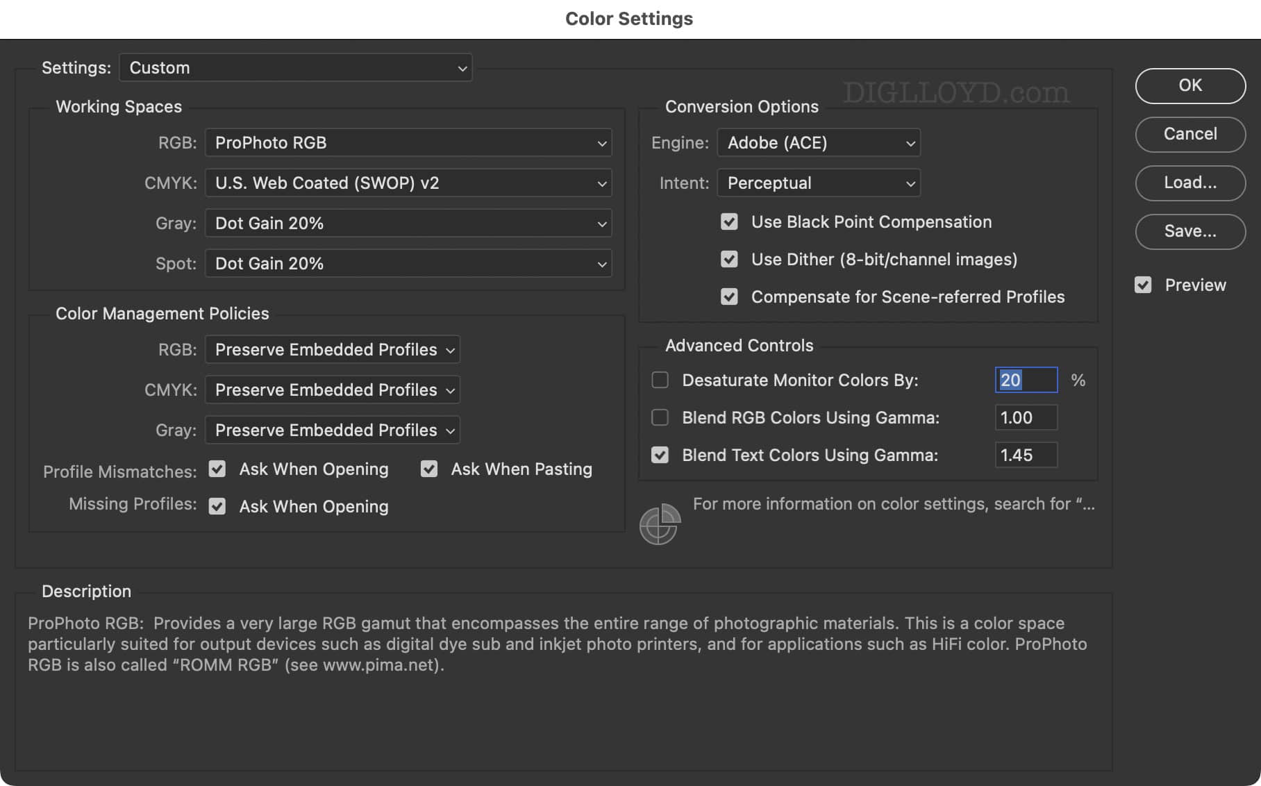
Shown below is a solid way to configure the color settings in Photoshop. Certain settings are crucial, lest the color be whacked when opening files, pasting things, etc. CMYK has no relevance for me, so it can be safely ignored for me and most.
Configure as shown and you can are gold. There is more to the entire process than this, but this is your foundation.
Working Spaces RGB: ProPhoto RGB — this setting utilizes the wide gamut color space. You will also want to work with 16-bit images (not 8 bit).
Color Management Policies: Preserve Embedded Profile — when a profile is present, the numbers are for that color profile only and no other, so it is crucial to use the embedded profile. Anything else will wildly alter color and brightness.
Profile Mismatches and Missing Profiles: Ask — when an image lacks a profile you had best guess the right one, typically sRGB when one is lacking, but sometimes AdobeRGB. Otherwise, the colors and brightness will be wrong
Conversion Options: Adobe (ACE) + Perceptual, etc — no right answer here but Perceptual is generally best for most purposes.
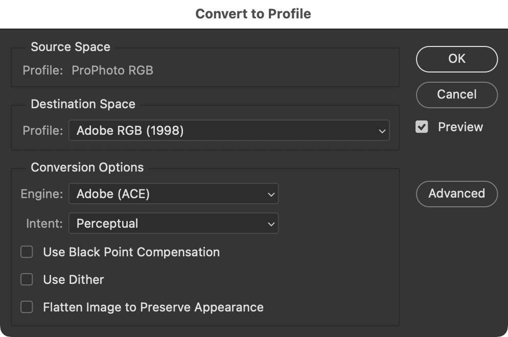
Converting to another color profile
When saving a derivation of a master image for use on the web or elsewhere, it’s best not to leave it in your wide gamut color space if only because of “dumb” applications that cannot render it properly. Convert the image (not the original) to AdobeRGB and be sure to include the color profile in the saved image (an option when saving). That way the image color will be tagged with the right profile. As shown, our image in the working space of ProPhoto RGB will be converted to AdobeRGB:
Checking color gamut
Included for completeness, since it relies on using a color managed display with a wide gamut (topic for another article).
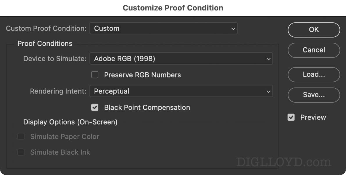
You’ll eventually want to get in the habit of checking whether there is a danger of clipping or crushing colors when converting into AdobeRGB or sRGB.
View => Proof Setup => Custom
View => Gamut Warning — enable to see what areas of the image are clipped, if any.
Use sRGB to check for clipping against the most constrained color space. AdobeRGB is wider and typically does not clip most images.
Conclusions
Working in Photoshop means getting the basics right to start, the most important of which is the Color Settings.
Running out of space on your internal SSD? Get a super-fast external SSD for most working room such as the OWC Express 1M2 or the travel-friendly OWC Elektron.
See also:
How to Setup a High Performance Storage Workflow for Photography and Video
Pure Viewing Pleasure: A 6k Display Is the Single Biggest Upgrade for Photo Enjoyment
The Ultimate Mac Buyers Guide, parts 1/2/3/4/5/6
All Rocket Yard articles by Lloyd
Need help working through your computing or photography system design? Consult with Lloyd before you potentially buy too much or too little, and see my Mac wishlist of current models, first pondering whether refurbished or used Macs might do the job for you.
View all posts by Lloyd Chambers… Lloyd’s photo web site is diglloyd.com, computers is MacPerformanceGuide.com, cycling and health are found at WindInMyFace.com, software tools including disk testing and data integrity validation at diglloydTools.com. Patreon page.
