You’ve likely heard the buzz: macOS 26, “Tahoe,” is bringing a significant visual refresh to your Mac, centered around something called “Liquid Glass.” But what exactly is Liquid Glass? Is it the revolutionary UI shift some are claiming, or just a subtle tweak? And what about those whispers of readability issues?
In short, this is Apple’s biggest visual refresh in years and part of a cross-platform design update spanning iPhone, iPad, Mac, and more. So, let’s dive into the world of Liquid Glass, track its evolution through the macOS Tahoe beta releases, and see how it might impact your daily Mac experience.
What exactly is Liquid Glass?
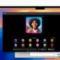
At a high level, Liquid Glass is a dynamic, translucent new system design material that will serve as a unifying design language across all of Apple’s operating systems. It mimics and mirrors the properties of both liquids and glass in the real world, bouncing, blending, and tinting itself based on the content behind and around it on your device’s display.
As a result, Liquid Glass, adds depth with realistic blur/refraction, and adapts in Light/Dark modes so foreground text and controls stay readable (usually). On Mac, Apple calls out that sidebars and toolbars are crafted from Liquid Glass, and the menu bar is transparent by default.
Why is Apple introducing it—looks or purpose?
Both. Apple says Liquid Glass unifies the design language across platforms and provides consistent visual hierarchy so content, not chrome, takes center stage. (Whether or not chrome should take a backseat to content is a question for another day and one we will likely learn the answer to through the Liquid Glass experiment…)
For developers, Apple has new guidance and APIs so apps can adopt the material predictably, which should mean more consistency and less one-off theming across the ecosystem. In Apple’s words, Liquid Glass “lays the foundation for new experiences” going forward.
Bottom line: it’s not just a makeover. The practical goal is a more coherent, content-first UI that feels familiar no matter which Apple device you’re using—while giving developers a standard, well-documented material to build with.
![]()
Is it really hard to read?
Sometimes it can be, depending on your wallpaper and which beta version of macOS Tahoe you may have tried. Early testers noted that text and icons could get lost on busy or high-contrast backgrounds.
However, Apple has been tuning readability throughout the summer beta releases: adjusting blur/opacity, refining tints, and rebalancing where fully “clear” glass is used. Recent iOS/macOS betas include readability tweaks specifically aimed at Liquid Glass.
On macOS in particular, the transparent menu bar sparked a lot of debate. Apple added an option to bring back a solid background if you prefer.
Takeaway: Liquid Glass is still very much a work in progress. Apple’s iterating quickly, and it looks like you will have at least some controls to tone the effect down if it bothers you.
How Apple has dialed it in (beta-by-beta)
Here’s a quick look at the changes users have spotted so far:
- Developer/Public Betas (June–July): Visibility concerns lead to stronger blur/opacity in places; some elements look “frostier” to help contrast.
- Beta 2 on macOS (late June): New toggle to restore a menu bar background for folks who don’t like the fully transparent look.
- Beta 4 wave (late July): Community testers note Apple “added more liquid back,” suggesting Apple is trying to split the difference between expressive and legible.
- Beta 6 wave (early August): Continued Liquid Glass refinement and updates to certain system icons.
Expect a few more passes before the fall release as Apple balances the aesthetic with day-to-day clarity.
How will Liquid Glass change the look and feel of my Mac?
- More depth, less chrome: Sidebars/toolbars look like real glass layers, which tends to push your document or canvas forward visually.
- Airier menu bar: The default transparency can make the desktop feel roomier—but wallpaper choice matters more than before.
- Cross-device familiarity: Apps that adopt the new material should feel more consistent with their iPhone/iPad counterparts.
Overall, Liquid Glass represents less of a big change on the Mac compared to devices like the iPhone and iPad. The changes are noticeable on the Mac, but potentially less disruptive.
Will it impact my workflow or my favorite apps?
- In general, your muscle memory will stay in tact. Unless you’re coming from a version of macOS from a few years ago, controls live where you expect; the change is largely visual.
- Readability in pro setups: If you run bright/busy wallpapers across multi-display rigs, you may want to tone down transparency or pick calmer backgrounds to keep labels crisp. Recent betas have been targeting readability specifically, but there is still work to be done.
- Third-party apps: Many will inherit system materials as they update to new SDKs. Apple’s guidance/APIs should speed adoption, but you’ll see a messy transition period where some apps look fully “Liquid Glass” and others keep their current chrome. Hopefully this transition period is brief, though it will be interesting to see if developers adopt and “agree” with the new design language or if they reject Apple’s vision of the future.
If it’s hard to read: Quick fixes on macOS
Reduce Transparency: System Settings → Accessibility → Display → Reduce transparency (replaces glassy backdrops with solid fills).
Bring back a solid menu bar: System Settings → Menu Bar → toggle Show menu bar background.
Choose a calmer wallpaper: High-frequency or super-bright images can clash with transparent chrome; swapping to a simpler background often helps immediately. (This is the same reason Apple applies subtle gradients behind the menu bar.)
The short answer
Liquid Glass is mostly good news. It modernizes macOS, lines it up with Apple’s other platforms, and—when tuned right—keeps your content front and center. Apple has already made multiple readability improvements in the betas, and you can still dial it back with a couple of toggles if you don’t love the fully glassy look.