 You know those rumors about how Apple had something exciting to showcase on Sunday?
Yeah… well… it really depends on your definition of “exciting.”
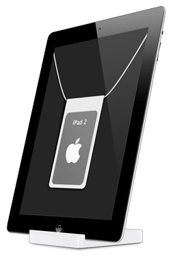
Apple “refreshed” its stores into what they’re calling “Apple Store 2.0” Its primary feature… all the paper info sheets that used to stand with the products have been replaced by iPads on little Lucite stands.
I’ll admit, it’s kind of nice to see a “green” alternative to paper cards which become obsolete once one minor specification changes. And, it would seem that several pages on an iPad can convey a lot more info than what I recall seeing on one of those single sheets. However, I’d avoid visiting the iPad display if you’re on any prescription medication – seeing iPads being used to display specs of other iPads might prove to be a bit trippy.
These iPads are running some customized firmware that disables the Home button, and they don’t seem to be powered off of a standard 30-pin connector (which makes it a convenient way to tell the difference between the “info” model and the “demo” model in the iPad display).
However, possibly the most convenient thing about this display is the button to page an Apple Specialist – something that my past experiences at the local Apple Store have shown to occasionally be more difficult than it should be.
So was all this worth the hours we dedicated to speculating on this? No, probably not.
But at least now we have yet another reason for iPad 2’s being so hard to come by.







Hmmm. With the energy/electricity consumption of an electronic device, I truly wonder how green it is to use iPads over a small slip of paper. I’m sure I’ll be corrected, but it seems similar to the idea of Prius cars: sounds like a great green idea, but after the costs of the carbon emissions are accounted for from the transporting of the massive batteries from China to the U.S. there is much less “green” than first realized.
We are so used to great ideas coming from Apple (and MacSales!) that as cool as this is, it’s seems a bit of a yawner to me.
That’s a good point. And I agree, this “upgrade” is a bit of a snoozefest; I was really jonesing for something really groundbreaking.
Though not neccesarily a “green” benefit, at least the info for the stuff they’re selling shoud (theoretically, anyway) be as up-to-date as possible. Something nice to know when new hardware comes out…
iPods with color displays then adopted some Mac OS X themes like Aqua progress bars, and brushed metal meant to evoke a combination lock. In 2007, Apple modified the iPod interface again with the introduction of the sixth-generation iPod Classic and third-generation iPod Nano by changing the font to Helvetica and, in most cases, splitting the screen in half by displaying the menus on the left and album artwork, photos, or videos on the right (whichever was appropriate for the selected item).
i think this is nice to see iprovements……..