 You know what can be really annoying? Bringing up a web page on your iPhone or iPad and having it default to a mobile version instead of what you’d see on your Mac or PC. Yes, responsive web design is making websites – including this one – look great in Safari on your favorite iOS device, but not every site has embraced the ability to automatically scale down and reformat all content to a smaller screen. In many cases, it’s just better to ask Safari to show you the original website in its full desktop glory.
Fortunately, it’s not that hard to do this. As an example, at right is the mobile home page for a “bistro and wine bar” near me. When I called up the page on my iPhone 6 Plus, it redirected to a “mobile website server” version of their website.
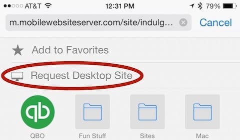
Sure, that mobile version is readable and has some of the information I want to see, but on the big screen of my 6 Plus the desktop site is very nice – especially in landscape orientation. In iOS 8, it’s easy to ask for the desktop version. Just tap in Safari’s address bar, which displays the Favorites screen. Next, swipe down slightly on the screen to reveal two “hidden” commands – Add to Favorites and Request Desktop Site.
Tap on the latter command, and Safari reloads the page as it would appear on a desktop machine. As you can see below, this restaurant’s desktop web page looks quite nice, especially when viewed in landscape orientation.
Note that this won’t work for those responsive websites, as they scale and reformat the content down to fit into the width of a browser window. In many situations, you may be able to see the desktop version of a responsive page by simply viewing the page in landscape orientation.


