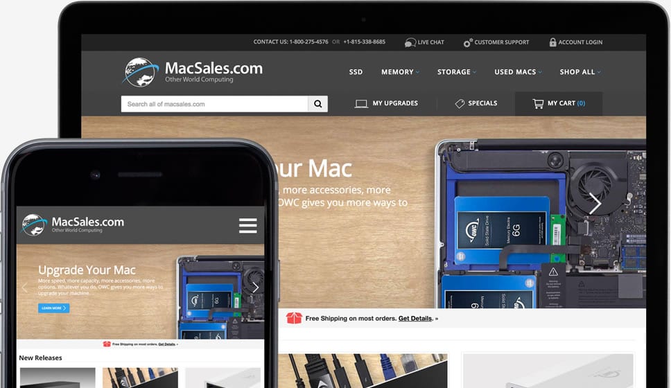
Our mission at MacSales.com has always been to help users improve their Mac experience as quickly and efficiently as possible. This is done by conveniently providing a variety of computer-related products and accessories, including SSDs, memory, external storage, and much more, at affordable prices.
And now, as a part of that mission, we are working to improve your overall shopping experience with MacSales.com so you will be able to find the gear and upgrades you need faster and more easily than ever.
Soon, we will be launching a refreshed MacSales.com featuring a new homepage, an improved search with more accurate results, as well as updated mobile and tablet sites. You can give the preview of the new MacSales.com a look right now and let us know what you think.
But while the site will look and function differently than before, its mission will remain the same: to feature the great products, services and support you have come to expect.


Yeah! You support mobile devices now!! :-)
BOO! Font is so small on my iPhone 5s that only ants can read it. :-(
IOW: Don’t just slap on a menu button and resize the page to fit screen. You also need to make content usable on small screens.
Ok… Looks pretty good. Some points…
On the new website:
1.) Couldn’t at all find any link to:
http://blog.macsales.com/
[EDIT: After writing all this, finally spotted the link to it, within the white banner, *above* the dark grey footer, at the bottom of each page.]
2.) *Initially*, couldn’t locate any links to:
http://eshop.macsales.com/shop/Thunderbolt/
*Eventually* found links to that Thunderbolt page:
a.) all the way down in the dark grey footer of all pages
b.) a bit over half-way down the main page, in the Thunderbolt section there (which obviously wasn’t initially evident to me), and
c.) finally *after* bothering to turn JavaScript on — within the Storage menu located at the top of all pages.
Like many other folks, I only turn JavaScript on when actually necessary, which means I almost always browse and research products on your site with JavaScript turned off.
So, for me to hop over to the Thunderbolt page on the new site, I need to remember to scroll down to the links all the way to the bottom of each page.
However, I really suggest you consider adding direct links to the Thunderbolt page, and to your blog, up in the header, at the top of each page — as has been done there for the (OWC) SSD page.
I also suggest adding a prominent section category link to the Thunderbolt page, on this page:
http://eshop.macsales.com/shop/storage
— which, of course is where I first looked for it, and initially couldn’t find any way of getting there — not even from the pages of individual Thunderbolt devices which I did locate.
Also, while the big slideshow on the main page looks very nice, it’s also very big. It normally takes up a good portion of the visible part of the page when it loads, and takes even more real estate when those with poorer vision or who are trying to reduce eye strain, are normally zoomed in at 125% or 150%.
That slide show, as it is, will both make it more likely that I’ll try to keep JavaScript turned off while visiting and navigating your site, and also more likely that I’ll try to avoid navigating to the main page both initially, and while browsing your site.
Thanks!
Hi, MD. We appreciate the thoughtful feedback!
You’re welcome. Here’s some additional feedback…
Fyi, further regarding usability:
At a functional browser zoom of 125% to 150% (as I’ve referred to above, to reduce eye fatigue), the otherwise fairly nice banner/header at the top of every page is:
1.) HUGE — Because of its initial size, and the *way* it’s *formatted* to begin with, it BLOWS UP unnecessarily large, and takes up way too much of the browser window’s display,
2.) and WORSE — it’s *fixed* to the top of the browser window display on every page, so it doesn’t scroll up and out of the way. So, what would otherwise be an aid in quick accessibility to the banner/header links, instead becomes an huge impediment to accessibility and usability, because it ends up hiding much of viewable area on *every* page on your sales site, that would otherwise be visible.
System Notes:
These observations made using the latest version of Chromium on OS X (likely wouldn’t be much different in Safari, in my experience), fullscreen, configured for maximum viewable page area, on a 17″ 1920 x 1200 display set to 1680 x 1050. Again, this is set up to reduce eye fatigue while reading and comparing product details — and with Javascript normally disabled.
User Notes:
Frankly, while actually trying to work with your site (shopping for memory and drives for different systems, etc.), I quickly found I couldn’t stand it any more, with that inflated banner hiding a huge portion of every page while I’m trying to look up and view your products, so I’ve given up. While working with your site, it got really annoying really quickly.
I’ve left the beta, and returned to only using your original site.
Sorry, I don’t intend to spend anymore time on the beta site at this point. With its banner/header formatted as it is, either I can’t see a good portion of each page — or, I have to reduce the zoom level, and unnecessarily increase vision fatigue while extensively reading through and comparing product specs on your site. Obviously, given all the hours I spend at keyboards, staring at screens, I’m not going to do the latter.
If this situation doesn’t improve by the time everyone’s forced to use the new site, I really don’t know what I’m going to do. It wouldn’t be worth my trouble to hack together a browser extension to reformat your site, because I wouldn’t even be able to install it on all the different systems’ browsers that I access your site from, anyway.
I haven’t looked lately — are all your products actually listed on Amazon now?