![]() The Finder is the operating system’s default file manager for viewing and working with the Mac’s filing system. It allows us to easily see and work with the hierarchical organizational structure inherent in our Macs. To help us easily find, access, and organize our files, the Finder offers four different methods of viewing the filing system.
The Finder is the operating system’s default file manager for viewing and working with the Mac’s filing system. It allows us to easily see and work with the hierarchical organizational structure inherent in our Macs. To help us easily find, access, and organize our files, the Finder offers four different methods of viewing the filing system.
In these two guides, we’re going to look at each of the four viewing options: Icon, List, Column, and Cover Flow; the viewing options that are available for each view, and some of the quirks and characteristics of each.
We’ll start with Icon and List view, two of the most often used views. In Customizing Finder Views: Part 2, we’ll look at the ins and outs of Column and Cover Flow views.
Icon View
To set the current Finder window to display items as icons, select Icon from the window’s toolbar; it’s the first button in the View section of the toolbar. You can also select View, As Icons from the Finder menu bar.
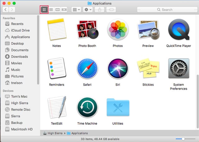
Icon view is the default Finder view, and is characterized by the use of icons to represent the items contained within a folder, usually files and other folders although other item types could be present, such as various types of links.
The icons can be plain default images supplied by the operating system, or custom icons created by an app developer or the end user to bring a bit of color and style to the desktop.
Icon Options
Icon viewing options are available whenever a Finder window is the front most active window, and the Finder window is set to Icon view.
To change the icon options, select View, Show View Options from the Finder menu bar, or press the Command + J keys.
The View options window will open, displaying the various icon viewing options:
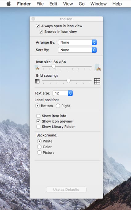
Always open in icon view: When selected, the current folder will always open in icon view. If deselected, the folder will open in whatever the previous view setting was.
Browse in icon view: When selected, the Finder will apply icon view to any subfolders within the current folder as you browse through them.
Arrange By: This dropdown menu lets you select the criteria by which to arrange items; the options include by name, kind, and date. The Arrange By option also interacts with the Sort By option. You can use them together to control the sorting order within an arrangement of items. For instance, when you arrange by kind, which will gather all images together, apps together, and documents together, you can then use the Sort By option to have the items within each group sorted by name, date, and size.
Sort By: Offers a number of sorting options, including name, date last opened, size, and tags. In addition, if Arrange By is set to none, you can use Sort By to force icons to snap to an invisible grid.
Icon size: Use this slider to reduce or enlarge the icon size. You can select from 16×16 to 512×512 pixels.
Grid Spacing: Use this slider to adjust the spacing between icons.
Text size: Use the dropdown menu to set the font size of the item name.
Label Position: You can set the item’s label to appear at the bottom of the icon or to the right of the icon.
Show Item Info: Selecting this option will display additional information about an object, such as the size of an image in pixels, the number of items in a folder, or the length of an audio or video track.
Show Icon Preview: This option allows the icon for some file types to display a thumbnail preview of the file’s content.
Show Library Folder: This option is only available when the window is displaying the contents of the home folder, and you’re using OS X El Capitan or later. Selecting this option will allow the normally invisible user library folder to be displayed.
Background: You can select from three background types:
White: This is the default.
Color: You can select a color to use from the color picker that appears.
Picture: You can select an image to use for the window’s background.
The Best Use for Icon View
Icon view has a few special features lacking in other views. The first is flexibility; you can arrange the icons any which way you like. This is similar to how a real desktop behaves, allowing you to pile items around the desktop anywhere you want.
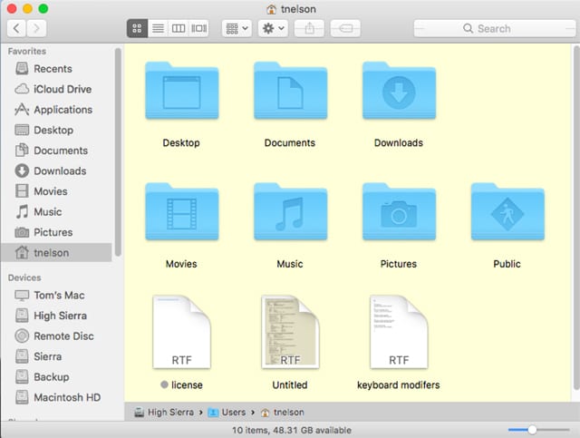
If you need a bit of guidance to keep the window or desktop a bit less cluttered, you can enable snapping to the grid, or occasionally issue a cleanup command that will temporarily rearrange the icons so they line up to the invisible grid. To do this, select View, Clean Up from the Finder menu.
In addition, icons give you a hint as to what is contained within each item. This is especially true if you have turned on the icon preview option mentioned above.
Icon view is best, then, for those who want to arrange items the way they want.
Tip: Window view options are set on a per folder basis, allowing each folder to have its own set of options. Use the color or background picture option in Icon view to make a folder you access often stand out from others.
List View
List view may be the most popular of the Finder views. Some people prefer Icon view; I tend to use List view a lot.
To set the current Finder window to List view, select View, as List from the Finder menu, or use the Finder toolbar to select the second button (it looks like a page with lines) in the View group.
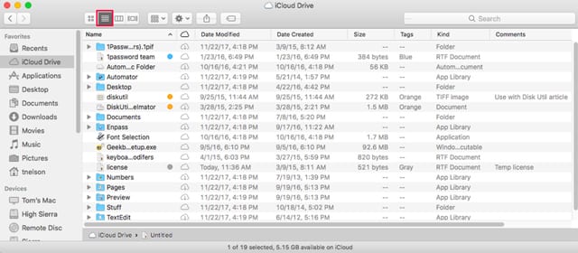
List view is compact, displaying each item in the window as an entry in a list. Think of a spreadsheet with rows and columns. Each item is a row, and the columns show the item’s name, date modified, date created, size, and kind. Actually, there are a number of column types you can have displayed in list view, which brings us to how to customize the list view.
List Options
To change list options, select View, Show View Options from the Finder menu bar, or press the Command + J keys.
The View options window will open, displaying the various list viewing options:
The first few options are identical to the Icon view options, so I’m going to refer you to the descriptions above for:
Always Open in List View
Browse in List View
Arrange By
Sort By
Text Size
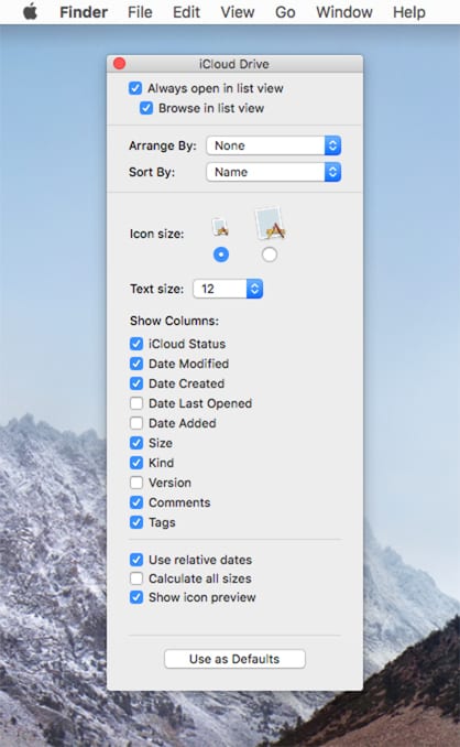
The items unique to List view start with the list of Columns that can be viewed:
iCloud Status: This column displays an iCloud status icon indicating whether the file or folder is only in iCloud and you need Internet access to see its content (a cloud with an arrow pointing down); not eligible to be stored in iCloud (a cloud icon with a prohibition slash); downloaded and up to date (a cloud icon); waiting to upload (a dotted cloud); and out of space (a cloud with an exclamation point). The iCloud status column is only available when using the iCloud storage service.
Date Modified: Displays the last time a change was made to the item.
Date Created: Shows the date the item was created.
Date Last Opened: Displays the last time the file was opened.
Date Added: This is the date you added the item to the current folder.
Size: Displays the file or folder size.
Kind: Shows the item type, such as PDF, URL, Folder, or JPEG.
Version: Lists the version number for apps.
Comments: Shows any comments that have been entered for the file. Comments can be entered by right-clicking a file, selecting Get Info, and adding text to the Comments field.
Tags: Displays any tags associated with an item.
Use relative dates: This allows the use of terms such as Today or Yesterday instead of actual dates in any of the date-related columns.
Calculate all sizes: Forces your Mac to calculate the size of all folders and any subfolders they contain; the size is then displayed in the Size column. This can take some time, so unless you have a need to know the size of all the folders, I suggest leaving this disabled.
Show icon preview: List view makes use of small thumbnail icons that can be set to show a preview of the item.
The Best Use for List View
List view offers a lot of information about each item in a Finder window, and does so using a compact view that puts the most amount of information in as small a place as possible.
With the customization options available, you can choose which information is important to you and which can be hidden, taking up less space. You can even browse a subfolder by clicking on its disclosure triangle, all within the same window, something you can’t do in Icon view.
List view is best when you need to sort the information in a window by any of the column heads. Simply click on a column head to sort by the column head property, such as Size or Kind.
Tip: Sort the List view by Date Modified, and the files you most recently used will appear at the top of the window.
Discover how to use Column View, Cover Flow, and additional Finder tips in Mac 101: Customizing Finder Views, Part 2.










I have transferred a bunch of photos from my PC to my cousin’s Mac. For each picture – I typed descriptions into the “SUBJECT” field for each photo. In the list above – I don’t see SUBJECT as a column option to display in the Finder. Am I going to have to move all of those descriptions into the COMMENTS field? – or does the Finder have a way to display other file info fields like SUBJECT?
I would like to know what all of the standard file icons mean. I have one that looks like a disk drive with an arrow pointing at it and don’t know what it means.
Where do you see this icon, and what does the arrow look like?
Is there a way to change the color of the background in list view to black and the text to white? I currently am running High Sierra.
thanks.
I’m not aware of a way to change the background/text colors that would only affect the Finder’s list view. However you can invert all colors on the display, which would make the list view background dark and the text white.
Of course it will also invert everything on your display.
To give it a try launch System Preferences and select the Accessibility preference pane.
In the sidebar, select Display.
Place a checkmark in the box labeled “Invert colors”.
If anyone know how to change just the Finder view, let us know.
Tom
How can I show a list of my photos or videos with dimensions? I want to clean up and remove those below a certain level.
For example
Filename dimensions
file1 420×420
file2 1440×810
If your images are located in your Pictures folder, you can add a Dimension as well as a Resolution column to the Finder. Right-click any of the columns and place a checkmark on the Dimension or Resolution items. The columns will be added at the far right of the window. You can drag them to where you wish.
Thank you. I had to change the folder name for this to work. Seems odd that the name of the folder determines which attributes can show up.
How does one change the font size in the left hand panel of the List or other views?
The sidebar font size can be changed from the General preference pane. Use the Dropdown menu named Sidebar icon size. This will also change the size of the text and icons in the Mail app.
Tom
So glad I found this tip, but for clarity, it’s the General preference pane in System Preferences, not in Finder preferences. I don’t want to admit how long it took me to figure that out. ;-)
What determines the size of a Finder window when you open it? Sometimes it’s the same size as the last Finder window, sometimes not. Also, I like to have 6 separate Finder windows open on my screen. Is there any app that will let me instantly open them all simultaneously at the same size and arrangement every time? Thanks!
Very useful. I learned so new tricks!
I hope you’re going to cover the Column view and the Cover Flow view.
I find the List View great for sorting and searching, but for normal everyday viewing of files I like to have the full path showing. It also helps me with hierarchical tracking to the file I want. The Cover Flow view is very helpful when wanting to look at image files quickly without having to wait for the image to load in something like Preview. I think all the views have their purposes and best use scenarios.