A lot has been written about Apple’s new iOS 13 that was released late last week, and by now you are likely familiar with many of the changes – even if you haven’t yet updated.
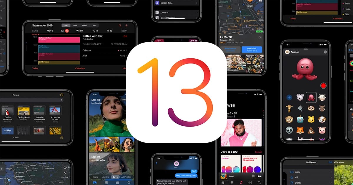
Here’s a quick punchlist of some of iOS 13’s key features…
- Dark Mode
- Sign in with Apple ID
- All new Photos app
- New Maps app
- QuickPath swipe-to-type
- Siri with neural TTS (and new Indian English voice!)
- Shortcuts app
- Re-tooled CarPlay app
- And of course, the much-anticipated mouse, octopus, and cow Animoji characters. Moo.
Obviously, the list of updates and new features is vast and goes well beyond the few listed above. But if you are so inclined, check out the comprehensive list on Apple’s iOS 13 feature page.
My Fave
I’ll admit, I’m a simple man. My favorite new feature (as of this writing) has to be Dark Mode. Having a background in coding and development, I quickly learned about eye fatigue – text editors like Sublime Text and BBedit that had Dark Themes were a lifesaver. The contrast of light-on-dark, as opposed to dark-on-light, made all the difference in the world and allowed me to code well into the wee hours.
Now with the new Dark Mode in iOS 13, we can all have our noses buried in our devices for 16 hours a day instead of 12. Thank you, Apple.
Your Fave
Now it’s your turn! The real intention of this post is to open up the floor to you, our faithful Rocket Yard readers – so let’s engage in a little conversation!
- What are your favorite and/or least favorite features of iOS 13?
- What’s missing or what shouldn’t be there?
- What do you like or not like?
- What would you like to see Rocket Yard dive deeper into and write more about?
One word answers are fine, novellas and white papers are okay too!


I am still in the process of getting to Catalina, Slow to jump into new upgrades. I have done the iOS for the phone and iPad, also like the dark mode, at 80 its easy on the eyes. You are my favorite source of information, THANK YOU.
I struggle with iCloud and fear getting locked into something I won’t like. I understand some of the adavantages, but as an old timer (35yrs in Computer Operations) I like keeping control of my stuff and doing my own back ups.
So off to study up on installing Catalina–maybe by end of next week.
We are so glad that you find the Rocket Yard blog useful – it’s why we do what we do!
Good luck with Catalina – we have several articles on installation (clean install and upgrade install) and common errors you may run into if you’d like to take a look! There is also some great conversation in the comment section of Why Waiting to Install macOS Catalina Might Be a Good Idea that might be worth checking out!
I love the Car Play update. I had quit using my iPhone for music in my car after updating my car stereo to an Alpine unit that supported car play. I was disappointed in the presentation of music and podcasts and wrote to Apple and Alpine both to express my feelings. I had went back to using my iPod Touch since the interlace was much more to my liking.
Needless to say the upgrade after iOS 13 is amazing. Rock on Apple :)
I like Dark Mode, but sometimes it’s too dark—a dark gray would be perfect for me.
Also, the way you update apps feels awkward now and (to me) not intuitive. it was easier and more straightforward before,
I see that Maps finally has voice navigation again. Not sure if that was part of iOS 13 or not. So necessary!
I hate the way you have to update apps in the app store. The old way was much more intuitive. Now one has to scroll through them to see what is new and updated. Updates should be at the top level of the app not hidden away behing the user.
Well, I’m not happy with 13, and that’s an understatement. This is the worst thing for me that Apple has ever done. I typically wait until others work out all the kinks before installing a new IOS or OS, but I had to bring in my phone yesterday for an easy fix and they told me to upgrade beforehand. Apple made a change in the new IOS that even their top level tech people didn’t know about. They merged all contacts. For me, I have at least two numbers for every student: the student is first and listed as iPhone and at least one parent is under the student by name. Whoever I’d texted last before the upgrade is now the default and the ONLY person I can text, even if I type in the number. It just goes to the one I last texted. I was on with, well, everyone at Apple chat, including a top tech supervisor. He is as shocked as I. He had no idea until he spoke with the engineering department. He said “The Engineers have stated that this is expected behavior. Threads were changed for iOS 13 to merge multiple contact numbers; purposely. No further action is needed.”
There is no way back and the only way to fix this is I have to go through my contacts and delete every student and parent from contacts and delete every text thread and then add to contacts under separate names. I do believe that will take days. I’m absolutely disgusted that they did this and that there was no warning, not even to their tech people! WTH, Apple?????
I really like the pop-ups that tell me how many times an app has accessed my location in the past 3 days. It also gives me the option to turn this function off except when I am using the app.
I am a huge fan of Dark Mode myself…
Except when using Siri to use maps while navigating.
Dark Mode in Maps does’t cut it for me, especially at night.
Fortunately, I can have Siri toggle Dark Mode off and then on again, which was surprisingly delightful since she seems to be somewhat useless for telling apps what to do in so many situations.
For that matter, I hate Dark Mode when reading my e-mails, even on my iMac or MBP. It’s a pain in the butt to have to go to Messages > View At > and switch to black-on-white for every single message.
Ideally, Apple should make Dark Mode optional for each and every application in both macOS and iOS.
Hi… I have to say the ability to use a Bluetooth mouse.
And the ability to control double-click speed and tracking.
I don’t like getting a mail alert and then seeing blank entries until I tap on them.
IOS 13 is slower, on my “old” X Max.
(Teaches me to install a dot zero version!)
Interesting. I haven’t had the “blank entry” problem. It seems to be operating just like iOS 12 was. At least in my notification center.
It likely is just me. I’m the one who causes supermarket cash registers to run out of receipt tape on the line I happen to be standing in.
13.1 cured the mail issue I was having.
This may not be a favorite, and may not even be new to iOS 13, but playing a song yesterday, I went to access the lyrics and couldn’t figure out where they went. Looks like they’re now presented karaoke-style, which is kind of a neat feature.
Haven’t had the opportunity to try out the new CarPlay setup in my wife’s Subaru (hoping it may have fixed the audio-dropout issue we’ve had).
Overall I will say the responsiveness of everything seems better.
I haven’t had a chance to mess around with the new CarPlay much, but just in driving around a bit, I’ve really enjoyed the new Dashboard.