As soon as iOS 9 became available to developers, I installed it on a device that I didn’t necessarily “need” for my day-to-day work — an iPad Air 2. This is the one current iOS device that can take advantage of all of the features that the next version of Apple’s mobile operating system can offer.
After two weeks of working with the beta, there are a number of major features that have become indispensable to me when working with the iPad. In this post I’ll detail how those features work and why they’re pushing the iPad into the direction of being more of a day-to-day work tool instead of a “second screen” for entertainment.
Slide Over
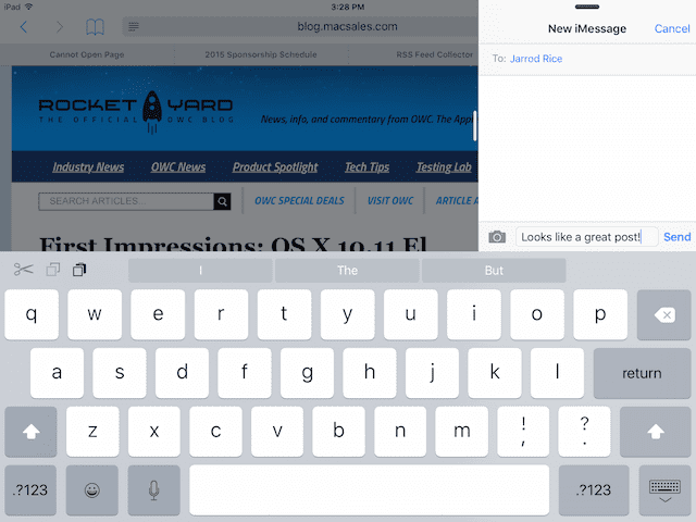
Slide Over is already becoming one of my favorite features of iOS 9. The way it works is intuitive: when you’re in an app — Safari, for example — and need to temporarily open a window into another app like Messages, swipe from the right side of the screen and a scrolling app picker appears. Tap on the app you wish to open and it opens in a smaller pane. Respond to the message and then slide the pane back out of the way.
If you want to open another key iPad app in the small pane, just swipe down from the top of the small pane and the app picker appears again.
Related: Check out OWC Dan’s first impressions of OS X El Capitan and Metal
I found this to be most useful was when I in the middle of one task and just needed a quick piece of information. Rather than having to get completely out of the app I was using, it was refreshing to be able to just get my glance at another app and then get the smaller pane out of the way.
Slide Over seems to work with just about any app as the primary screen. While Apple’s own Pages app is not yet set up for Split Screen, it worked well with Slide Over. I enjoyed using Tweetbot as my primary app and opening Safari in a Slide Over pane to look something up.
Split Screen
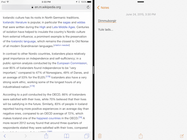
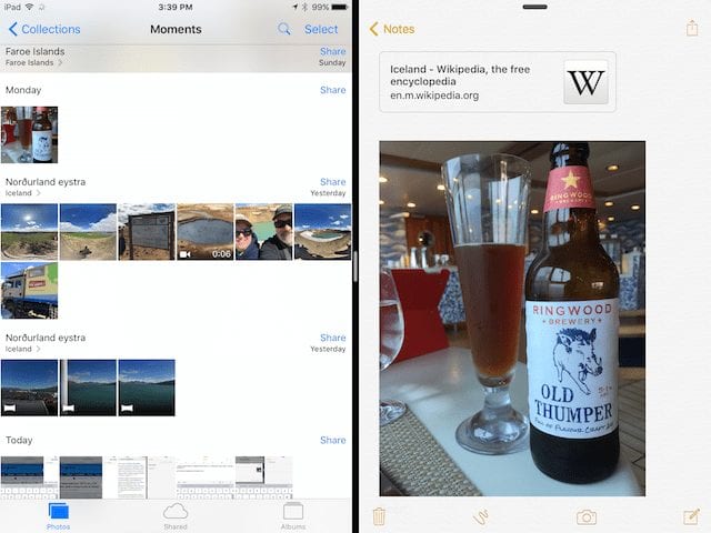
For pure productivity, though, Split Screen is the best. Take two apps — like Safari and Notes, for example — and you can work in both side-by-side on the same screen at the same time. Certain apps allow drag and drop between each other, making it incredibly simple to move things like images between a source (Safari) and a recipient (Notes).
At present time, Split Screen and Slide Over only work with built-in Apple apps. However, Apple made it quite clear during the WWDC 2015 keynote that developers who are using common frameworks will find it simple to have their apps work with the new modes. I’ll be ecstatically happy when I can work in Split Screen on an iPad Air 2 with a browser window and my favorite writing tool — Ulysses — open simultaneously.
Related: See if your iDevice is compatible with iOS 9
Split Screen is the one iOS 9 feature that could make me use an iPad instead of a MacBook as a favored mobile computer. When I was working on this article, I found it very useful to have Safari and Notes each taking up half of a screen. I could research something, then jot down a quick note.
Picture in Picture
Bloggers all over the world were probably cheering Picture in Picture when it was announced, since it makes the iPad a useful tool for watching a keynote livestream and write about it at the same time.
Picture in picture allows videos from FaceTime and YouTube (and soon other video apps) to be shrunk down to a small, resizable and movable window that can stay open while you’re using another app. Shrinking the video is done by pressing the Home button while it’s playing.
It’s perfect for taking notes while watching a video, watching a news update while playing a game, or pretending to pay attention to your spouse during a FaceTime chat while you’re actually getting work done.
Notes
Notes has always been a go-to app for grabbing short bits of information, but in iOS 9, Apple adds some much-needed enhancements that turn it into a very valuable tool. The app gains the ability to have note attachments such as photos and sketches, and the sketch tool that’s built in is very complete. Not only does it have a nice set of sketching tools — a fine point pen, a highlighter, and a pencil — but there’s also a ruler that snaps to any angle you set, allowing you to draw precise lines.
There are only eight colors available in the Notes sketching palette; hopefully Apple will add the ability for users to create their own colors in the future.
Perhaps the most useful addition is the ability to create checklists in Notes. With the tap of a checklist button on the virtual keyboard, each new line is preceded with a dot that can then be filled as complete with the tap of a finger.
While the “Share to Notes” feature didn’t seem to work properly for me in the first beta, I can see where it could be extremely useful; the idea is that from any other app, you can just tap the share sheet icon, share with Notes, and then append text, images, maps, or other items to your notes.
Keyboard Changes
The one feature that’s always differentiated the iPad from the MacBook is the lack of a physical keyboard. While some people can type quickly on the virtual keyboard of the iPad (or even the iPhone for that matter…), I’d venture to say that most people prefer the feedback afforded by a physical keyboard. Apple made some changes to the iOS keyboard that make it much more useful, and if they could add haptic feedback at some point… well, who would need a separate external keyboard?
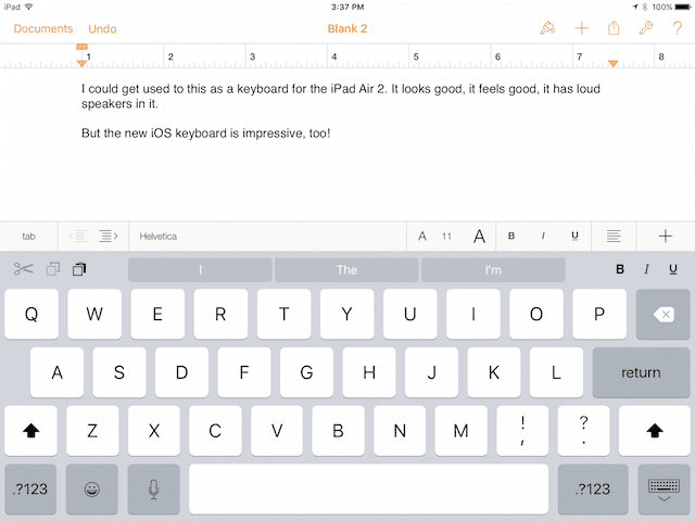
iOS 9 adds a new shortcut bar at the top of the virtual keyboard. It adds cut/copy/paste buttons, simple formatting buttons (bold/italic/underline), and an attachment button. These buttons can be customized by app developers, so it should be fun to see what special buttons are added to the shortcut bar.
My favorite tool on the new keyboard? The ability to use two fingers on it as a virtual trackpad! This makes it extremely easy to highlight large sections of text or precisely place the cursor in a document.
Smaller Updates
Apple says that updates will now be quite a bit smaller, allowing more people to jump to the new iOS without having to wipe their device first. There’s one other feature that was discovered yesterday by Twitter user Kaleb Butt, who found that the OS now asks you for permission to temporarily remove some apps in order to create enough room for the update to download and install. As soon as it is done, the operating system re-installs those apps automatically.
Conclusion
While I haven’t had an opportunity to test many of the new search and Siri functions of iOS 9 (I’m on a ship with slow Internet service…), the features I have tried make me quite optimistic about the upcoming update. All of them seem to be designed to make iOS faster, easier, and more convenient to use; precisely what an update should accomplish instead of just adding more features with questionable utility.
Rumors abound about a larger 12.9-inch iPad coming out later this year, and the combination of more screen real estate, the multitasking features (Slide Over and Split Screen in particular), and the updated keyboard features could truly turn the iPad into a powerful productivity machine.
If you’ve had the opportunity to install iOS 9 on any of your devices, we would like to hear about your experiences and what you like or dislike about the early beta versions. Leave your comments below!


