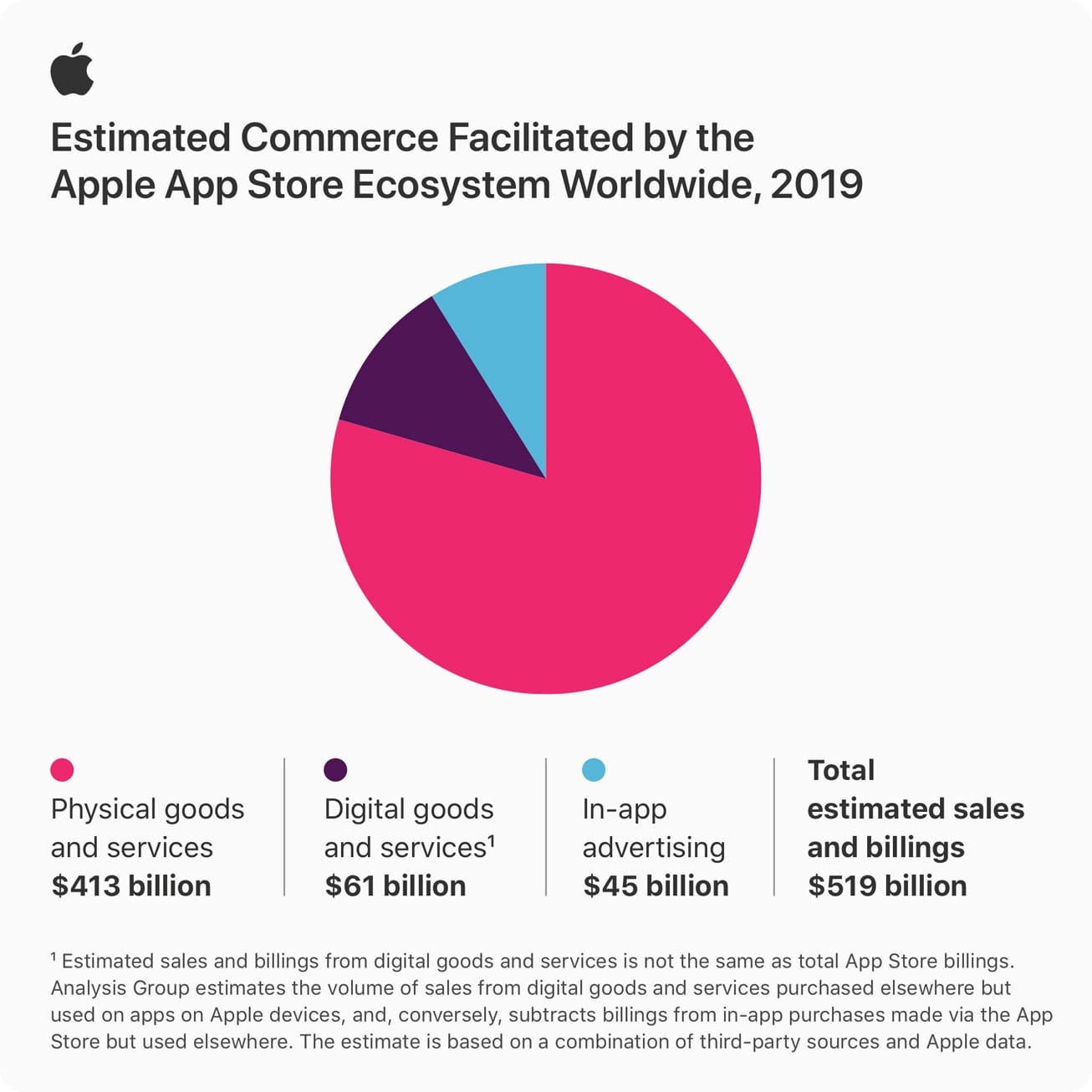
In a press release yesterday, Apple announced that $519 billion in global commerce was facilitated through the App Store in 2019. That doesn’t mean that the App Store itself brought in more than half a trillion dollars, for the largest category by far was physical goods and services, which came in at $413 billion, or roughly 80% of the pie. This would be your e-commerce apps, such as Best Buy, Target, Etsy, etc.
Digital goods and services such as “apps for music and video streaming, fitness, education, ebooks and audiobooks, news and magazines, and dating services,” comprised $61 billion. Only 8% is attributed to in-app advertising, which came in at $45 billion.
It will be interesting to see how the App Store fares in 2020. With so many new social distancing guidelines due to COVID-19, people are spending more time than ever on their mobile devices – that will undoubtedly translate into even more commerce. Launched in 2008, it’s safe to say that the App Store has changed how we work, play, interact, and transact.
“The App Store is a place where innovators and dreamers can bring their ideas to life, and users can find safe and trusted tools to make their lives better,” said Tim Cook, Apple’s CEO. “In a challenging and unsettled time, the App Store provides enduring opportunities for entrepreneurship, health and well-being, education, and job creation, helping people adapt quickly to a changing world. We’re committed to doing even more to support and nurture the global App Store community — from one-developer shops in nearly every country to businesses that employ thousands of workers — as it continues to foster innovation, create jobs, and propel economic growth for the future.”








You need to run your graphics past some colorblind employees.
While I can easily distinguish the four sections of the pie chart, the small areas of the color samples in the legend make it almost impossible to distinguish the Physical goods from the Digital goods. I had to really study the legend to figure out which of the two dark dots matched the slices of the pie and then verify by rereading the article.
Please keep in mind that 8% of the male population has red-green color blindness.
The image is straight from Apple, so we don’t have control over the color scheme. But I do understand your point that colorblindness should always be considered when choosing palettes – especially in infographics.
In that case, please pass my request on to Apple.
In addition, It would be easy to just modify the image to make the legend swatches larger.
Try clicking on the image, it should open at full-size in a new window.
I had not tried that because I was able to match the legend with the slices, but trying that now, I find that it doesn’t help much. Apparently, I can easily distinguish the colors of the slices of the pie because they are adjacent to each other, but when separated, as in the legend, making the image larger helps only slightly. The real problem is a poor choice of colors, and if Apple had shown this to a color-blind person, they would have discovered the problem. Of course, there aren’t many color-blind people in the graphics design department precisely because they are color-blind.
But thanks for the suggestion. I should have tried that before my original comment.