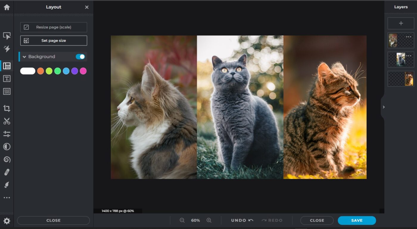
Do you need a banner, hero, or header image for a webpage? The typical ratio for the image at the top of a website landing page is 16:9, so it needs to be wide enough or at least croppable.
Unless you stumble upon the perfect stock photo on a site like iStock, Pexels, or Unsplash, that shows each and every subject you wish to discuss, you may have to put a few images together in a collage to make the final asset wide enough to be used on the web.
Or you may prefer to use one of your own original images, but it’s just not sizing up and cropping in a way that preserves the balance the photograph. The solution to this is to choose three photos and create a triptych—essentially a collage—allowing your photos with portrait ratios to be used.
There are many photo editing apps out there. Pixlr.com is an easy-to-use app that allows you to make basic edits like cropping and resizing. It’s easier to navigate than Photoshop, and it’s got a free web-based version. Let’s get started!
Choose a template in Pixlr
- Go to Pixlr.com
- Select Templates from the left sidebar menu
- Scroll through templates to find and select Simple collage
- You will arrive a large selection of collage templates. Choose Simple 3 in a row (when you pass your cursor over each one, the name is displayed)
You are then brought to the Pixlr editor where you can insert images, change the aspect ratio of your header, and change the size of your header.
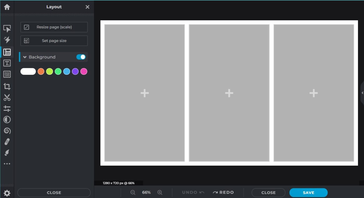
The simple three in a row template is already set at 16:9 which is standard for most web banner images. It loads automatically at 1280×720.
Check with the requirements or preferences of your website or blog where you will displaying the image—you may need the image to be bigger. Here on the Rocket Yard blog, we use 1400×788. Other sites I’ve worked with use 1920×1080.
Resize a template in Pixlr
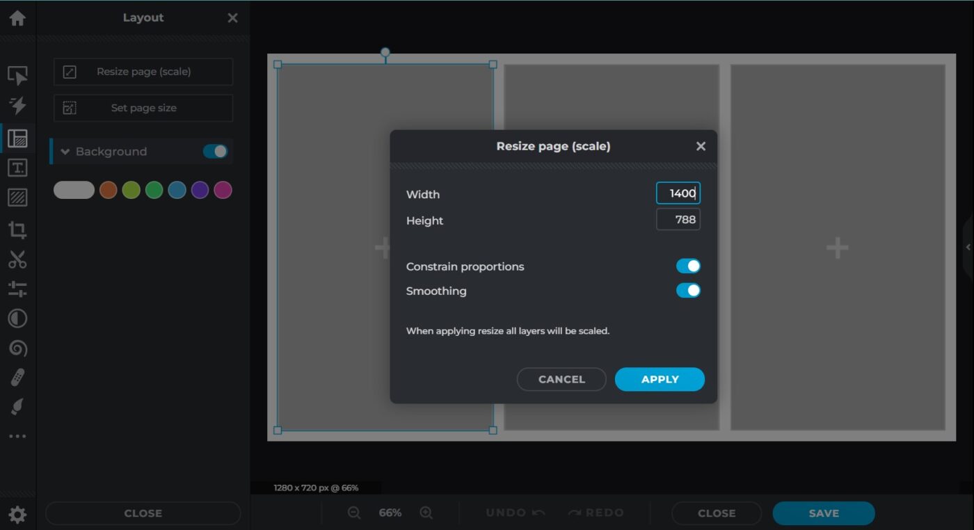
- Head over to Resize Page (scale)
- Change the size of one of the dimensions to your preference (the other dimension will change automatically, according to ratio, if “constrain proportions” is selected)
- All the layers of the template that contain each panel of the 3 in a row will be resized.
Note: Changing the dimensions of Set page size will only make the background bigger but it won’t change the layers and their panels in the collage.
Insert images
Now add your images to create a collage. Simply double-click/double-tap on the plus sign or anywhere in the space of the image panel and you will be taken to your files.
Once you have all three images selected and uploaded, change the border color or size of the border—or eliminate it altogether.
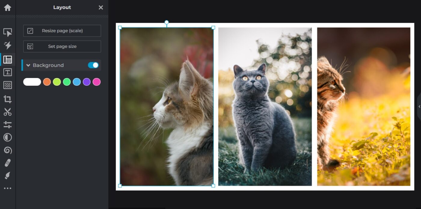
Pro tip: A collage without borders is a cleaner more professional look.
To eliminate the border, start with the center panel. Single tap it to select and drag it to line up with the top or bottom border of the background, Then stretch it at one corner to line up with the left panel, and stretch it again at the other corner to line it up with right panel. After that you can play around with the other two panels, but at least the middle is centered and within proportion.
Adjust each image in the collage
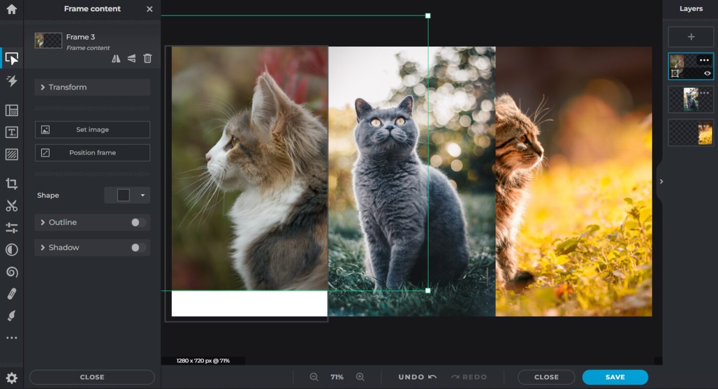
When you upload an image to the template, the whole image is loaded to one layer, but you can only see a portion of it in the panel of the collage. Decide how you want your image to display in the collage by moving it around or resizing within the panel.
- Double-tap the image you want to adjust to access that layer only. The entire image should be outlined in green.
- Tap and hold to drag the image around until it displays the way you like it in the panel. You can also grab a corner to resize the image.
- Tap outside of the image to exit the layer.
And there you have it. Once you are happy with the placement of each image you can save the file. You now have a wide banner, header, or hero image you can use at the top of your webpage.


