macOS Sonoma is not quite the bug fix update a lot of Mac users were hoping for. Instead, Apple is adding some new stuff and some old stuff back into the OS with the aims of making the entire experience of owning a Mac better.
macOS Sonoma brings more customization, the addition of long-needed features for Safari, new screen savers, a Game Mode(!?), and what looks like the reincarnation of the much-beloved Dashboard of Mac days gone by.
And it’s that last one that really feels like the most substantial update in this new OS. The new widgets implementation is the feature that has the most potential of augmenting your use of the Mac moving forward in a meaningful way. Here’s why.
Dashboard reborn
Beyond other ways that macOS Catalina earned its rather infamous reputation among Mac diehards, a particularly frustrating example for widget lovers was the removal of Dashboard in that OS release.
Disabled by default in OS X 10.10 Yosemite before getting the ax completely in Catalina, Dashboard has been missed ever since. So, a lot of people were very happy to hear that Apple is planning on bringing a version of the functionality Dashboard provided back to the Mac in mac OS Sonoma.
Introduced in Mac OS X 10.4 Tiger, Dashboard would go on to become one of the defining features of the OS X era. Invoking it brought a group of widgets to the foreground of the desktop. As a visual metaphor, it was a more literal representation of a real world “desktop” than any personal computer OS had included to that point.
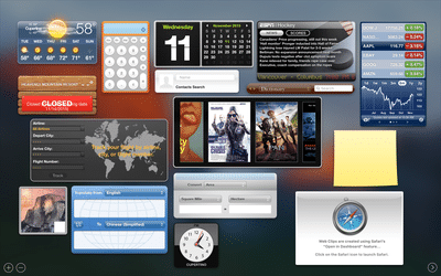
In the Dashboard you could place a clock, sticky notes, a calculator, stock tickers, a dictionary, etc.―just like a physical desk. (The skeuomorphic design language of the OS X days drove the physicality of these widgets home even further.) And those were just some of the stock options available. Eventually, Mac developers would add thousands upon thousands of available widgets to Dashboard.
With the removal of Dashboard in 2019 however, widgets were relegated to the Notification Center, forcing those who actually use widgets to interact with a part of macOS very few people want to use.
In a lot of ways, the success of Dashboard was a precursor to the iPhone App Store, showing an appetite for bite-sized, feature-specific apps.
Fast forward to today, and, in a roundabout way, the iPhone is now responsible for bringing a new-and-improved version of Dashboard back to the Mac. Though widgets were available on Android from the early days of that platform, iOS users didn’t gain the feature until 2014 in iOS 8. However, the implementation on iPhone was limited to what you could argue was the “new” Dashboard: Notification Center―a screen dedicated to viewing widgets and notifications.
It wasn’t until 2020 that Apple actually started letting users place widgets on their home screen. And just like other popular iOS features have had heavy influence on the development of macOS in the post-iPhone era, the enthusiastic adoption of widgets on iPhone are no doubt responsible for their now being a tentpole feature once again in macOS Sonoma.
How Apple is improving widgets in macOS Sonoma
By default in macOS Sonoma, you’ll still find your widgets in Notification Center by clicking the date and time in the menu bar, or by swiping left with two fingers from the right edge of a trackpad.
But now Apple is finally allowing you to place widgets on your Mac desktop―and not just Mac widgets either.
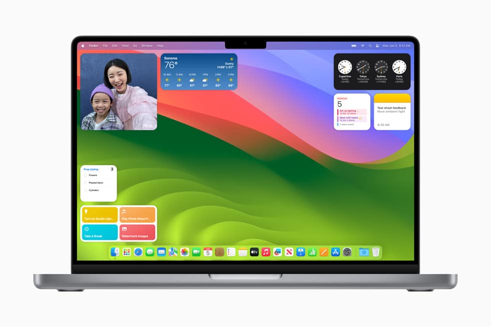
Based on comments in the keynote, it seems like the reason Apple hasn’t allowed widgets on the desktop in the past is because they felt they would be too distracting as you move through other windows and apps. So, as part of this new implementation, whenever you open an app in the foreground, the widgets on your desktop fade into the background.
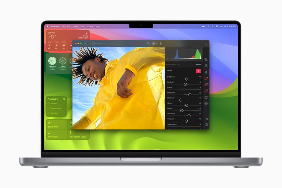
They’re still there and still legible, but they basically become transparent, matching the color of the portions of the desktop they rest upon. It’s a thoughtful implementation and―to me anyway―a clear upgrade over the current implementation and even Dashboard.
Apple is further bolstering its new implementation in Sonoma with a widgets gallery. To open it, you simply right click your desktop and then select “Edit Widgets.” From the box that pops up, you can drag a new widget to the desktop.
Continuity brings iPhone widgets to the Mac
Maybe the most “wow”-worthy feature of this new widget implementation though is the addition of Continuity.
In the widgets gallery, Continuity automatically presents you with any widgets that you currently have installed on your iPhone. What’s really cool though is that you don’t have to have these widgets installed on your Mac.
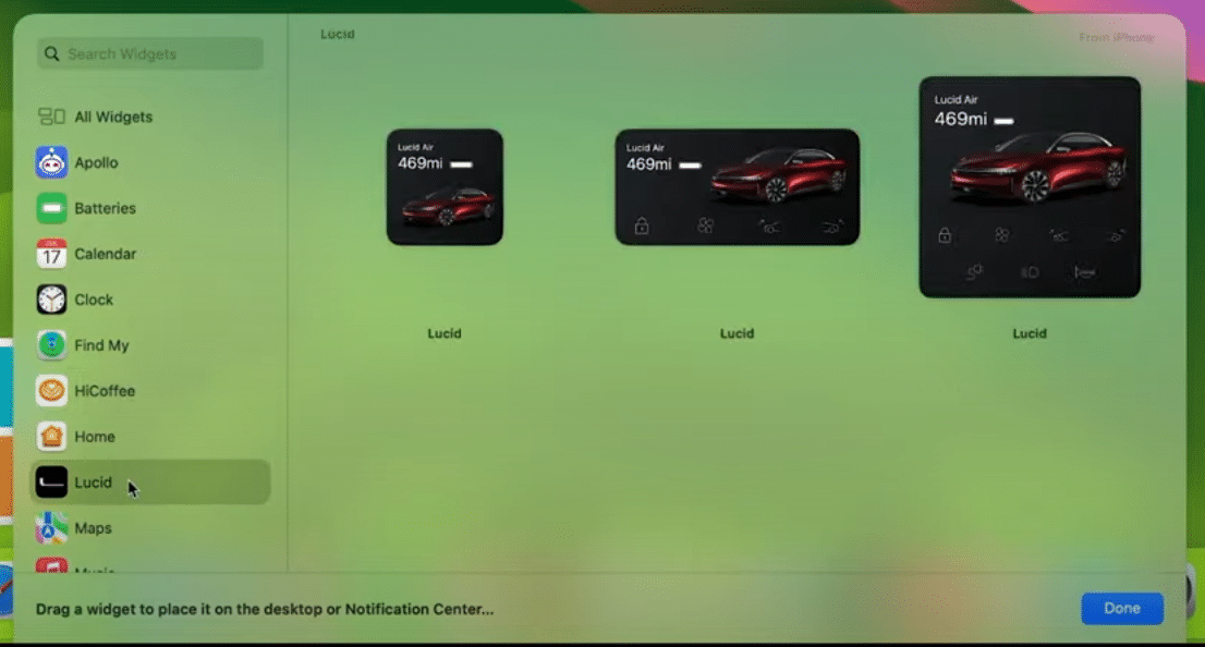
As long as your iPhone is nearby or on the same Wi-Fi network, Continuity basically streams them to your Mac, allowing you to place and use them like any other Mac widgets. Very cool.
Widgets on Mac are interactive too
No matter what widget you’re using, whether it’s an iPhone widget via Continuity or one installed on your Mac, all widgets are interactive on the Mac now as well.
That means that you can perform complete actions from the widget without actually opening the app it represents.
For instance, during the demo, Apple VP of software engineering Craig Federighi pinned a widget from car maker Lucid Motors and with a single click sent a command to a Lucid Air to start cooling the cabin. In another, he selected photos on the desktop before clicking a button on the shortcut widget which automatically formatted the photos and dropped them into Mail to be sent. It was pretty slick.
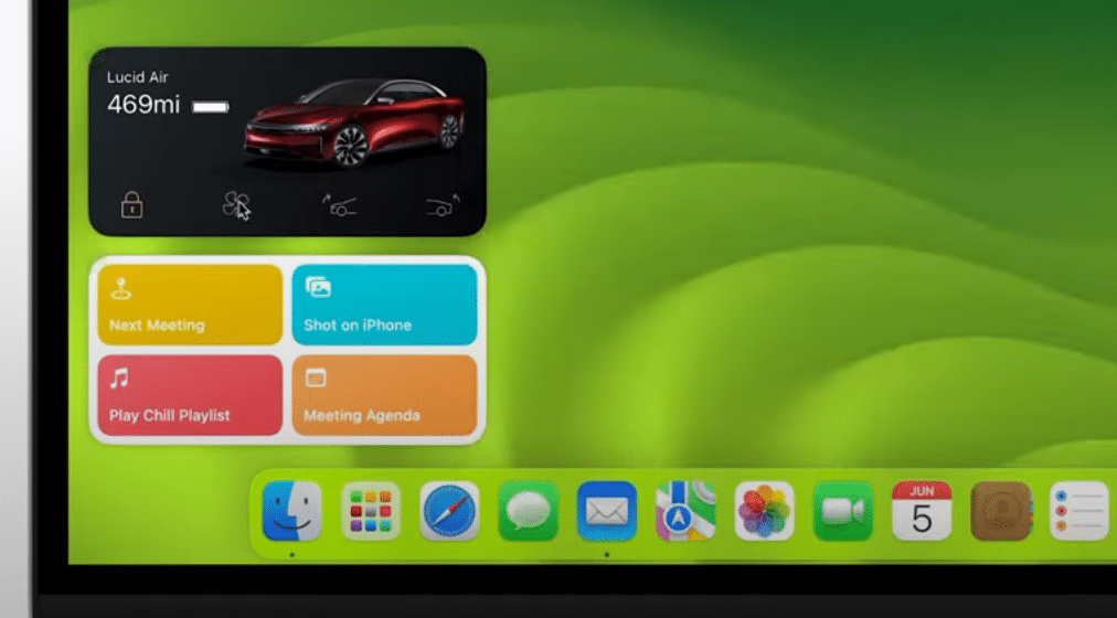
All in all, this is the implementation of widgets that Mac users have been hoping for for years. Being able to finally place widgets on the desktop is awesome, but this Continuity feature along with interactivity really are the icing on the cake. This feature alone is probably enough to convince a lot of Mac users to upgrade.






I’m hoping that widgets can still be used with the option of them not being on the desktop screen all the time faded or not.
I wish Apple would fix malfunctioning apps instead of wasting programming time on flippancy.
For example Apple talked about PDF new stuff with Preview. I wish that Apple fixed the unreliability of Preview in saving edits in PDF documents. This has been a long complained problem. No fix in sight.
Mostly, what I want from Sonoma is for Music.app to -stop crashing- on multiple AirPlay streams. I’d rather Apple invest in making existing features bugproof than adding new “features” of dubious value and increased complexity (of both the code base and the user interface. An example of the latter is that mis-feature where if I accidentally bump the top of a window to the menubar, it suddenly expands to consume the entire display. That’s yet another user interface annoyance, particularly when using Mac OS on a large display rather than a laptop.)
David, I agree completely. I didn’t get into this in the post, but when widgets and moving screensavers are tentpole features of a macOS release in the year 2023? Something is amiss.