

To call Apple a “trailblazing company” would be an understatement. Much of the brand’s history is practically folklore in the tech world. You probably already know of Steve Jobs and his iconic black turtleneck. You may even be familiar with one of his better-known sayings, such as:
Design is not just what it looks like and feels like. Design is how it works.
But when and how did Apple go from a company that practically ignored design in the late ’80s to the revolutionary candy-colored tech powerhouse that we know and love today?
Let’s take a look.
Extraordinary Vision
There wasn’t as much of a strong design and marketing component to Apple products until Steve Jobs returned as CEO of Apple in 1996. With Jobs back at the helm, the company succeeded where they had once failed – recruiting young upstart product designer Jonathan (Jony) Ive, who came on board in 1997 to redesign Apple computers.
At this point, industrial design was barely a consideration for most tech manufacturers. Jobs drew upon the Buddhist principle of simplicity to create intuitive technology that anyone could use.
The iMac: Bondi Blue VS Technicolor

Jobs understood the untapped potential of incredible design. The design team faced the challenge of making computer usage more widespread and designing “must-have” technology. At this point, computers were white, grey, or black and clunky. The iMac would change all of this.
The iMac was originally launched in a translucent shade called “Bondi Blue” in 1998. At the product launch, Jobs famously said that while he loved the iMac, it was the wrong color.
The iMac was then released in five different bright colors that looked good enough to eat: Strawberry, Blueberry, Lime, Grape, and Tangerine. It was a computer designed with color and personality. Thus began Apple’s long history of designing products and interfaces that told a story.
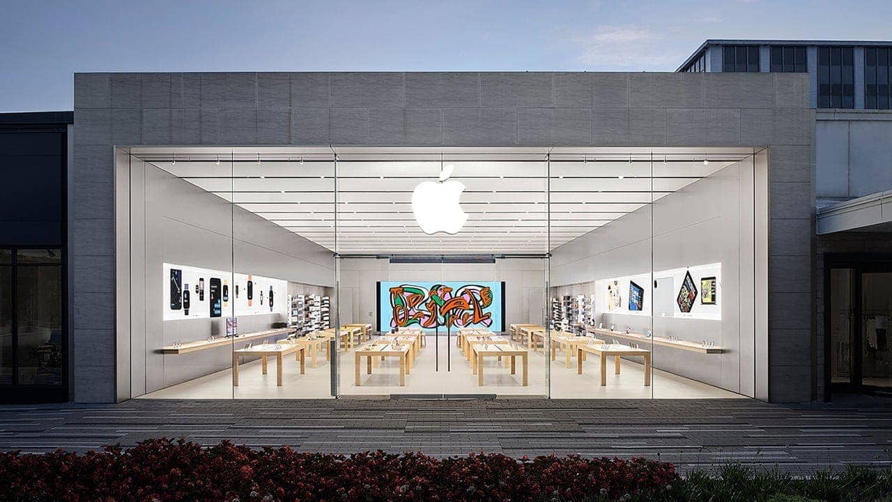
A New Kind of Retail Store
Apple products were originally sold at “stores within a store” concepts at big box stores. But the company wasn’t getting the traction they needed by selling within other retail stores. Most people still weren’t comfortable working with technology in the late ’90s. The team recognized that to create something truly revolutionary they would need to build a new kind of retail outlet — one that encouraged an immersive, hands-on experience. In 1999, Apple’s retail store team began to conceive building upon the iMac’s success with Apple-exclusive retail stores. The idea was to create stores that were hubs for customers’ digital lives. Apple only had a few products at this point. Still, Jobs has a vision: he wanted to build large Apple stores that rivaled apparel retailers such as Nike in size. This meant using negative space in a way that was never before seen in a tech store.
The first two Apple stores were opened in 2001 in Fairfax County, VA, and Glendale, CA. The stores were a totally different technology experience — one that was welcoming and invited customers to touch and feel Apple products. Apple’s Genius Bar allowed customers to get hands-on product support from tech experts. The ethos of the stores was also different. Instead of the cold, take it or leave it approach that surrounded tech sales to that point, Apple stores became synonymous with human support, kinesthetic learning, excitement, and creativity.
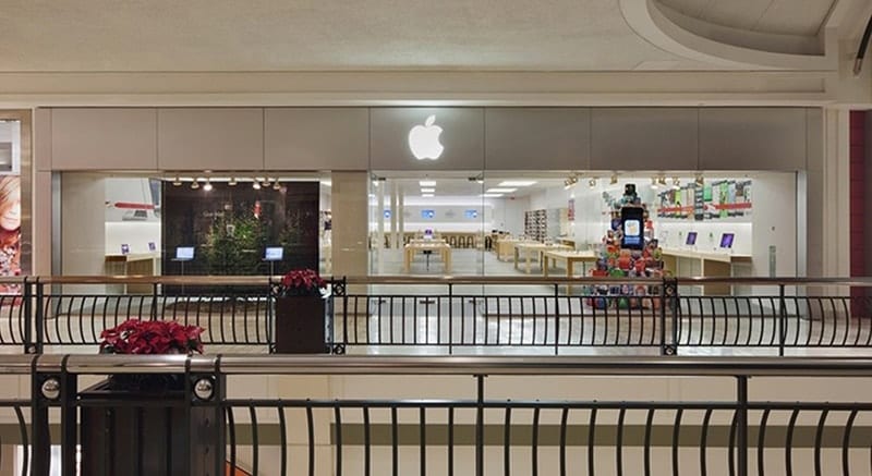
Interestingly enough, Apple is now returning to the store-within-a-store concept for its new collaboration with Target. Target will double Apple’s in-store footprint. This could prove to be a strategic move to maintain the availability of Apple products if retailers deemed non-essential are once again shut down.
The iPod: A Digital Hub Strategy

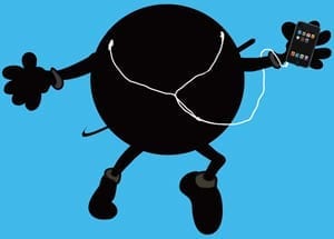
Apple first launched the iPod in 2001. It came in white with a rotating scroll wheel and was only compatible with Apple products. Quite a few other tech companies — Google, Sony, Microsoft — launched portable MP3s around this time, and the scroll wheel wasn’t enough to make the first iPod an industry leader.
Microsoft dominated the MP3 market in the late ’90s and early aughts. Jobs understood that for the iPod to become truly competitive, it would have to be Microsoft compatible. This was no easy feat, and Apple couldn’t swing it alone. Hewlett Packard helped create a unified product and gained licensing rights to a run of iPod+HP in 2004.
In 2004, Apple also released the iPod Mini, a thinner iPod that came in a wider variety of colors. But it wasn’t until the release of the iPod Nano in 2009 that the company hit its stride with handheld devices in the delectable candy colors that made the iMac a success.
The iPhone: A Shocking Mobile Device

In January of 2007, Apple launched the iPhone. It was a revolutionary mobile device. The iPhone was touch-activated with no physical keyboard. While it wasn’t exactly the first phone of its kind — IBM had released a touch-activated mobile phone in 2004 — IBM’s take was large and heavy. The iPhone’s unique, compact design, on the other hand, made it the trailblazing product that has changed the way we live today.
Size was another difference. Up to this point, mobile phones came with keyboards and a stylus. While IBM’s mobile phone was touch-activated, users still had to use a stylus to send messages with the phone. But consumers could operate the iPhone with their hands alone.
The hardware and software were tied together to create a connected hub. Visuals and animation were intuitive. And, for the first time, mobile phone ownership wasn’t relegated to the elite. Incredible design was made accessible to the masses, and Apple’s retail outlets provided free, hands-on training for any novice interested in trying out the tech.
“Designed by Apple in California”
Since the launch of the iPhone, phones have gotten larger, and phones have gotten smaller, according to the trends of the time. Right now, Apple is taking two different paths with its offerings. There are compact, affordable phones like the iPhone 12 Mini and large screen digital hubs like the iPhone 12 Pro Max.
An innovative, minimalist aesthetic has made Apple products both a cult phenomenon and a household name. The company continues to incentivize innovation through events such as the Apple Design Awards, the annual celebration of intelligent hardware and software design.
Did we miss anything?
What is your favorite Apple-designed product? Drop us a line in the comment section below!


The iMac design actually had a legacy far beyond making personal computers colorful. Those of us around at the time may remember that several accessory manufacturers released products in Bondi Blue (including printer manufacturer Epson). Many offered accessories in the fruit colors as well.
The iMac even had an influence on more disposable design, as makers of office equipment like paper clip holders and organizers and companies that made plastic tableware imitated the iMac fruit color palette.
My first Mac was an SE that I bought with an ImageWriter dot matrix printer. Because it was my first computer, I was not sure what I would do with it, but I got over that pretty quickly as I began churning out stuff to help me in my job. Sales flyers and price sheets to replace those that we have been hand writing or typing out. The ability to save a document and then reopen and make changes was such a time saver that I convinced my boss to buy one for work. We got another SE and this time, I picked out a LaserWriter. Now were are talking top-notch desktop printing (in black and white) that looked great.
Before I had a scanner, a digital camera, or even the Internet, there was no way to capture an image, but there were sellers of clip art in books where you could cut out the art and glue them to paper. Run through the copy machine, they gave me a way to add logos and images to may work.
So long before Steve left and came back, long before design extraordinaire Jony Ive came on the scene, Apple changed my life in a profound way that must make today’s users chuckle. For me, Apple has always been about great design and products that work. Of course I lived through the clones, the clowns, and a lot of bad design before Steve came back and I have spent a fortune on must-have Apple products of all shapes and sizes. One thing that I never forgot, however, is that first Mac SE. I still have it.
The Skittles iMac’s were cute, I would still vote for the iMac G4 swing arm, snow ball iMac as the most elegant and unique design Apple ever produced for a desktop.
Who at Apple invented light gray text on a white background?
What were they thinking?
Were they thinking?
How did design aesthetics so overwhelm functionality?
To speculatively answer your questions:
Who invented light gray text on a white background? An ad wonk. Ad wonks don’t read or write text, they just want it to look pretty.
What were they thinking? See answer to question one.
Were they thinking? Ad wonks don’t think, they are purely emotional. See answer to question one.
You can’t blame ad wonks for the model and serial information on the bottom of an iMac’s foot, or the bottom of a laptop case. If light gray on silver at 4 pt. isn’t a violation of ADA, it should be.
I don’t disagree with much said here. Jasmine, it must have been hard not to repeatedly use the phrase, “it almost goes without saying…”.
But now that we’ve said that, I would like to add that unrestrained design for the sake of design eventually supersedes function as it did towards the end of Jonny Ive’s reign.
Yes, he was his own kind of crazy, artistic genius, and we know that because he has an English accent and talks reallllly….slowwwwwly when trying to describe the inside of his vision. He’s a god in technology design, but sometimes the gods must be crazy. When Jonny started making the iMacs so thin that people were getting paper cuts when they adjusted them, that’s when I felt he probably should have gone back on his meds.
Yes, I love the thin, lightweight approach to MacBooks. They needed it. Engineers hated it, but if we left everything to them we’d still be toting giant 7-pound Nokias in our backpacks. It was a good move by both Jobs and Ive to force them to think thin.
But they lost me at the iMac.
We lost screws to magnets and highly reflective glass, and then magnets to glue. Today we have nearly unrepairable (much less upgradeable) machines. We never needed an ultra-thin iMac. We needed a powerful iMac with lots of space for creation, speed, cooling, and repair.
And the MacPro trash can?
Someone really needs to test Cupertino’s cafeteria salad bar mushrooms. I think it is, bar none, the dumbest, most ugly Mac ever made. My fingers are crossed so hard they’re numb hoping we finally see a truly modular, expandable design for the new M-series MacPro likely to be released in the next 18 mos. or so.
Think Mac Cube. One of the coolest, most functional Borg designs ever to come out of Cupertino. Stacking, interlocking MacPro modules could blow away industry professionals who need scalability and not simply those wanting to mine BitCoin.
And the AppleTV remote? Jonny. Seriously? I don’t see that one appearing on your resume anywhere and you definitely had to sign off on that. If the Trash Can MacPro is the dumbest/ugliest design ever to come out of Apple since Stevo returned, the AppleTV remote has got to be the least functional, nearly unusable piece of hardware I’ve ever seen. Even the perfectly round Apple mouse was not as bad.
So yes, I agree. The Second Coming of Jobs brought color (or colour, as Jonny would call it) and plastic bucket loads of fun, imaginative, much-needed design. It’s hard to believe it took so long to arrive, but there is no arguing that the bubbled iMac may have saved Apple before the iPhone arrived. How did we live with those ugly, off-cream towers for all that time? It’s just a shame that design ended up running over function like roadkill at the end of King Jonny’s reign.
If my research is current, Jeff Williams, the AppleWatch Designer has now taken over Ive’s old desk. There are rumors that Ive and Cook didn’t click in the same way that Jobs and Ive did, but so what? It was just time for a change. Perhaps Jonny just got bored, or Timo rejected Ive’s new MacPro design because it looked like a banana?
Either way, I’m hopeful for a better balance between form and function. If colored iMacs returning to the scene helps sales, great. But please don’t forget they need to be more than just pretty things that sit on our desks and stream TikTok.
Form still should follow function.
Alas, with the bean counter Mr Cook at the helm Apple seems to have turned to chasing money rather than focusing on design…from new and exciting bugs introduced in updated OSes to them pushing hardware down users’ throats – I recall a couple of years back my iPad Mini “all of a sunned” required the official Apple wall wart to charge, despite it having been perfectly happy with the generic one I had been using for 6 months – just after an iOS update.