In macOS, some apps have semi-transparent panes and toolbars. If something colorful sits beneath them, these surfaces show a blurred version of the colors.
Sometimes the underlying content below is animated, and this can be distracting to some folks, especially those with vestibular disorders. However, it’s easy to remedy this.
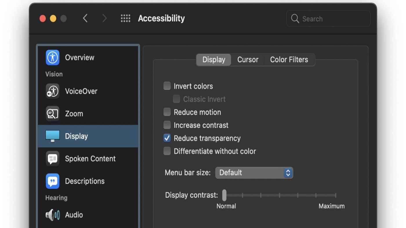
Go to System Preferences > Accessibility > Display.
Click the option to “Reduce transparency.” The transparent areas of the desktop and app windows become gray. Semi-transparent panes and toolbars will become solid (as will the macOS menu bar and its menus).
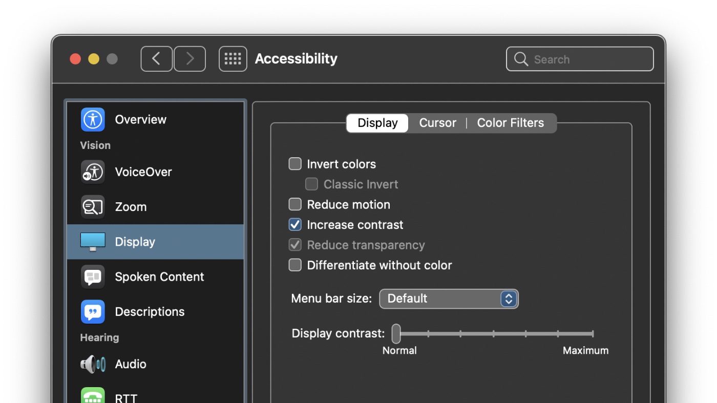
You can also enhance the clarity of your Mac’s screen by enabling the “Increase contrast” option. This darkens the pane and button borders. I find it a bit much, but, thankfully, I don’t suffer from any vestibular disorders.




It works great, thanks. Interestingly some other of the options on that menu, like ‘increase contrast’ takes effect immediately while the ‘reduce transparency’ one half worked. The window of the game I had open at the time still was trasparent but the scrollbar-thingy with all the apps lost all transparency immediately. When I restarted the game window though it went though fully. I’ve had this problem for a couple of years but it only matters when the background windows are very colourful but it’s nice to finally have it fixed
Once again, thanks Dennis!
It turns out increasing the contrast can also wash out the white/grey checkerboard used to display transparency in the alpha channel. Reducing transparency has a similar but some what more logical effect.
Hi Dennis how do I stop the menu bar coming up on the right side please
It’s so annoying..
Carol
Woke up early this am (thank you Eastern Standard Time), read the tips and tweaked a few settings in less than 30 seconds. Easy-Peasy! Thank you Dennis! I appreciate the tech tips!
While I am booting my MacBook Pro I get an alert message that says, ungrammatically, that I should increase contrast on and I’ve always wondered, “on what?” There is contrast control on the keyboard and I had found the contrast increase in System Preferences/Accessibility, but changing those values does not eliminate that opening alert message. Do you have any idea what’s going on? Are there other contrast controls? This started when I started using Big Sur. It does not occur when I open up my Mac Pro.
Thank you very much for this tip. I have been frustrated in Safari for years by the totally unhelpful and distracting moving shadows at the top of every window. I don’t remember when this silliness appeared, but I’ve been trying to find out how to turn it off for years. You are the first person that I have found to share an answer. This is very valuable to me.
Just to be clear, Safari was the only program where the transparency really bothered me. I wish I could fix just this program, rather than change the appearance of the whole OS interface.