 Maps – Geeks, nerds, travelers, and millions of trivia buffs, all love maps. Almost everyone, except my mother, loves maps. Internet maps are particularly interesting, because they often highlight the most read sites in a creative way. One trend is to show off site popularity by mapping sites on a subway map. Subway maps have lots of logical pathways that make showing Internet topic areas easy, plus they allow color-coding and good layout. I can’t imagine how anyone could read such a huge amount of information if you tried another format, such as a circuit board, or the national electric grid!
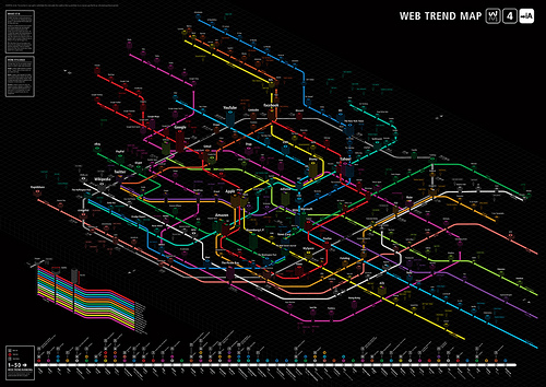
Web Trend Map 4 Final Beta overlays the most popular web sites over the Toykyo transit system map. This gargantuan effort, fashioned by Information Architects (iA) in Japan, shows off the 333 most popular Web sites. A timeline-type graphic along the bottom highlights the 50 most influential domains and their associated movers in the industry. According to the site, the map should be finalized today, and only 1,000 copies will be printed. The 2008 version sold out completely, but you can still download the PDF file of the Web Trend Map 2008. We recommend you open the file on a large monitor, if you want to view and actually read the map.
The new map includes topic lines for Community, Creative, Consumption, Broadcasting, Knowledge, Advertisements, Sharing, Entertainment, and Filters. Little square stations populate the map to highlight domains, which show off site success by height, stability by width.
The lost and missing on this map are hardware companies and equipment vendors. They can’t be dismissed as unimportant across the Web, especially considering how much valuable information these sites contain. Maybe next year a similar map with the likes of HP, Hitachi, Seagate, and of course, OWC will appear.


Hmm interesting, I never thought about laying out information in a manner like this. It is an interesting concept for sure, makes me wonder if it could be used for formatting other information.