 This fall we are sharing a series of simple design techniques for Illustrator, Photoshop, and After Effects. Rather than setting up a tutorial where you follow a “recipe” and end up with our design instead of your own, we show core workflow steps that allow you to try different tools or looks. Where pitfalls or caveats were found, we’ve noted them so that you can avoid problems. The idea is to get you experimenting with these powerful apps and enjoying the creative process! While you don’t need to be an expert to follow along, it is a good idea to familiarize yourself with each application and its core features before you begin.
 Setup: The application used for this article was Adobe Illustrator CC, 2015.3.1 release, running on a Late 2013 MacBook Pro with an SSD and 16GB of RAM. The system version is OS X 10.11.6.
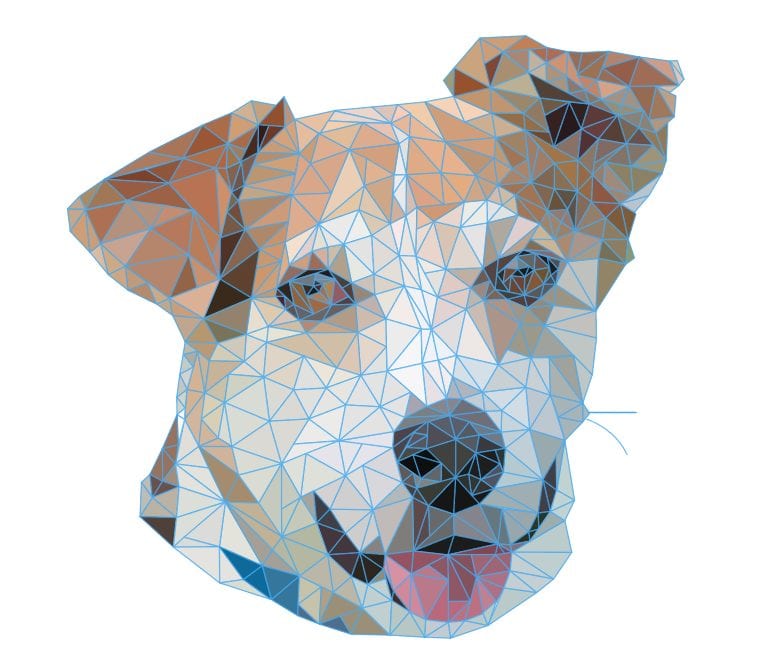
Concept: What is a low-poly portrait? Basically it’s a photograph — a real portrait — that is remade from an inter-connected series of polygons (sometimes called a “mesh”) that you apply in Illustrator or other vector graphics program. The idea is to use a series of triangles of varying sizes and placements, to map out the shapes and color regions in the original portrait. What you end up with is an abstract representation of the original portrait, but in a way that the subject can still be recognized. (Note: Click here for Part 2 of this series.)
Subject: For this two-part series we’ve teamed up with our friends at Helping Paws — a well-respected no-kill animal shelter located just down the road from our headquarters in Woodstock, Ill. Why a dog instead of a person? October is National Adopt a Shelter Dog month so this is a great way to help some great dogs in need of a new home. Later in the article we’ll also provide information for our local customers on upcoming events that provide assistance for the shelter. For customers outside of the McHenry area, find your local no-kill animal shelter online to see whether any events are scheduled for your area this fall.
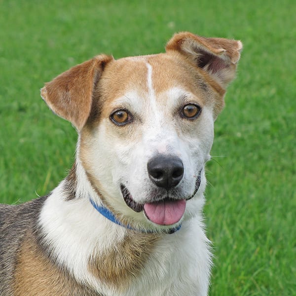
To get in the spirit of things, we acquired a portrait of the amazing and talented Fonzo, a newcomer to Helping Paws. Originally from Kentucky, Fonzo is an eager companion who needs an owner that is not only affectionate but regularly active —daily walks are a must and a special challenge like agility classes would make a high-energy dude like Fonzo one happy camper!
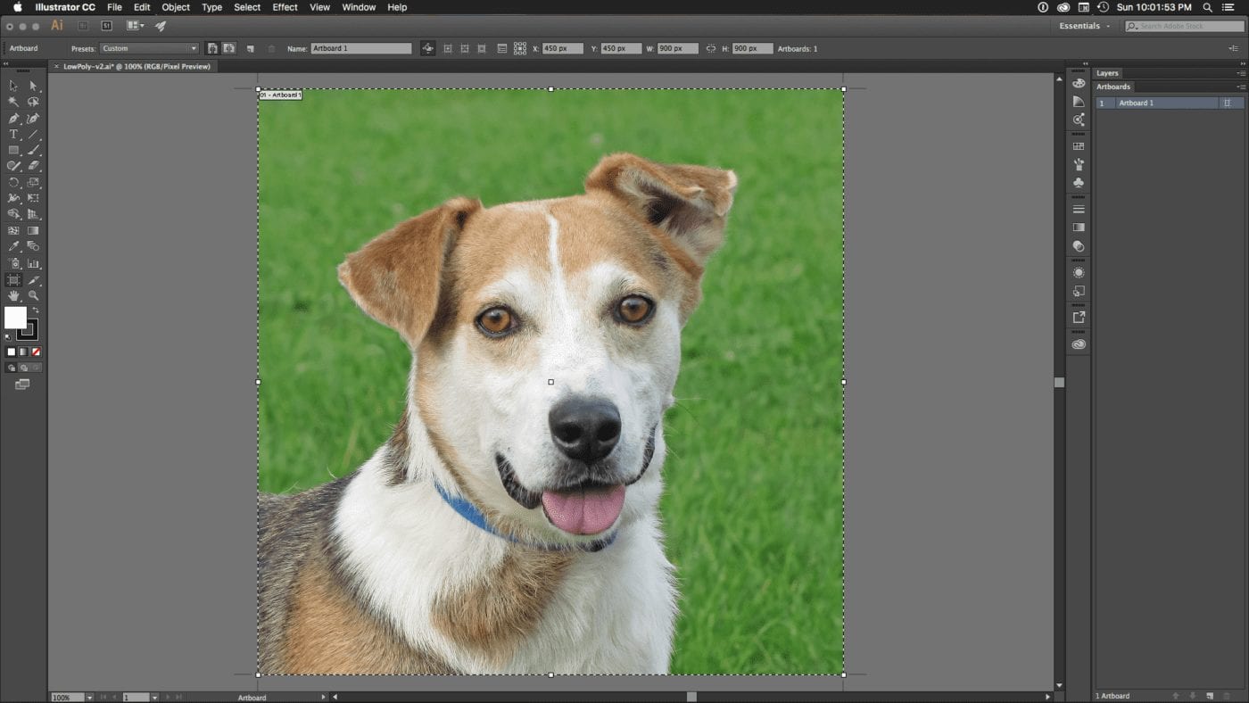
Step 1) Set up your artboard and image.
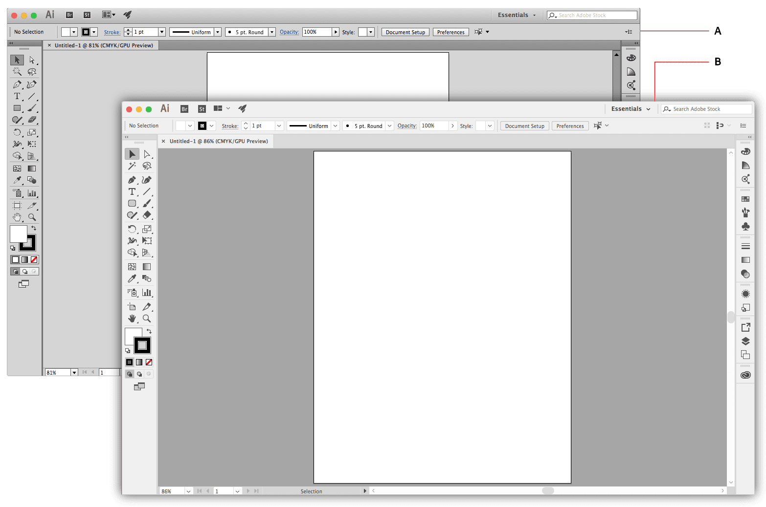
First you need to determine the dimensions of your output, and then create an Illustrator file and artboard to reflect those constraints. For this example we have a square image destined for the web, so we set a limit at 900×900 pixels. Once your new file is open, choose File > Place, select your target image, and add it to the Illustrator file. Next set the Width and Height settings in the Control panel to match your artboard. Last, use the move tool to click and drag the photo over the artboard; it should snap into place by default.
Note: because of how Illustrator CC interprets raster images, make sure your source photo is set to display at 72 ppi without altering the native dimensions. You can achieve this in Photoshop CC by opening the image, choosing Image > Image Size, then uncheck “Resample” and set the Resolution setting to 72 ppi. Click OK, then save the document.
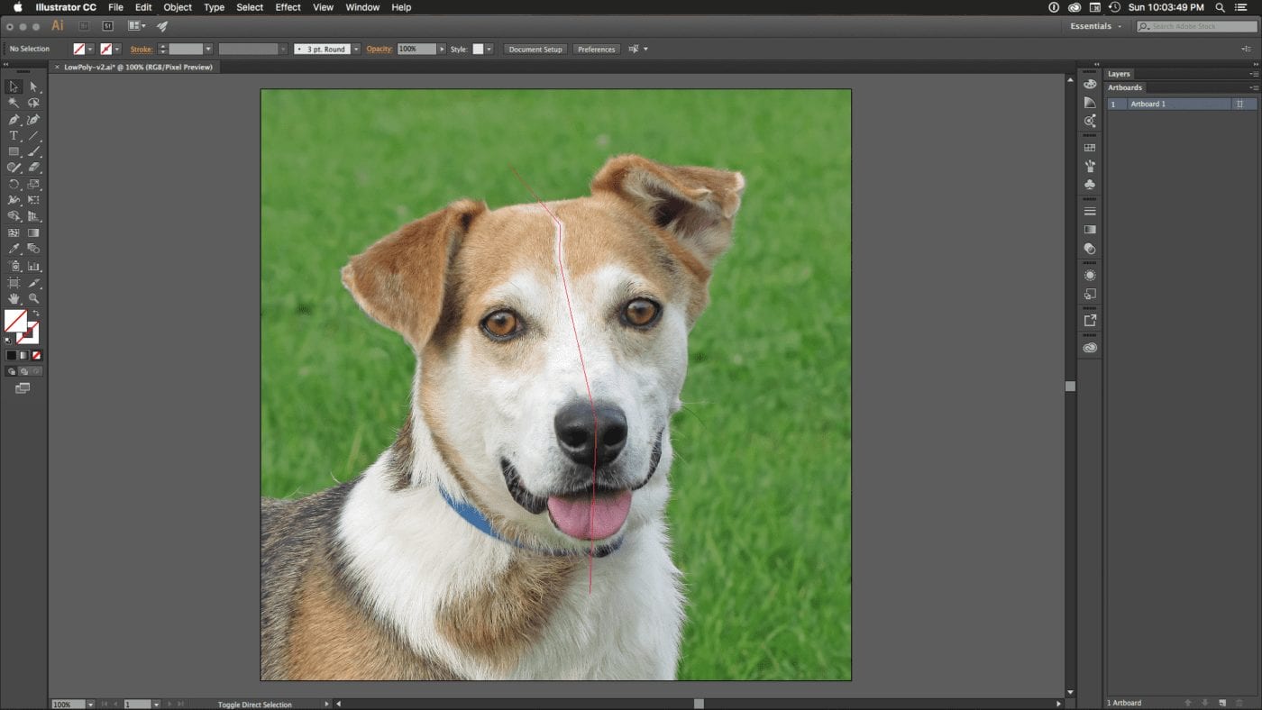
Step 2) Set up your guide(s).
Whether you intend to map out only one side of the subject’s face and then “mirror” the polygons to the other side for perfect symmetry, or whether you intend to block off each region of the portrait individually, it is useful to set up one or more guides. For symmetrical portraits, drag out a vertical guide from the Ruler and position the guide over the bridge of the nose or down the center of the subject. If your subject is off-angle, try to create a guide that follows the centerline in the photo.
For custom guide shapes, use the Pen Tool to create a multi-segment line that traverses the boundaries you think are important. You don’t have to worry about dividing the subject into precisely even segments — just make it close. Tap the Delete key when you’re finished adding line segments, then right-click and choose Make Guides. Repeat this process as many times as necessary. You may need to change the color of the guide in preferences, so that it stands out from your subject.
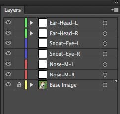
Step 3) Set up the illustration layers.
As with our previous article, it is helpful to set up layers that define each region of your portrait. This allows you to manage and evaluate different areas of the polygon mesh in isolation. You can either set them up as you go or create them at the start. Give each layer a name and if needed a layer color to set it apart from the others. Just switch to a new layer each time you finish one region of the polygon mesh, so that the next set of polygons sits on its own layer.
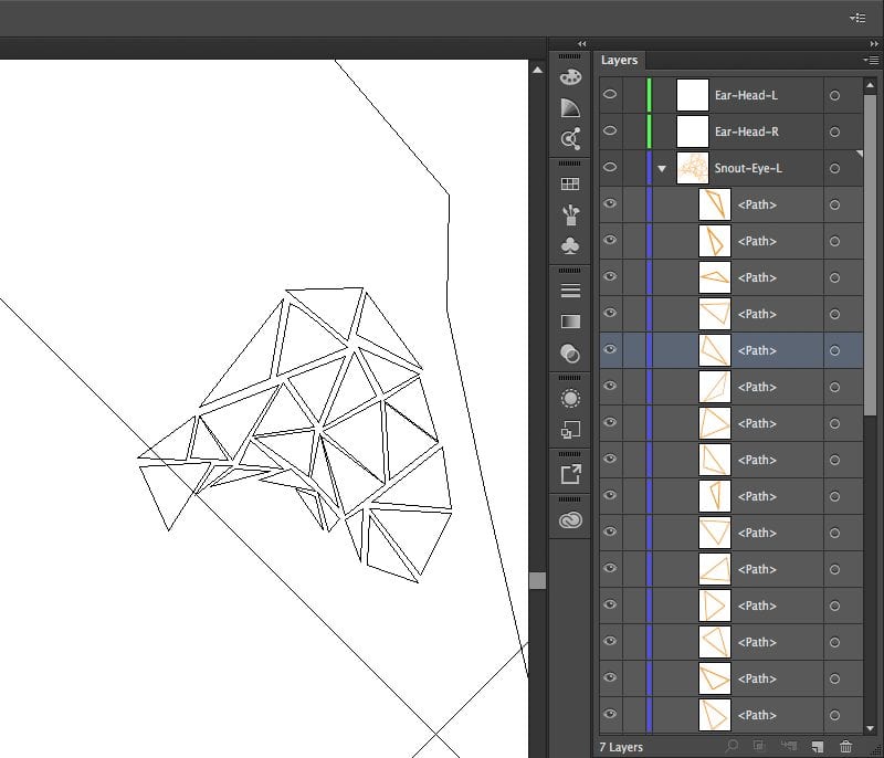
Step 4) Map polygons to picture regions.
While you can use different types of polygons in your design, generally speaking people stick with triangles. The restrictions imposed by using only one shape — combining triangles and later fills in different ways to accurately depict the colors, shading, and lines of the original photo — tends to produce more interesting results. One rule of thumb is to use smaller polygons over areas of smaller detail, and relatively larger ones over larger areas of detail.
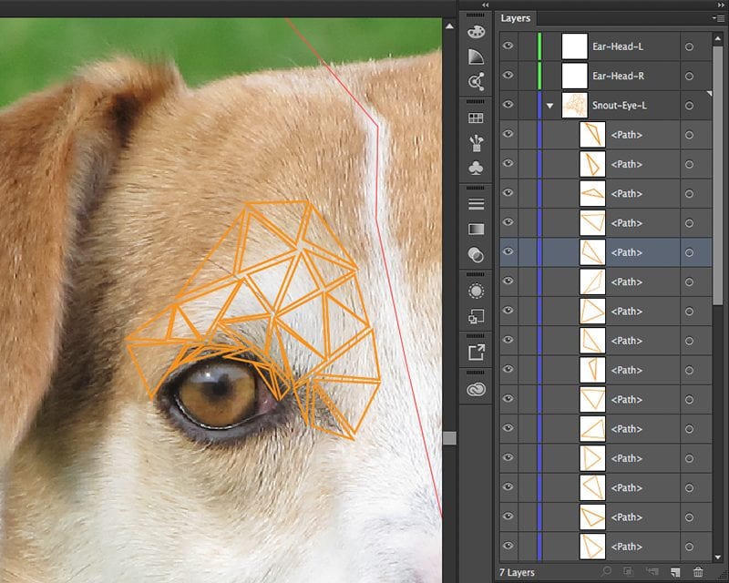
First, create or select the layer for the region you intend to cover. Next, select the Pen Tool — make sure the Control panel options are set to No Fill and a 1 pixel stroke that uses a color which contrasts with the dominant background color. Begin building out from one of the guide edges or from one of the edges of your subject — try to think a step ahead, while allowing your eyes to find the natural color or shade patterns in the image. It may take some trial and error at first but that’s normal.
As you create each new polygon try to work along a common edge from a previously created polygon; don’t worry if they don’t align or join perfectly. There will be gaps and odd spaces at first, but we’ll take care of those in part two of this article. Periodically, you may want stop and use the Outline preview (Cmd-Y for Mac, Ctrl-Y for PC) to get a clearer idea of how your mesh is evolving.
Coming up:
In Part 2 of this article we’ll add fill colors to the completed mesh, and close any random gaps or corner errors with our polygon mesh, creating the final look of the design.
If you live in the McHenry County area and would like to learn more about how you can help Fonzo or any of the other dogs at Helping Paws Animal Shelter, please give them a call at 815-338-4400 or sign up for their 10th Annual 5K Run/Walk or 1 mile Fun Run on Nov. 6, 2016.


