![]() macOS Mojave has many new features and capabilities that make it a compelling upgrade. And while we’ve covered many of the marquee features of Mojave, sometimes it’s the lesser-known features that can have a big impact on how your use your Mac.
macOS Mojave has many new features and capabilities that make it a compelling upgrade. And while we’ve covered many of the marquee features of Mojave, sometimes it’s the lesser-known features that can have a big impact on how your use your Mac.
Now that we’ve had a chance to work with Mojave, and tried out almost all of its features, it’s time to take a closer look at lesser-known capabilities that could fundamentally change how you use your Mac.
OK, that last part may be a stretch, but give them a shot anyway. In no particular order, here are my favorite six features that are often overlooked in Mojave, but turned out to be very helpful.
Favicons in Safari
Safari has long supported favicons, those itty-bitty icons that show up within Safari’s URL field and represent the website you’re viewing. With Mojave, favicons finally are allowed to exist outside of the main URL field, and can now populate Safari’s tab bar.
This can make it much easier to scan across the tab bar, and pick a loaded website to bring to the front for viewing.

To turn your Safari tab bar into a favicon-rich environment, launch Safari.
From the Safari menu item, select Preferences.
From the Preferences toolbar, select Tabs.
Place a checkmark in the “Show website icons in tabs” box.
Now whenever you open a website in a tab, its favicon will be part of the tab.
Safari has a number of new features introduced with Mojave. Check out: A Guide to New Features in the macOS Mojave Safari Browser.
Emoji Selector in Mail
It’s likely that you’re used to using emojis in your messaging apps; with macOS Mojave and Mail 12, you can use the same emojis available in iOS and the Messages app within the Mac’s Mail app.
With just the click of the mouse, or the tap of a finger, you can embed an emoji in your Mail message, and convey a bit of emotion that may be hard to put into words, but easy to display in a graphical shortcut.
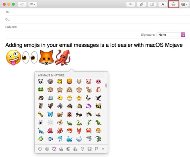
To add emojis, start by opening a new message in the Mail app.
Place the insertion cursor within the body of your email, where you would like the emoji to appear.
The message window’s toolbar includes a new entry in the top right corner: a button that looks like a smiley face.
Click or tap the smiley face button to bring up a character viewer palette that shows the available emojis and symbols you can include in your email message.
Browse through the character viewer until you come across the emoji or symbol you wish to add to your message.
Double-click or tap the emoji to have it appear at the cursor location in your message.
You can make the emoji bigger by selecting Format, Style, Bigger from the Mail menu bar, or by using the keyboard shortcut ⌘ +. You can also use the font viewer shortcut Format, Show Fonts to adjust the size of an emoji. This last method is quicker for making large changes to an emoji’s size.
Note: Emojis in Mail aren’t new, but Mojave makes adding one a much easier task by including the Emoji and Symbol palettes directly in the Mail message toolbar.
Accent Colors
Mojave’s new Dark Mode may be getting all the attention, but just as interesting is another UI change that Mojave brought: the addition of six accent colors, bringing the total to eight. In previous versions of the Mac OS, you could select blue or graphite to be the accent color for many of the UI elements, such as menus, popup menus, radio buttons, and fields in focus. With Mojave, you can now select from eight different colors: Blue, Purple, Pink, Red, Orange, Yellow, Green, and Graphite.
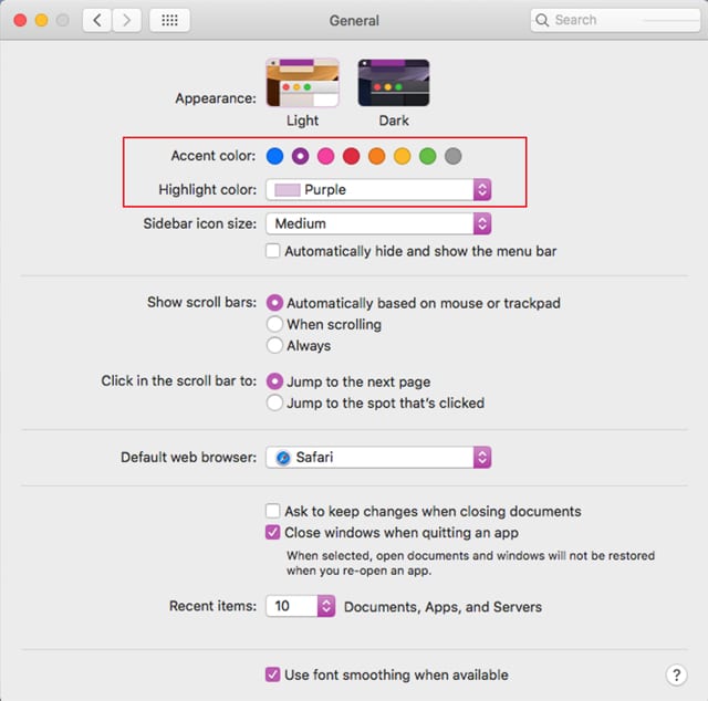
It may seem like a simple change, but it gives you a bit of UI freedom that Apple hasn’t provided Mac users with before now.
To change accent colors:
Launch System Preferences by clicking or tapping the System Preferences icon in the Dock, or selecting System Preferences from the Apple menu.
Choose the General preference pane.
In the Appearance block of controls near the top of the window, you’ll see eight color radio buttons.
You can pick any of the colors you wish to use for accents.
Note: When you pick an accent color, the highlight color will change to match the selected accent color. You don’t have to use the same highlight color; you can use the Highlight dropdown menu to select one of the available colors. Highlight colors are used to highlight text that has been selected.
Recent Apps in Dock
Mojave provides a makeover for the Dock, adding a second dividing line to break the Dock into three sections. Apple says the new section holds the three apps that you’ve used most recently, allowing you to quickly return to an app you may have just closed. In actuality, the Recent Apps section doesn’t display the three most recently used apps, but the three most recently used apps that don’t already have a home in the Dock. To put it another way, the recent apps section of the Dock is smart enough not to display app icons for apps already permanently docked.
The recent apps section also serves as the destination for a non-docked app’s icon to be displayed when the app is open. This provides a visual clue to let you know the app in use doesn’t permanently reside in the Dock, something that was difficult to know before Mojave, since all apps displayed their icons in the same section of the Dock.
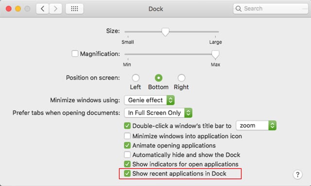
You can turn the recent apps section of the Dock on or off from the Dock Preferences:
Right-click or tap on the vertical divider in the Dock, and select Dock Preferences from the popup menu.
In the Dock preferences window, place or remove the checkmark from the “Show recent applications in Dock” item.
Quick Actions
One of the new features of Mojave is Quick Actions, a new way to quickly edit and manipulate files in the Finder, without having to launch any apps. Quick Actions comes with some predefined actions, such as rotating or marking up a selected image. If you have a video file selected, the Quick Action options will change to include a Trim function, letting you perform a quick edit on the length of a video.
You can also create custom Quick Actions for tasks you perform often, and would like to invoke directly from the Finder.
You can find out how to enable and use Quick Actions, as well as how to create a custom Quick Action, in the Rocket Yard article: A Guide to Quick Actions in macOS Mojave.
Folders on Top on the Desktop
With the release of macOS Mojave, there have been a few Finder-related upgrades. Some of these, such as Desktop Stacks, Gallery View, and metadata in a Finder window, we’ve highlighted already. But this Mojave feature is probably one of the least well-known, and yet it could produce a big impact for anyone who actively uses their desktop to organize files, or at least temporarily store files before they’re moved to a better location.
The new feature is actually an update to an old one: the ability to keep folders at the top of a Finder window when sorting by name. Essentially, this lets all of the folders in a Finder window be grouped together first; any files are then displayed after the folders, also by name.
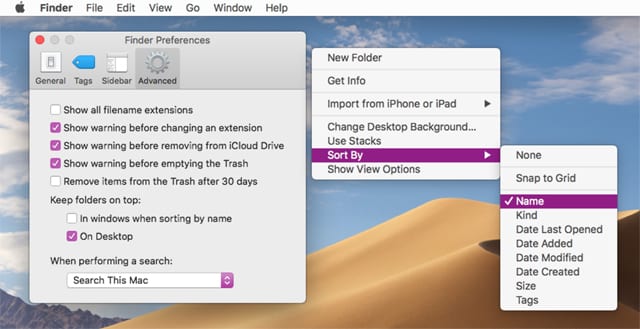
With Mojave, the folders first option has been extended to the desktop, letting you more easily organize your desktop by keeping desktop folders in the top right-hand side of the desktop when you choose to sort by name. The actual display order is mounted volumes, folders, files, and aliases.
To use this new desktop display option, perform the following:
Click or tap the Finder icon in the Dock, then select Preferences from the Finder menu.
Choose the General item in the Finder Preferences toolbar.
Place a checkmark in the “Keep folders on top: On Desktop” box.
Close the Finder preferences.
To actually see the results of picking this option, click or tap in a blank area of the desktop to ensure the Desktop is selected, then select View, Sort By, Name from the menu bar.
The Desktop will be rearranged to place folders near the top of the desktop.
Discover More about Mojave
Here are a few articles to help you get the most out of macOS Mojave:
- GPU Upgrade Makes Mac Pro Tower Mojave Compatible
- Five macOS Mojave Utilities You Should Get to Know
- Is MacOS Mojave Making Some Fonts Blurry?
- How to Customize Trackpad Gestures in macOS Mojave
Please feel free to share your own tips in the Comments section, below.






I do keep lotsa things on the desktop, and that darn “Sort by” has so often screwed my arrangements with an accidental selection. Wish there was an undo! Wasted so much time rearranging. Have resorted to pulling the .DS_Store file from a backup!
Keep folders on top is in the Advanced preference pane, not the General pane.
Eye candy, and two slightly useful functions. I can’t help wondering what useful stuff Apple took out.
Server.